There is something quietly persistent about a dot. It carries a rhythm that stripes and florals never quite manage, a pattern that reads as playful and precise at the same time. The polka dot nails trend 2027 leans into that duality, pulling the motif away from its retro pin-up associations and reframing it as something airier, softer, more architectural. What used to feel loud now feels considered. The dots have shrunk, spaced out, and learned restraint.
When you approach this look, start by deciding what the dot should do for you. A single scattered pattern over a milky base behaves very differently from bold graphic spots on a French tip, so anchor your choice to one visual priority: negative space, contrast, or color story. If you want everyday wearability, keep the base neutral and let the dots stay small. If you want a statement, choose one nail to carry the density and let the rest breathe. The pattern is forgiving, which means the real decision is about how much visual weight you’re willing to hold on your hands.
Monochrome Polka Dot French Tips on Almond Nails
The classic French shape gets a graphic update here, with black-and-white dotted tips replacing the usual solid white crescent. The almond silhouette elongates the finger, and the dotted border sits precisely where the tip would normally land, so the eye reads it as familiar before it registers the twist. Contrast does most of the work: the crisp white base against inky black dots creates a high-legibility pattern that stays sharp even at a distance. The dots vary slightly in size toward the edges, which softens the geometry and keeps it from feeling rigid. It’s a look that balances polish with a little irreverence.
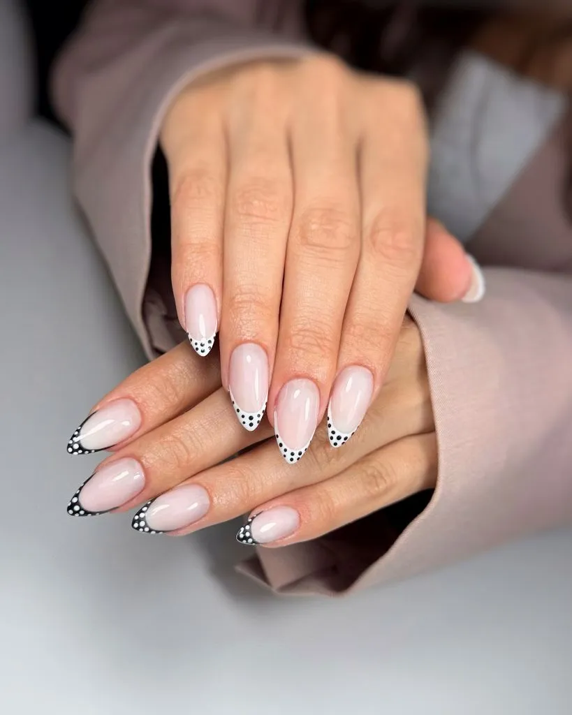
If a full set of dotted tips feels like too much commitment, scale it back to two accent nails and keep the rest as plain nude or milky French. That preserves the concept without the maintenance of a busy pattern across all ten fingers. Shorter almond or oval shapes work just as well; the dotted tip simply compresses and still reads clearly. For anyone who works with their hands, the tip placement is practical, since minor wear at the free edge blends into the pattern rather than exposing an obvious gap. You can also swap black for a soft charcoal or navy if the contrast feels harsh against your skin tone.
The reason this works comes down to placement discipline. By confining the dots to the tip, the design borrows the structural logic of a French manicure while injecting texture, so it never looks chaotic. It’s a study in editing: one motif, one zone, maximum effect. If you wanted a warmer version, terracotta dots on a cream base would carry the same idea into autumn palettes without losing the clean architecture.
Bold Black Ovals on Rounded Tips
This variation trades tiny scattered dots for larger, confident ovals clustered along the free edge of a rounded nail. The scale shift matters. Bigger spots read as deliberate design rather than delicate detail, and the effect is closer to a graphic print than a dainty pattern. Against a bare pink base, the black caps the tip like a bold border, and the rounded shape keeps the whole thing feeling soft rather than aggressive. There’s a retro reference in there, but the oversized proportion pulls it forward into something more modern.
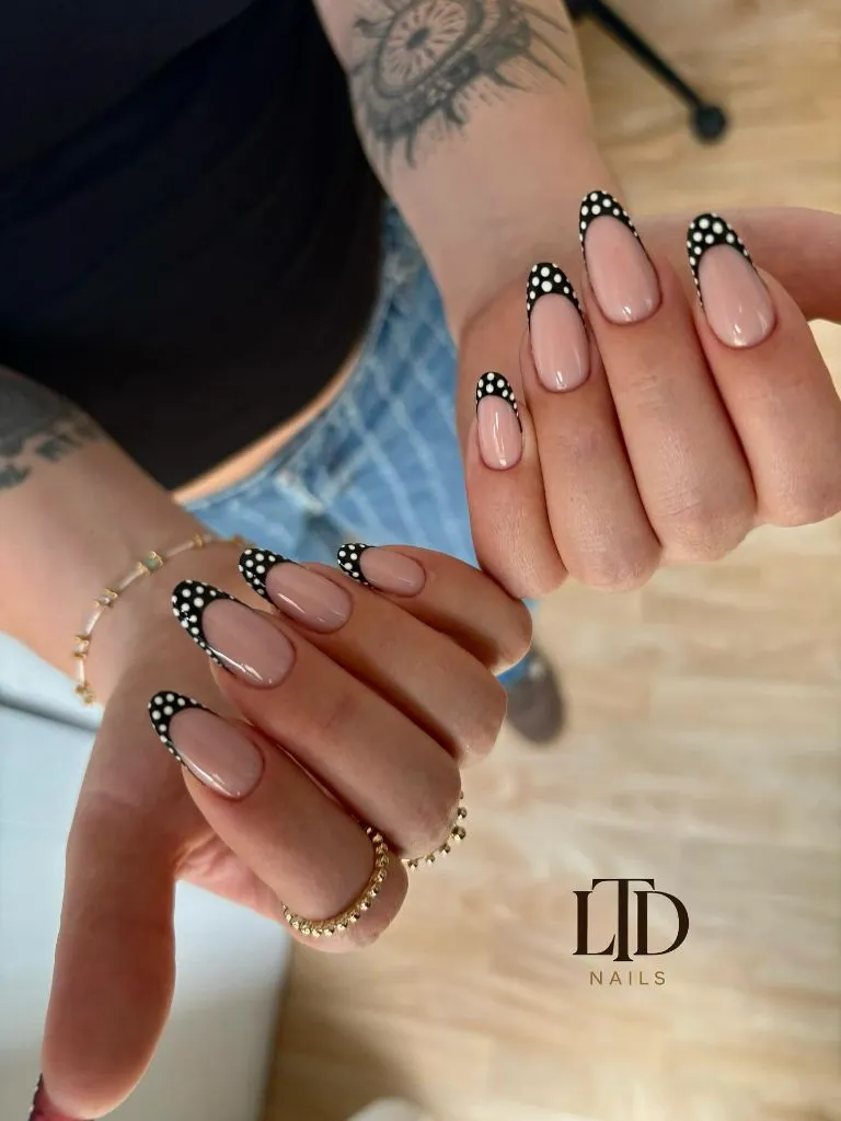
For a lower-maintenance take, this pattern actually favors shorter nails, since the large dots need less real estate to make their point. You can also reduce the density, using three or four generous dots per tip instead of a packed row, which keeps the look breathable and easier to freehand at home. If you’re drawn to seasonal tones, the same bold-dot logic translates beautifully into deeper hues; a rich maroon base with cream dots offers a cozier read, and you can find more of that direction in these maroon fall nail ideas. The key is keeping the dots large enough to stay intentional.
What makes the oversized dot compelling is how it plays with proportion against the nail’s own curve. The rounded tip echoes the round dots, creating a quiet visual rhyme that ties the design together. Scale up the motif and it becomes fashion; scale it down and it becomes decoration. If black feels too stark, a warm brown or forest green would keep the graphic weight while softening the overall mood.
Retro Red and Cream Alternating Dots on Long Square Nails
Length gives this design room to breathe, and the alternating red-on-cream and cream-on-red nails turn the whole hand into a coordinated set rather than ten identical tiles. The long square shape offers a flat, uninterrupted canvas, which lets the evenly spaced dots march across the surface with almost wallpaper-like regularity. Color reversal is the clever move here: swapping the base and dot color from finger to finger creates rhythm without adding any new elements. It reads as vintage and confident, a nod to mid-century prints without tipping into costume.
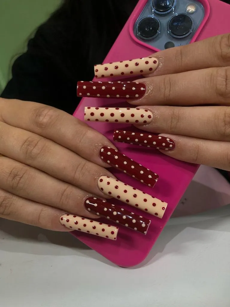
Extreme length like this is a commitment, so a shorter square or squoval version keeps the same alternating-color concept far more practical for daily life. You can also limit the reversal to just two nails per hand rather than every finger, which softens the visual load and reduces the chance of the pattern feeling busy. The polka dot nails trend 2027 rewards this kind of editing, where you keep the idea intact but trim its intensity. Long nails also demand attention to the dot spacing, since any unevenness becomes obvious across a large surface.
The design principle at play is repetition with variation. The dots repeat for consistency, but the color flip introduces just enough surprise to hold interest across the hand. That tension between order and play is what keeps polka dots from feeling static. If red feels too bold, a muted rust and oatmeal pairing would carry the same alternating structure into a quieter, more wearable palette.
Buttercream Yellow with Chocolate Dots and Half-Moon Negative Space
Soft yellow rarely gets its moment, but here it anchors a design that feels like early spring filtered through a vintage lens. The pale buttercream base is scattered with small brown dots, while a bare half-moon at the cuticle introduces negative space that lightens the whole composition. That unpainted crescent does something important: it keeps the pattern from feeling heavy and gives the eye a place to rest. The brown dots read warmer and softer than black would, which suits the gentle base. The square shape keeps it tidy and grounded.
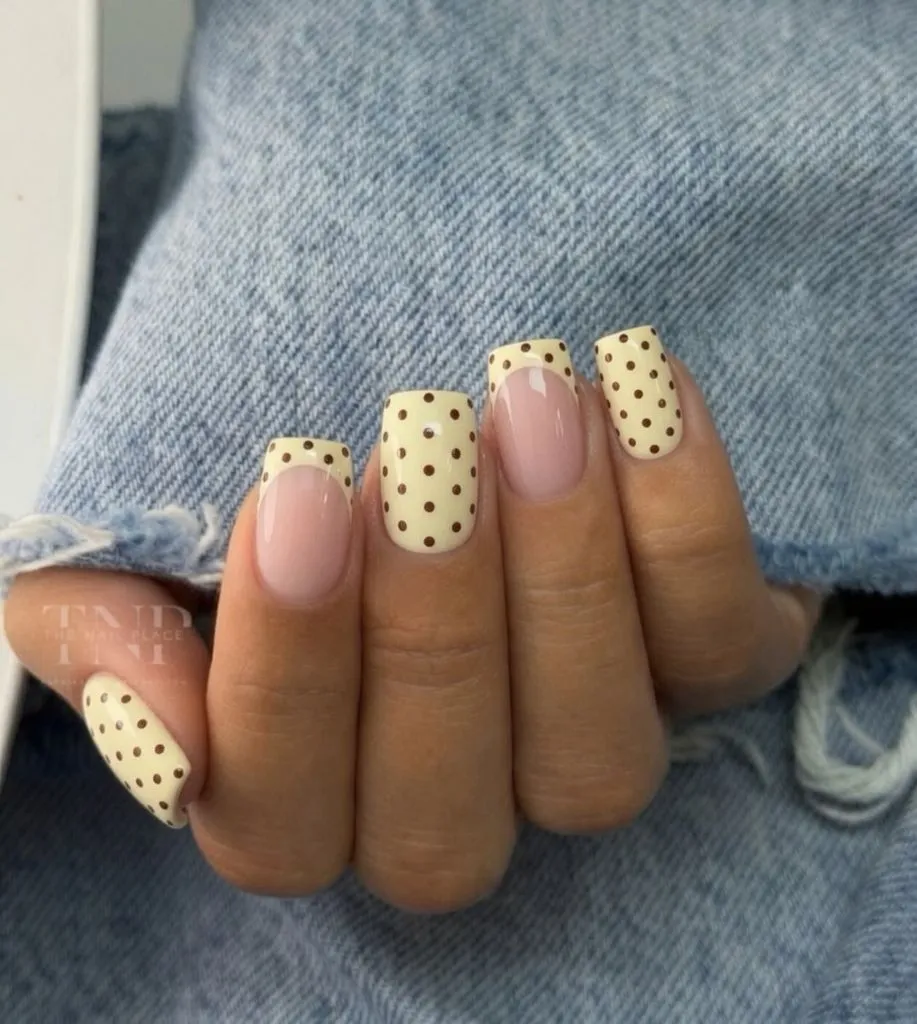
This is one of the more forgiving looks to maintain because the negative-space cuticle area means regrowth is far less noticeable over the following weeks. If you want to simplify further, skip the half-moon and simply keep the dots sparse, which achieves a similar airy effect with less precision required. The buttercream tone flatters most skin tones and pairs easily with denim and neutral knits. For colder months, shifting the base to a soft caramel or oat keeps the warm, edible quality while feeling more seasonally appropriate.
The reason the brown-on-yellow combination succeeds is its low contrast. Instead of the sharp pop of black and white, this pairing sits in a tonal middle ground that feels calm and considered. It proves that polka dots don’t need high contrast to work; they can whisper. Swap the yellow for a pale sage or dusty blue and the same brown dots would carry an entirely different, cooler mood.
Pink Coffin Tips with Scattered Black Dots and Rhinestone Detail
The coffin shape brings drama, and this design uses its wide, flat tip as a stage for a white dotted French edge peppered with irregular black spots. The base stays a glossy translucent pink, so the busy tip has a clean counterpoint below it. Scattering the dots at varying sizes and angles gives the pattern a hand-painted looseness rather than mechanical precision, which reads as more artful. A subtle rhinestone or two adds a point of light without overwhelming the graphic. It’s maximal in shape but disciplined in its color story.
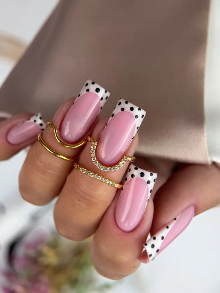
Coffin nails require length and upkeep, so if that’s not realistic, the same dotted-tip-over-pink concept works on a shorter squoval with almost no loss of impact. You can drop the rhinestones entirely for a cleaner, everyday version, or reserve them for a single accent nail to keep the sparkle intentional. The translucent pink base is the real workhorse here, since it flatters the natural nail and hides minor imperfections. If you prefer warmer neutrals for the season, a nude fall base would shift this into more grounded territory, and there are good examples among these nude fall nail looks.
What holds this design together is the contrast between the busy tip and the quiet base. The eye is drawn to the pattern, then given somewhere calm to land, which prevents visual fatigue. That balance of active and passive zones is a reliable formula across nail art. Replace the pink with a soft lilac or peach and the scattered-dot tip would still function, since the base is only ever a supporting player.
Milky White Almond Nails with Tonal White Dots
Restraint defines this one. Instead of high contrast, the dots are painted in a soft off-white over a milky, semi-sheer base, so the pattern is felt more than seen. The effect is textural, like embossed dots on paper, and it catches the light rather than shouting for attention. The almond shape and the diffuse, cloudy base give the whole hand an ethereal quality. This is the polka dot nails trend 2027 at its most understated, proof that the motif can be nearly invisible and still register as intentional.
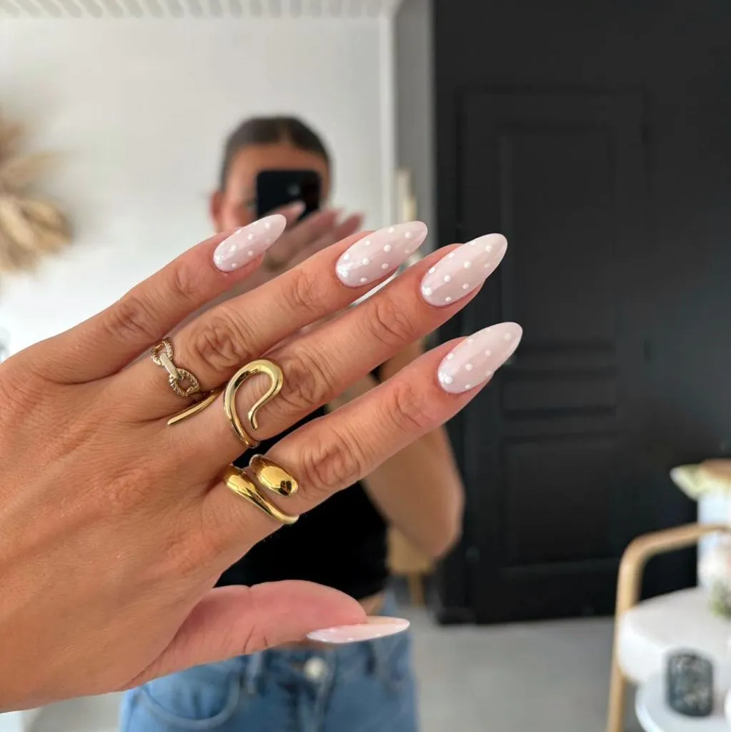
Because the contrast is so low, this look is remarkably forgiving to grow out and easy to touch up, making it ideal for anyone who wants low maintenance. If you want the dots slightly more visible, adding a faint pearl finish or a whisper of shimmer to them catches light without breaking the tonal harmony. The milky base flatters short and long nails alike, so you don’t need length to make it work. For a cooler season variation, a soft grey-white base with the same tonal dots would keep the quiet elegance while feeling more wintry.
The design logic here is subtraction. By removing contrast, the pattern shifts from graphic to tactile, engaging the eye differently. It rewards close looking, which gives it a quiet luxury. If you wanted a barely-there warm version, tonal beige dots on a nude base would achieve the same soft-focus effect with a slightly cozier undertone.
Statement Polka Dot Tips with 3D Floral Accents
This is the ornamental end of the spectrum, pairing black-and-white dotted tips with sculpted, semi-translucent 3D flowers on select nails. The dots provide a graphic framework while the raised florals introduce dimension and a soft focal point. Contrast carries the composition again: the flat, high-legibility dotted pattern against the delicate, light-catching petals. Restricting the flowers to one or two nails keeps them special rather than overwhelming. The pink base underneath both elements grounds the whole thing so it doesn’t tip into chaos.
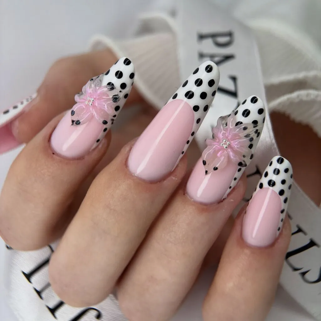
Three-dimensional embellishments snag and wear faster than flat art, so this is best reserved for occasions rather than daily life, or adapted by keeping the florals on a single accent nail. A flatter alternative would be a painted flower over the dotted base, which gives the layered effect without the raised profile. The dotted tips alone are entirely wearable on their own if you decide to skip the florals altogether. Length helps display the sculptural work, but even a medium almond can carry a single bloom comfortably.
The interesting principle here is the pairing of flat and dimensional elements. The dots stay two-dimensional and orderly, which makes the raised florals feel like an event by comparison. That deliberate contrast in texture, not just color, is what gives the set its richness. Swap the translucent flowers for a single pearl cluster and you’d keep the dimensional accent while simplifying the execution considerably.
Lace-Edged Brown Dot French on Nude Almond Nails
Here the French tip gets a scalloped, lace-like border filled with tiny brown dots, softening the usual hard line into something that feels almost embroidered. The nude, sheer base keeps everything grounded and lets the delicate tip detail take the spotlight. Brown dots instead of black warm the palette and give the design a vintage, hand-stitched quality. The scalloped edge is the clever touch, because it borrows from textile design and translates it onto the nail. It reads as refined and slightly nostalgic.
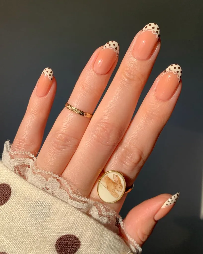
The intricate lace edge takes a steady hand, so a simpler version would keep a straight dotted border rather than the scalloped one, achieving a related effect with less precision. The sheer nude base is the most practical element, growing out gracefully and flattering nearly every skin tone. Shorter almond or oval nails suit this delicate detailing well, since the fine work doesn’t need length to shine. If brown feels too subtle, a deep burgundy would sharpen the lace edge while keeping the warm, autumnal feeling.
What makes this design succeed is the translation of a textile idea into nail art. The scalloped, dotted border evokes lace trim, which gives the manicure a tactile reference point the eye recognizes instantly. That borrowing from another medium is what elevates it beyond a standard French. Replace the lace edge with a simple dotted arc and you’d still have an elegant, wearable tip, just with less of the vintage embroidery reference.
Sheer Nude Base with Oversized Black Spots and Metallic Chrome Accents
This look mixes matte-graphic and high-shine finishes, setting large irregular black dots against a sheer beige base while a few nails go full metallic copper. The oversized spots feel almost abstract, more brushstroke than pattern, and the negative space around them keeps the composition open. Placing the glossy chrome nails between the dotted ones creates a rhythm of matte and metallic across the hand. Tiny gold bead accents punctuate the dots and add a jewelry-like glint. It’s editorial and a little unexpected.
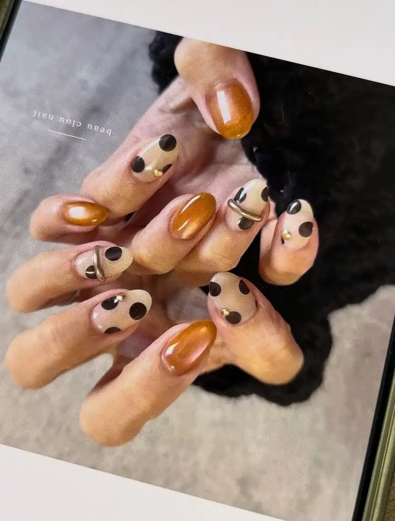
Mixing finishes across the hand can look busy if overdone, so a calmer version would keep the chrome to a single accent nail and let the dotted nails carry the rest. The sheer base is naturally low-maintenance, and short round nails suit the abstract dot scale nicely. If chrome feels too bold, a soft satin gold or bronze polish gives a similar warm metallic without the mirror finish. The gold beads are optional and easy to leave off for a flatter, quieter set.
The principle worth noting is the interplay between finishes. The matte, graphic dots and the reflective chrome each make the other more noticeable through contrast of surface rather than color. That textural conversation gives the design depth beyond its palette. Swap the copper for a cool silver or pewter and the same matte-versus-shine dynamic would still drive the look.
Sheer Pink Nails with Delicate White Dots and Gemstone Accents
Softness is the whole point of this design, which layers small white dots over a barely-there pink base and finishes each nail with a single pink or clear gemstone. The short, rounded shape keeps it sweet and low-key, and the sheer base almost disappears into the natural nail. The white dots are spaced loosely, giving plenty of negative space so the pattern feels light. A tiny gem near the cuticle adds a point of sparkle without weight. The result is delicate and quietly feminine.
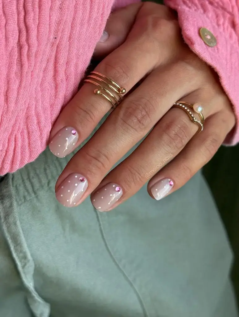
Short natural nails make this one of the easiest looks to wear and maintain, and the sheer base means grow-out is nearly invisible. If you’d rather skip the gems, the dotted pattern stands perfectly well on its own, and removing them makes the manicure more practical for typing and daily tasks. The white-on-pink combination is gentle enough for professional settings while still feeling considered. For a subtle seasonal shift, a warmer peach base with the same white dots would carry this into autumn without losing its softness.
The reason this works is its commitment to lightness. Everything is scaled down and spaced out, so the design reads as a whisper rather than a statement. That restraint makes it endlessly wearable. Replace the gemstone with a single pearl and you’d trade sparkle for a softer, more matte kind of shine while keeping the delicate composition intact.
Mixed Animal Print and Polka Dot Stiletto Set
This maximalist set combines dotted nails, leopard print, and creamy swirl accents across long stiletto tips in a deep chocolate palette. The mix could easily overwhelm, but the shared brown-and-white color story holds the different patterns together. Dots on some nails, spots and rosettes on others, and a fluid white swirl on the accent create variety without clashing. The stiletto shape amplifies the drama and gives each pattern a long canvas. It’s bold, cohesive, and clearly designed as a set rather than a random mix.
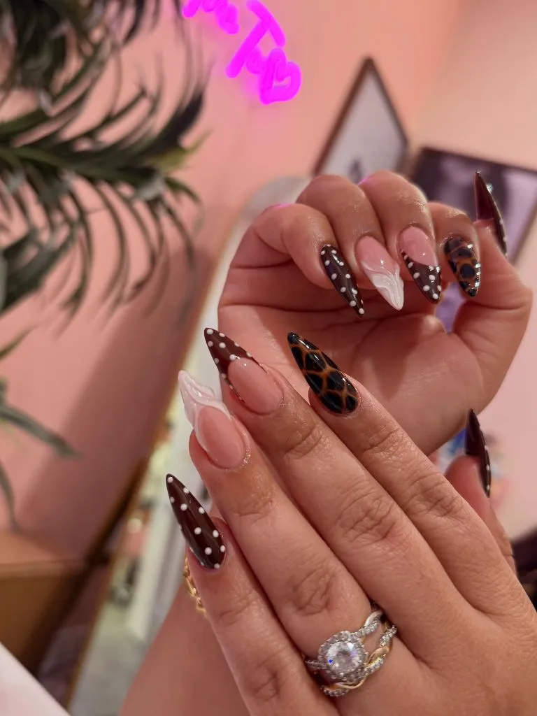
Long stilettos with mixed patterns are demanding to wear and maintain, so a shorter almond version with just two patterns keeps the concept manageable. You could pair simple dots with a single leopard accent and drop the swirls entirely for a cleaner read. The unifying trick is the palette; as long as every nail stays within the brown-and-cream family, the mixed motifs cooperate. For a softer take, the same pattern mix in taupe and off-white would lower the intensity while keeping the layered interest.
What makes this ambitious set hold together is color discipline. When patterns share a palette, the eye accepts the variety as intentional rather than chaotic. That single rule is what separates a curated mix from a cluttered one. Swap the chocolate tones for a black-and-grey scheme and the same pattern-mixing logic would produce a cooler, more graphic version.
Red and White Polka Dots with Sculpted 3D Ruffle Accents
A playful, dessert-like set, this combines white-with-black-dot nails, red French tips, solid red nails, and sculpted red ruffle accents that look like piped frosting. The variety of finishes and elements is held together by a tight red, white, and black palette. The 3D ruffles add real dimension and become the focal point, while the flatter dotted and French nails keep the surrounding fingers from competing. It’s whimsical without losing its structure. The rounded almond shape softens the overall effect.
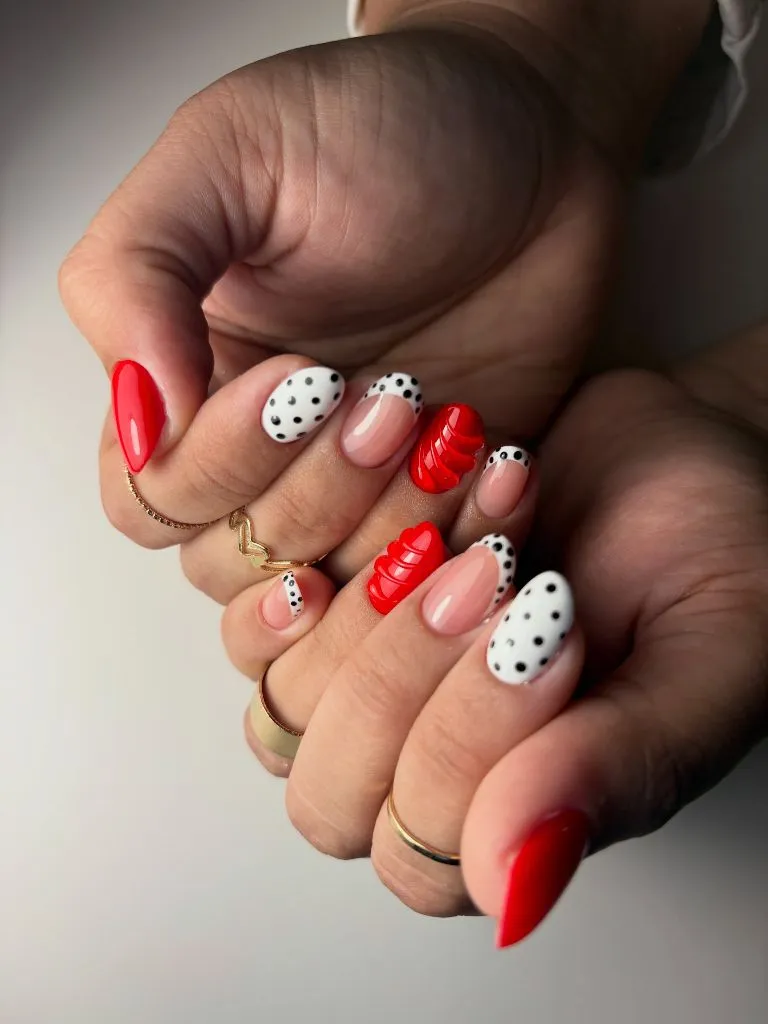
The sculpted ruffles are fragile and best kept to occasions, but the dotted and French nails around them make a completely wearable set on their own. A simpler adaptation would replace the 3D ruffle with a painted red accent, preserving the color story without the raised element. The polka dot nails trend 2027 often plays with this kind of contrast between flat and dimensional, and you can keep whichever elements suit your daily life. Shorter nails carry the dots and tips just as well as longer ones.
The design principle is hierarchy. By making the ruffle the clear focal point and keeping everything else flatter, the set guides the eye deliberately instead of scattering it. That intentional ranking of elements is what keeps a busy design legible. Swap the red for a soft blush and the same structure would feel gentler while retaining its playful spirit.
Classic Red French with White Dots and Ladybird Charm
This set channels a distinctly retro, ladybird-inspired mood, pairing red French tips dotted in white with fully red dotted accent nails. The nude-to-red gradient on the French nails keeps them light while the solid red dotted fingers deliver the punch. White dots over red read as instantly nostalgic, evoking classic polka dot dresses and vintage kitchenware. The square shape gives the pattern a clean, orderly surface. It’s cheerful without being cartoonish.
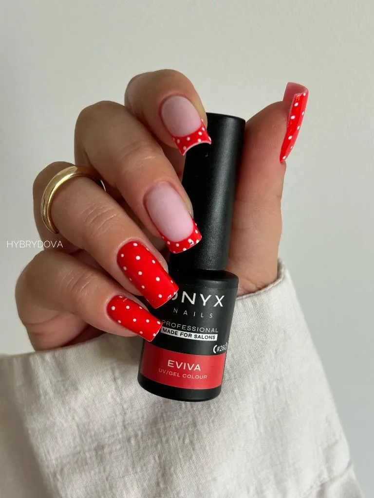
The mix of dotted tips and fully dotted nails offers flexibility; you can lean entirely on the French version for something more subtle or go all red-and-dotted for maximum retro impact. Shorter square nails keep the look tidy and practical for everyday wear. Red is bold, so if you want to tone it down, a muted brick or coral base softens the vintage reference while keeping the spirit. The white dots stay crisp and forgiving, blending small wear into the pattern.
The reason red-and-white dots endure is cultural memory. The combination is so tied to vintage prints that it reads as intentional and charming before any other design decision registers. That built-in association does half the styling work. Swap the red for a deep navy with white dots and you’d shift from playful retro to a cleaner, more nautical mood.
Two-Tone Burgundy and Blush Micro-Dot Almond Set
This considered set splits the difference between rich and soft, pairing deep burgundy nails with tiny white dots against blush-pink nails scattered with dark micro-dots. The contrast between the two bases is the whole story: moody and glossy on one hand, pale and delicate on the other. The dots stay small on both, keeping the pattern refined rather than loud. The almond shape lends elegance and length. It’s a palette that feels autumnal and grown-up.
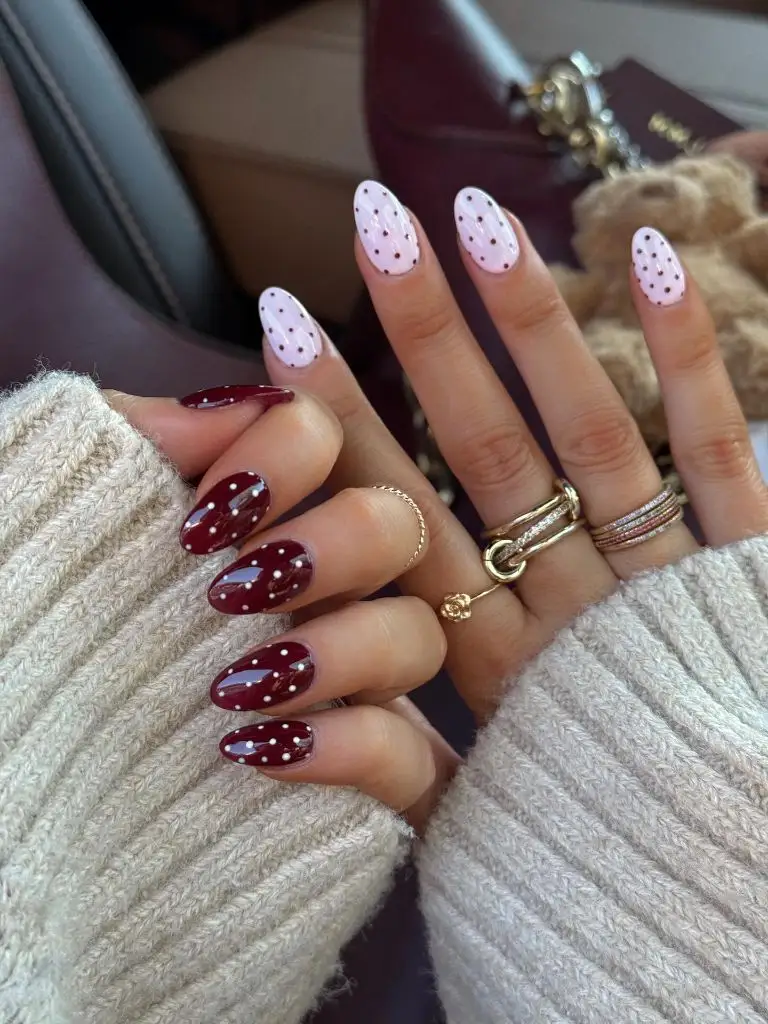
Splitting bases across hands is a low-commitment way to enjoy two moods at once, and either half works perfectly well on its own if you prefer a single tone. The micro-dots are forgiving and easy to freehand, making this achievable at home with a dotting tool. Burgundy hides wear well, while the blush grows out gracefully, so maintenance stays manageable. For a fuller seasonal dive into this deeper direction, these polka dot fall nail ideas explore the same rich-and-soft contrast.
The principle here is tonal pairing. By keeping the dot scale consistent across two very different bases, the set feels unified despite the color jump. That shared detail is the thread that ties opposites together. Swap the blush for a warm cream and the burgundy would feel even richer by comparison, deepening the autumnal mood.
Glossy Burgundy Almond Nails with Scattered White Dots
Stripped down to a single rich color, this look lets deep glossy burgundy carry the weight while irregular white dots scatter across the surface like tiny stars. The high-shine finish makes the burgundy feel jewel-like, and the white dots pop cleanly against it. Spacing the dots unevenly gives the pattern an organic, hand-painted quality rather than a rigid grid. The almond shape and the deep tone read as polished and seasonal. It’s simple, but the color does the heavy lifting.
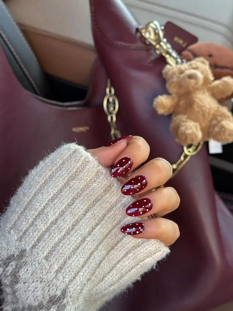
This single-color approach is one of the more practical dotted looks, since there’s no complicated layout to maintain and grow-out reads as intentional against the dark base. A glossy top coat is doing real work here, so keeping it fresh preserves the jewel-like depth. The scattered dots are easy to touch up if one wears off. If burgundy feels too dark, a deep forest green or navy with white dots would carry the same rich, glossy effect into a cooler palette.
The reason a single saturated base works so well is that it gives the dots maximum contrast with minimum effort. There’s no competing color, so the pattern reads instantly. That simplicity is a strength, not a limitation. Swap the white dots for gold and the whole set would shift from crisp to warm and slightly more luxurious.
Sheer White Almond Nails with Multicolored Confetti Dots
Lightness returns in this airy set, where a sheer milky-white base is scattered with tiny multicolored dots in burgundy, gold, and brown. The confetti effect keeps things playful while the muted color choices keep it grown-up rather than childish. The near-translucent base lets the dots float, and the generous negative space keeps the pattern breathing. The almond shape lengthens the hand and the overall read is soft and celebratory. It’s a quiet way to introduce multiple colors without any single one dominating.
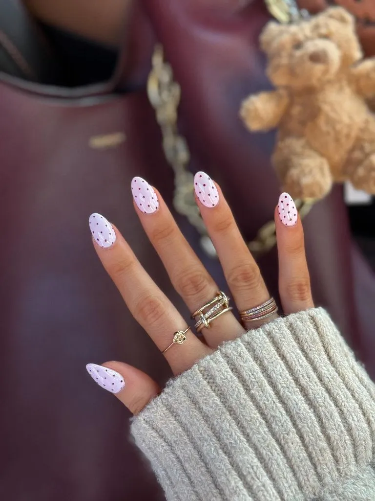
The sheer base makes this exceptionally low-maintenance, and the tiny scattered dots hide minor wear easily. If you want to simplify, limiting the palette to two dot colors instead of three keeps it cohesive and even easier to execute. Short or long nails both suit the confetti scale, so length is entirely optional. For a warmer autumn version, shifting the dot colors toward rust, mustard, and deep brown would tie it to seasonal tones while keeping the playful scatter.
The design logic is controlled randomness. The dots look casually thrown on, but the restrained palette and even spacing keep them from reading as messy. That balance between spontaneity and control is what makes confetti patterns feel intentional. Swap the milky base for a sheer pale blue and the same muted confetti would take on a cooler, frostier character.
Chocolate Brown and Blush Polka Dot Mixed Almond Set
This set builds an entire look around a warm brown palette, combining glossy dark chocolate nails with white dots and soft blush nails with brown dots. Reversing the base and dot colors between the two tones creates rhythm and ties the hand together. The deep brown feels rich and unexpected, a sophisticated alternative to black, while the blush softens it. The almond shape keeps everything elegant. It reads as considered and seasonal, closer to a styled editorial than a casual manicure.
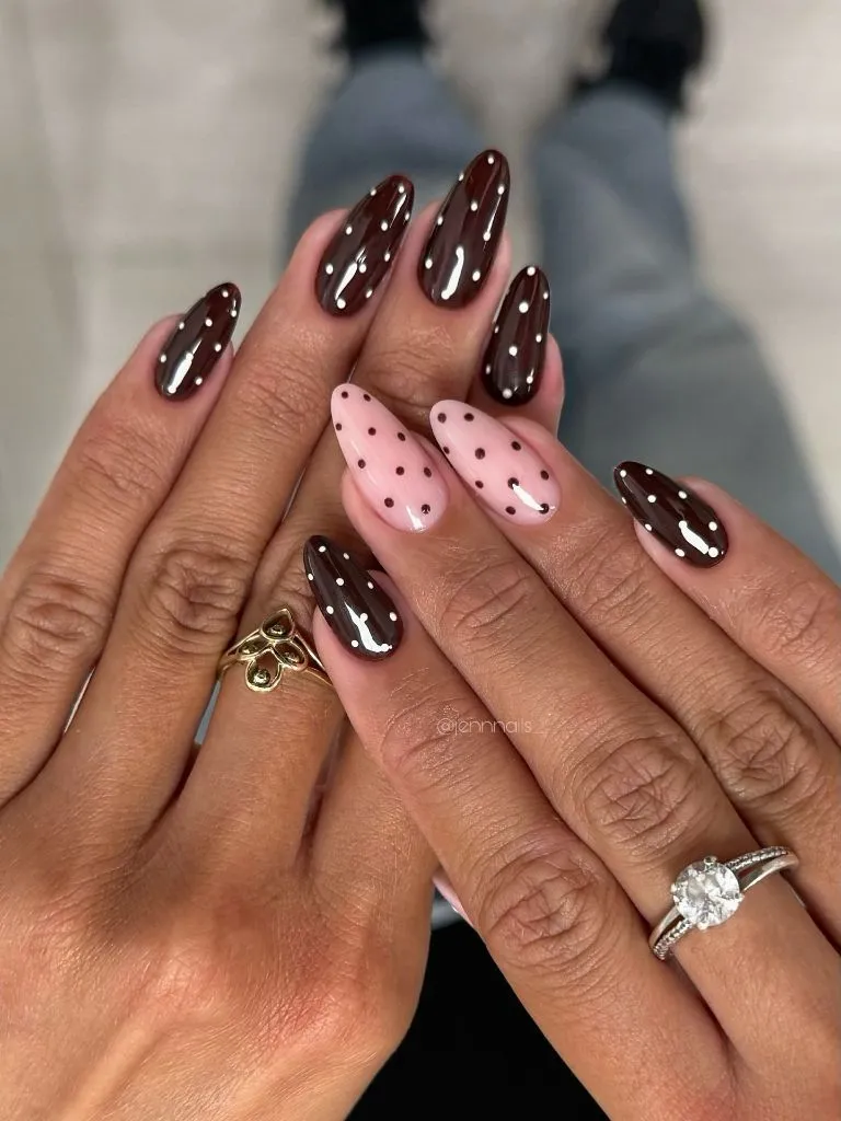
Mixing two bases lets you enjoy variety without committing to one dominant color, and either the chocolate or the blush works beautifully on its own. The glossy brown hides wear well, while the blush grows out softly, so upkeep stays reasonable. A dotting tool makes the reversed patterns achievable at home. If you want a fuller exploration of warm neutral nail palettes for the season, these fall manicure color ideas offer plenty of direction.
The principle at work is color reversal for cohesion. By flipping the base and dot between the two tones, the set feels like a matched pair rather than two unrelated ideas. That mirroring is a simple trick that reads as thoughtful design. Swap the chocolate for espresso-black and the blush for cream, and the same reversal logic would produce a crisper, higher-contrast version.
Playful Pink and Red Reverse Polka Dots on Almond Nails
Warmth and energy drive this set, which alternates red dots on a pink base with pink dots on a red base across almond nails. The reversal creates instant rhythm and a coordinated look without needing any additional elements. The tonal closeness of red and pink keeps the contrast gentle, so the pattern feels lively rather than jarring. Varying the dot sizes slightly adds a hand-painted charm. It’s bright, cheerful, and confidently coordinated.
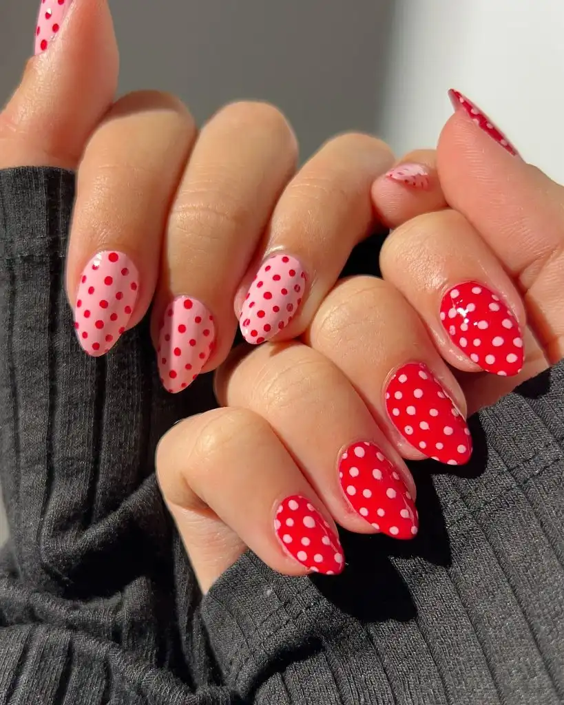
The reverse pattern gives flexibility; you can commit to the full alternating set or keep just one direction for something calmer. Almond nails of any length carry this well, and the forgiving dot pattern hides minor chips. Red and pink together feel festive, so if you want something more subdued, a dusty rose and brick pairing would keep the reverse concept in a quieter register. The dots are simple enough to freehand with a little practice.
The reason pink-and-red works despite breaking old color rules is their shared warmth. Because they sit close on the color wheel, the combination feels harmonious rather than clashing, which lets the pattern shine. That analogous pairing is a reliable way to get vibrancy without discord. Swap in coral and cream and the same reverse-dot structure would feel softer and more summery.
Sheer Nude Short Nails with Classic White Dots
Back to basics, this set proves how effective a simple idea can be, placing evenly spaced white dots over a sheer nude base on short natural nails. There’s no French tip, no accent, just a clean all-over pattern. The sheerness of the base keeps it understated and workplace-friendly, while the white dots provide just enough interest. The short length makes it exceptionally practical. It’s the kind of look that reads as effortless precisely because it’s so restrained.
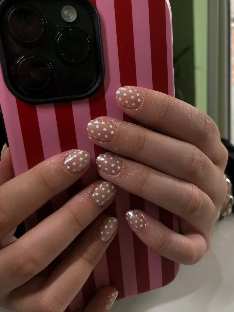
This is arguably the most wearable version on the list, requiring minimal length and maintenance, with grow-out that barely registers against the sheer base. If you want even less commitment, scattering the dots more loosely reduces the precision needed and still looks intentional. The white-on-nude combination flatters most skin tones and suits nearly any setting. For a subtle seasonal shift, warming the base to a soft caramel would carry this into autumn without changing the simple formula.
The design principle is that simplicity scales down beautifully. Stripped of accents and complications, the pattern relies entirely on even spacing and a clean base, and that restraint is exactly what makes it feel polished. There’s confidence in doing less. Swap the white dots for a soft grey and the whole set would read even quieter, almost like a subtle texture rather than a pattern.
Soft Pink Almond Nails with Sparse Black Polka Dots
This closing look balances minimalism with a touch of graphic edge, scattering small black dots loosely across a soft pink base on almond nails. The generous negative space between dots keeps the design airy, while the black provides just enough contrast to feel deliberate. The pink base warms the starkness of the black, softening what could otherwise feel severe. The almond shape lengthens the hand and the overall effect is clean and modern. It’s minimal without being plain.
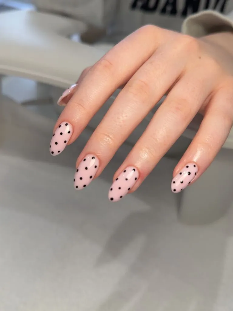
Sparse dots make this forgiving and quick to execute, and the loose placement means there’s no precise grid to maintain. If black feels too stark against the pink, a soft charcoal or deep grey would gentle the contrast while keeping the graphic quality. The almond shape works at short or medium lengths, so there’s no need for dramatic length. The pink base grows out gracefully, keeping maintenance low. It’s a look that reads as intentional even weeks in.
The principle here is that negative space is a design element in its own right. By spacing the dots widely, the empty areas become as important as the marks themselves, giving the eye room to breathe. That restraint is what makes sparse patterns feel modern rather than sparse. Swap the pink for a milky white and the black dots would sharpen into something cooler and more graphic, shifting the whole mood toward the minimalist end.