There is a particular kind of clarity that comes from looking at trendy winter hair color ideas as compositions rather than shades. Judged one strand at a time, most of these look similar: brown, red, blonde, repeat. Judged as whole pictures, the differences are structural. Where the darkest value sits, how far down the length the lift begins, how wide each ribbon of color is, and how much unbroken color field is left alone all matter more than the name on the shade.
Before scrolling, decide what you are actually comparing. Look first at the root area, then at the endpoint of the lengths, then at the width of the transition between them. A short transition reads graphic and needs upkeep; a long one reads soft and forgives grow-out. Weigh contrast against maintenance, and depth against how much your hair texture can hold light. None of these arrangements works as a rule.
1. Mahogany Depth Leads Against a Dark Wall
What controls this frame is a deep mahogany base that reads almost black at the crown and opens into red only where light catches the crests of the waves. The length falls past the chest in loose S-bends, and the color field stays unbroken — no visible highlight, no lifted perimeter, no lighter panel near the face. Against the matte black wall behind, the hair becomes the only warm surface in the upper half of the picture.
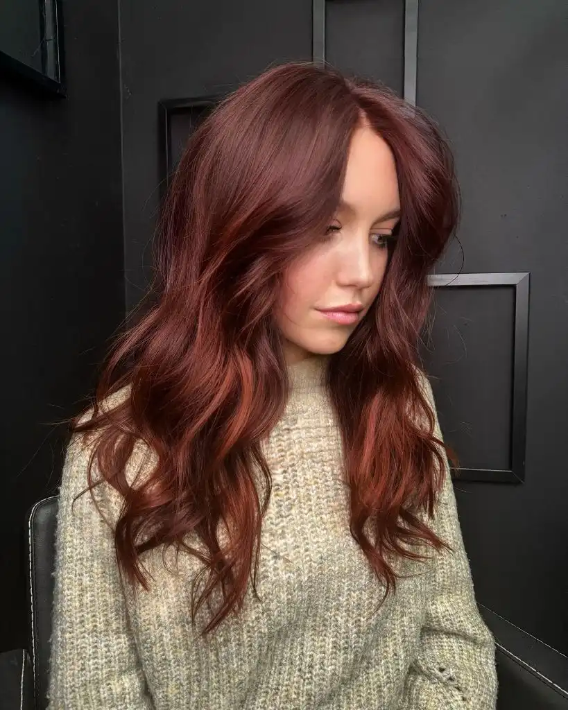
The oatmeal ribbed-looking sweater does the quiet work. It sits at a mid-light value, so the red never has to compete with either a white or a black garment, and the hair keeps the darkest weight in the composition. The sharpest contrast falls where the ends cross the knit, and that is also the clearest endpoint — the waves stop with visible density rather than thinning out. Skin and lip tone repeat the same muted rose that the mahogany carries.
The transferable point here is about value, not hue. A red this dark behaves like a brunette in most light and only declares itself under direct light, which makes it a low-drama entry into red. The trade-off is fade: mahogany tends to slide cooler and flatter as it washes out, so the shine you see is the first thing to go.
2. Copper Waves Carry a Blunt Bob
The dominant element is scale rather than color: a chin-length bob with a heavy, almost blunt perimeter, bent into wide waves that push the volume outward instead of down. Copper runs through the whole shape at a fairly even saturation, brightest across the top of the head where the hand lifts a section, and slightly deeper underneath. There is no visible root shadow, so the color reads as one continuous field.
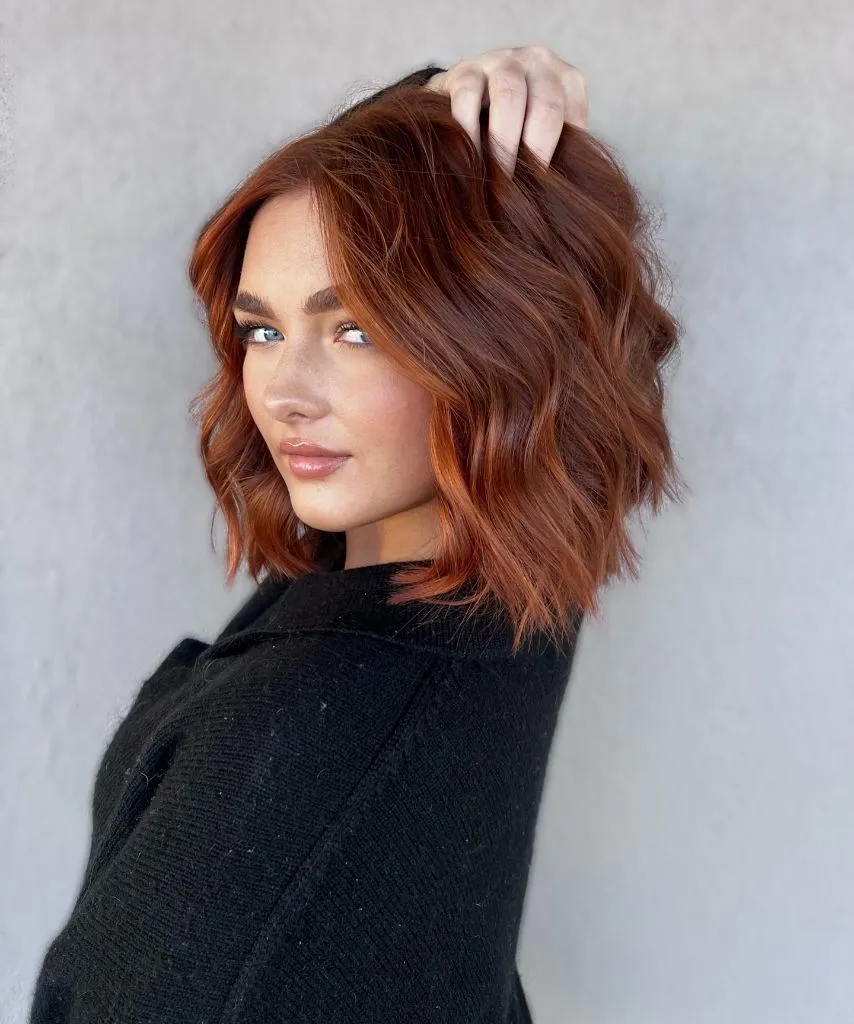
Everything around it stays deliberately neutral. The black knit-looking sweater and the flat grey wall remove any competing color, which lets copper occupy the entire warm register of the image on its own. The brows are groomed to a warmer brown that echoes the hair without matching it, and the makeup stays close to skin. The strongest edge in the picture is where the copper ends meet the black shoulder — that hard line is what makes the bob read as a shape rather than a texture.
Compared with the darker mahogany above, this is the higher-commitment option. Even copper on short hair asks for gloss refreshes, because bright warm tones on a short perimeter show fade at the ends where the hair is oldest. If you want the shape without the upkeep, the same cut in a deeper auburn holds its tone considerably longer.
3. Plum Ribbons Break Up Near-Black Lengths
Seen from behind, this is a near-black base with plum-toned ribbons pulled through it in fine, vertical strips. The base holds the visual weight at the roots and through the interior, while the lighter violet-red pieces sit mostly on the outer layer, following the curl pattern. Because those ribbons are narrow and repeated rather than blocked, the whole head reads as one dark burgundy field with movement inside it.
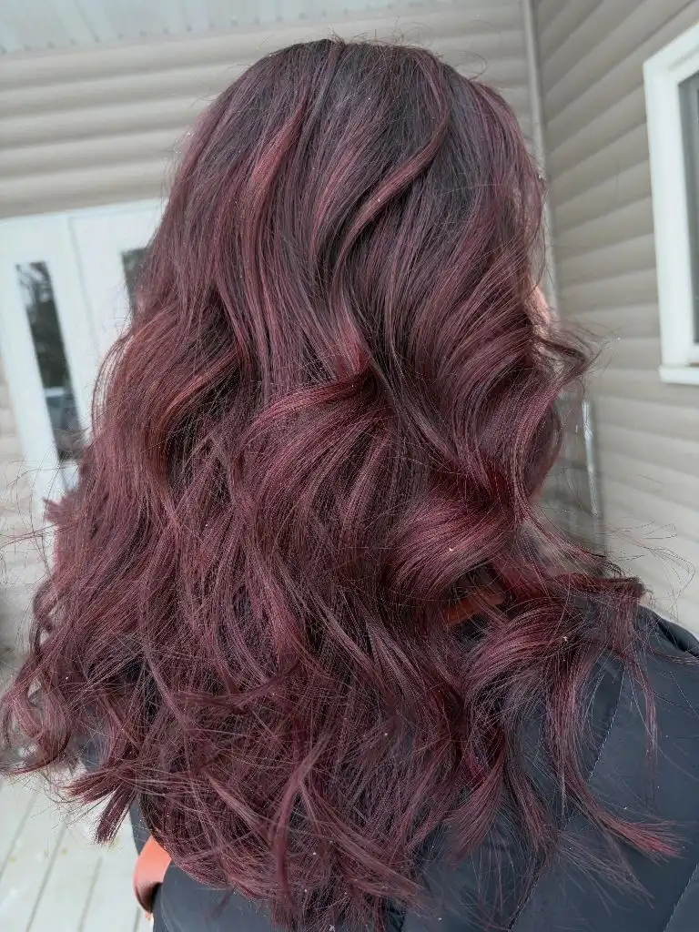
Daylight is doing a lot here, and it is worth being honest about that: outdoors, plum reads clearly, while under warm indoor light this would collapse toward brown-black. The beige siding behind supplies a flat, low-saturation backdrop that keeps attention on the curl. The clearest endpoint is the irregular, piecey hemline, where individual plum strands separate from the mass and catch light against the darker layers beneath.
For anyone drawn to trendy winter hair color ideas that stay dark, this is the useful template — dimension built from a violet family rather than from lift. Grow-out is nearly invisible because the root is already the darkest value. The limitation is the opposite of most: you get depth easily and brightness almost never, so photographs indoors will underplay the color.
4. Buttery Highlights Frame a Long Curtain Fringe
Volume dominates before color does. The hair is long, layered, and pushed forward over one eye, with the widest mass sitting at cheek and jaw level rather than at the ends. Within that mass, buttery golden highlights concentrate around the parting and the front curtain pieces, while a mushroom-toned base stays visible at the root and through the back sections.
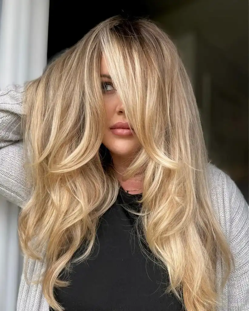
The support comes from an unusually tidy palette: a grey knit-looking cardigan, a black top, and warm neutral skin. Nothing in the garments repeats the gold, so the highlights have no rival. Texture is the second axis — the ends look drier and more separated than the mid-lengths, which reads as movement rather than damage in this light, though the material is not identifiable, so the visible separation is the useful detail rather than any condition claim.
The lesson is placement. Concentrating the brightest gold at the front means the color works hardest exactly where the face is, and the darker back sections carry the weight that keeps long hair from looking flimsy. Push it further by dropping the root half a shade; soften it by toning the front pieces slightly cooler.
5. Chestnut Auburn Anchors Long Layers
From the back, the composition is almost entirely one color: a warm chestnut-auburn that runs from a slightly deeper crown into progressively brighter mid-lengths and ends. The waves are large and uniform, cut in long layers that keep the perimeter thick, and the color follows the wave pattern so that each ridge lifts to a cinnamon tone while each trough drops back to a russet brown.
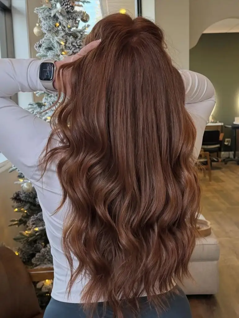
The white long-sleeved top is the smartest quiet choice in this set. It brackets the hair on both sides with a bright, neutral field, which makes the auburn read warmer than it probably is on its own. Behind, a flocked tree and soft interior lighting add a cool grey-green counterpoint that keeps the hair from tipping orange. The endpoint is the hemline: dense, level, and cut low on the back, which is what gives all that length its authority.
I like the restraint of this one — no ribboning, no contrast, just a single warm field with the waves supplying all the dimension. The comparison worth making is with the copper bob above: same warm family, opposite strategy. Here length does the work, and the color simply has to stay even.
6. Caramel Threads Cut Through Chocolate Brown
A dark chocolate base runs the show, and caramel appears only as thin threads that follow the curl through the mid-lengths. The parting area is left deliberately deep, so the head reads solid brown from above; the lighter work begins around eye level and increases toward the ends. Waves are large and brushed out, which spreads each caramel thread across several ridges rather than concentrating it.
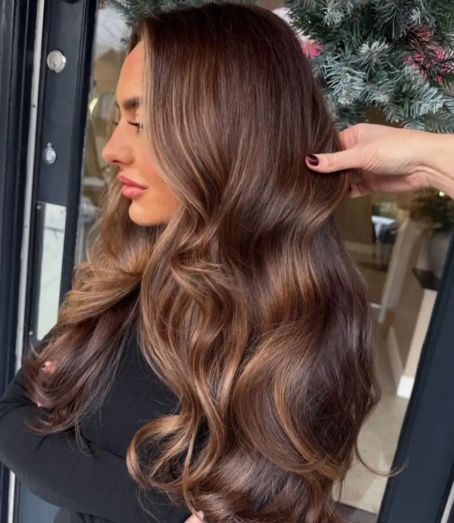
The black top removes the lower boundary entirely, so the hair appears to dissolve into it and the eye stays on the lit mid-section. A dark red manicure repeats the warmest note in the brown, which is a small palette echo but a real one. Sheen is the differentiating surface detail: the waves are polished enough to produce continuous highlight bands, and those bands, not the color placement, create most of the perceived shine.
This sits close to what people mean by dimensional colour, and if you want to see how far that idea can be taken on darker bases, the range of dimensional brunette hair color ideas shows the same principle at different contrast levels. The honest constraint here is styling: brushed-out waves are what make the threads visible, and air-dried hair will hide half of them.
7. Shadowed Root Sets Off Bright Ends
The organizing device is a soft root shadow. A cool brown occupies the top two inches, then the color opens into a bright, buttery blonde through the mid-lengths and ends. The face-framing pieces are the lightest sections in the whole picture and they are pulled forward over the shoulders, so the brightest value sits directly beside the skin while the darker root recedes at the crown.
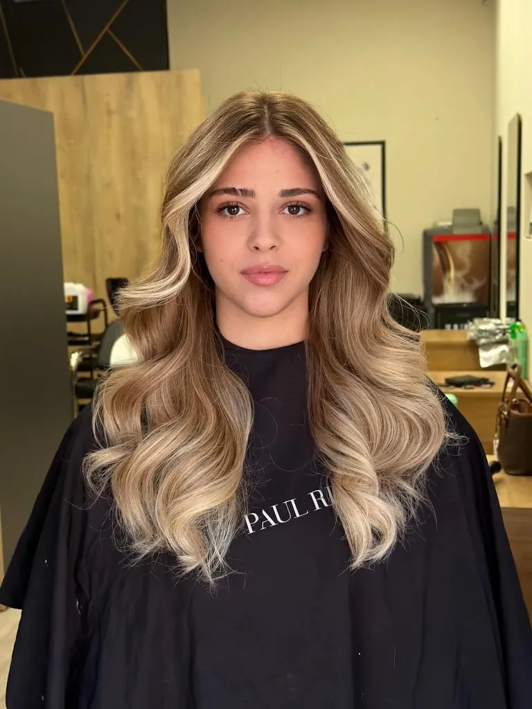
A black cape crops the body out completely, which turns the photo into a study of the color alone. The waves are set in an even S-pattern with a clear direction away from the face, and that regularity is what makes the transition zone read as gradual rather than striped. Contrast peaks at the parting, where dark root meets bright front panel within a couple of centimetres; everywhere else the change is stretched over a long span.
The practical detail for anyone considering this is the grow-out. A shadowed root buys months, because new growth arrives into a zone that is already dark. The trade-off is that the top of your head will always read a full shade deeper than the ends, which flatters some face shapes and shortens others.
8. Grown-Out Warmth Softens Into Straight Lengths
This one is the least worked of the set, and that is the point. Long, poker-straight hair sits in a centre part with a cool medium brown at the root and a warm honey-orange occupying the last third. There is no ribboning and no defined transition line; the two zones simply blur into each other around chest level. The hemline is straight and slightly thinner than the interior.
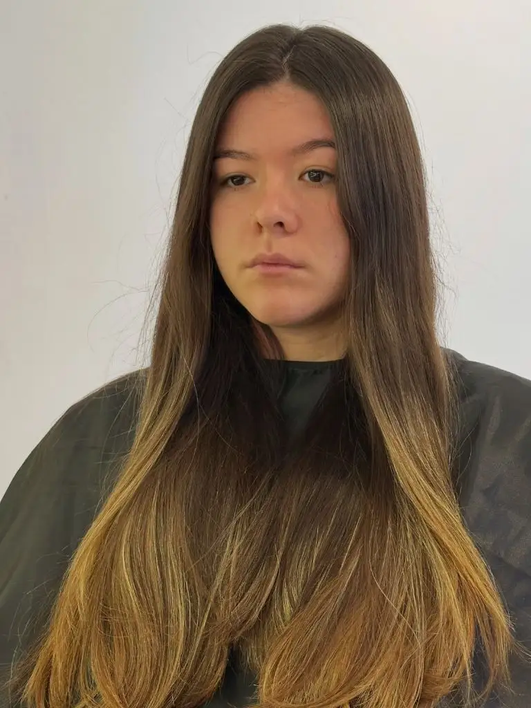
Flat frontal lighting and a plain white wall strip out every shortcut. Without wave, without gloss, and without a contrasting garment, the only thing left to read is the vertical gradient — which is exactly why the warmth in the ends looks unresolved rather than intentional. The dark cape absorbs the bottom of the frame and pushes the warm ends into the brightest part of the picture, where they are hardest to defend.
After the polished sets above, this reads notably quieter, and it is a fair illustration of what fade actually looks like on straight hair. The fix is not more lift; it is a tone through the ends to pull the orange toward beige, plus a blunt trim to rebuild the perimeter so the gradient has a firm stopping point.
9. Icy Ribbons Interrupt a Bronze Base
Wide bands of near-white blonde dominate a bronze-brown base, and their width is the story. These are not fine highlights but broad ribbons, several centimetres across, laid over the outer layer of a shoulder-length lob and bent into a strong wave pattern. Where the wave turns, the dark base shows through in short diagonal breaks, producing a clear alternation of light and dark across the whole back of the head.
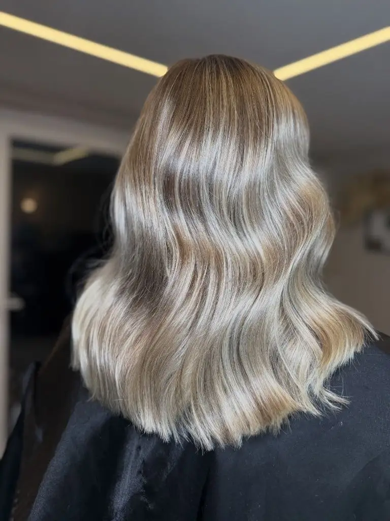
The root is left almost untouched, which is what keeps the effect from tipping into full blonde. Warm bronze at the top, cool white through the lengths — that opposition gives the piece its temperature tension, and the black cape below removes any distraction from the endpoint. The blunt, slightly rounded hemline is where the ribbons finish cleanly, so the pattern has a defined edge rather than trailing off.
Among trendy winter hair color ideas, this is the clearest example of contrast used as pattern. Push it further by widening the ribbons again; soften it by adding a mid-tone between the bronze and the white, which closes the gap and makes the whole thing read as one blended blonde instead of stripes.
10. Ash Bronde Meets a Blunt Perimeter
A cool, low-contrast bronde covers everything, and the cut supplies the structure. The hair is shoulder-length with a heavy blunt perimeter and waves that stop before the ends, leaving the last two inches straight and dense. Color moves from a deep ash brown at the root through a mushroom mid-tone to a soft beige at the tips, with the lightest pieces sitting along the face.
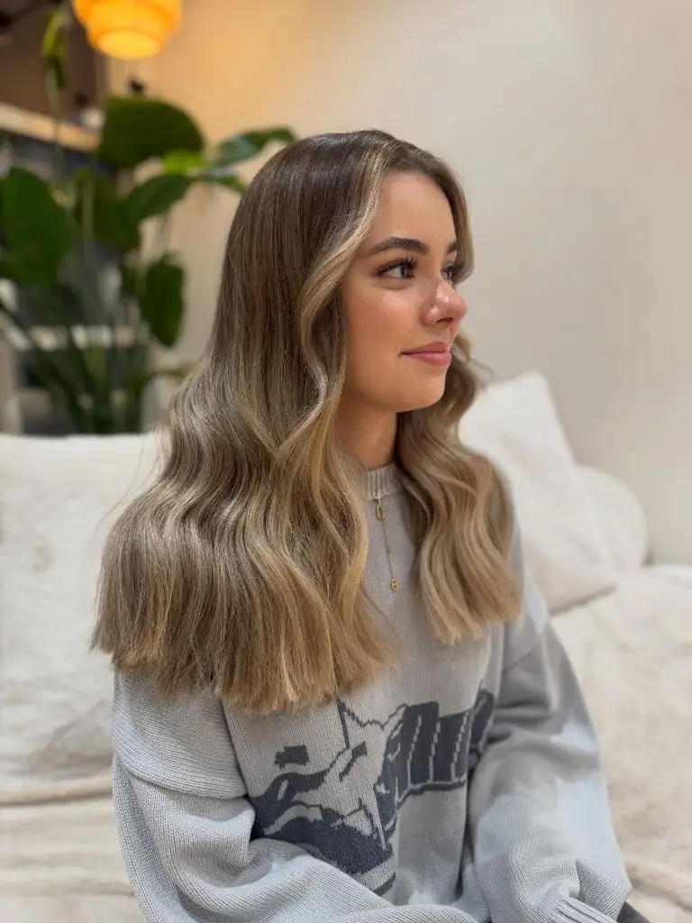
Grey sets the tone throughout. The oversized printed sweatshirt-looking top, the white sofa, and the pale wall are all in the same cool neutral band, and the hair sits comfortably inside that palette rather than against it. Two thin gold necklaces are the only warm notes, and they are small enough not to shift the reading. The strongest contrast in the frame is the darkest root at the crown against the beige jaw-level pieces — a difference of maybe two shades, no more.
The lesson is about restraint at the perimeter. Because the ends stay blunt and straight, the color has a hard boundary to end on, and low contrast reads intentional instead of faded. Compared with the ribboned lob above, this asks for far less maintenance and delivers far less drama.
11. Ginger Copper Extends Past a Curtain Fringe
Warm ginger-copper fills the entire frame at a fairly high saturation, and the volume is centred at the sides rather than the top. A soft curtain fringe splits at the middle of the forehead and sweeps into the length, so the color arrives at the face from both directions. Root, mid-length, and end are close in value, with a faint deepening at the very top that keeps the crown from looking flat.
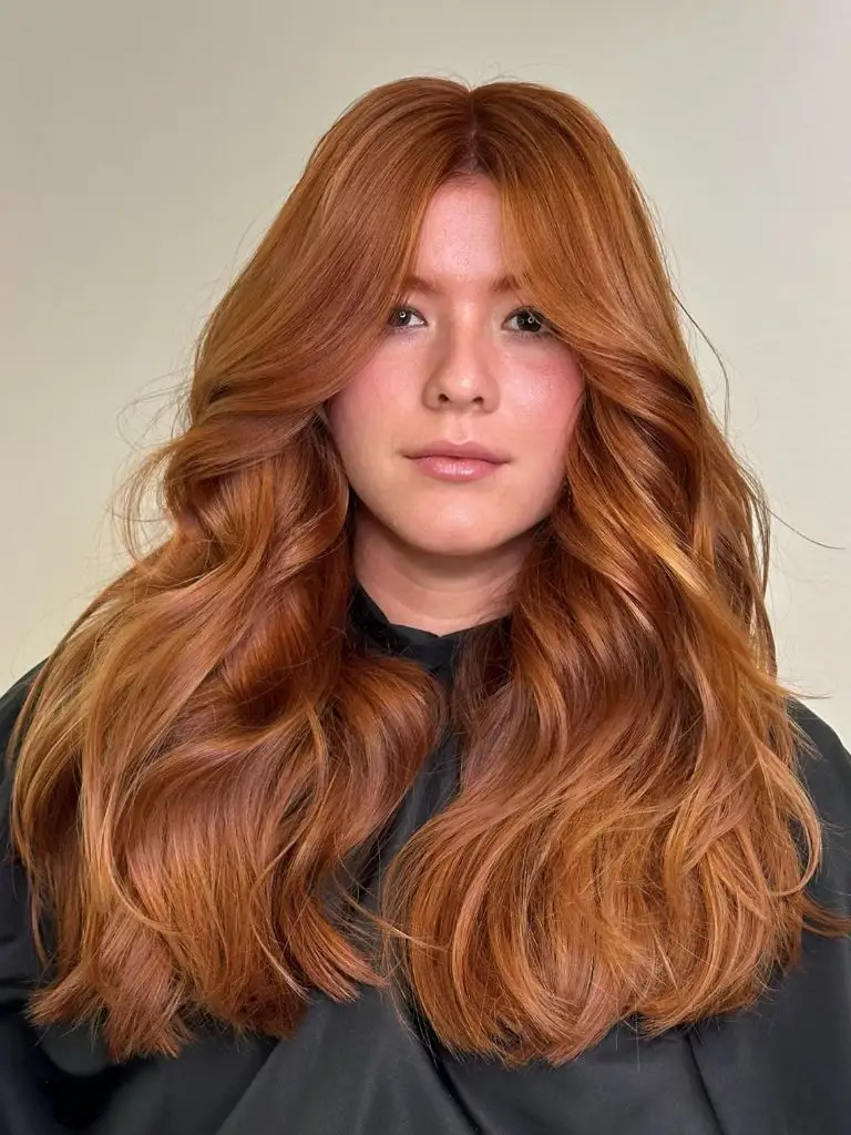
The cream wall and the near-black cape sandwich the hair between a light field above and a dark field below, which exaggerates how much of the picture the copper occupies. Skin reads pink here, and the ginger repeats that pink through its cooler passages, particularly around the temples. Wave definition is uneven — tighter near the fringe, looser through the lengths — and that irregularity is what stops such a uniform color from looking like a wig.
The honest limitation is fade. Single-tone copper at this brightness loses its red first and its depth second, which usually means a gloss every few weeks. If that is unrealistic, sitting the base a shade deeper and keeping the brightness only around the fringe gets most of the effect for less of the schedule.
12. Saturated Crimson Takes Over Everything
Nothing else in this picture competes. A high-chroma true red covers the full length, from a slightly deeper root through brilliant mid-lengths, and the waves are loose enough that the color reads as a continuous field with bright ridges rather than as separate pieces. Scale matters: the hair reaches well past the shoulder blades, so the red occupies most of the vertical frame.
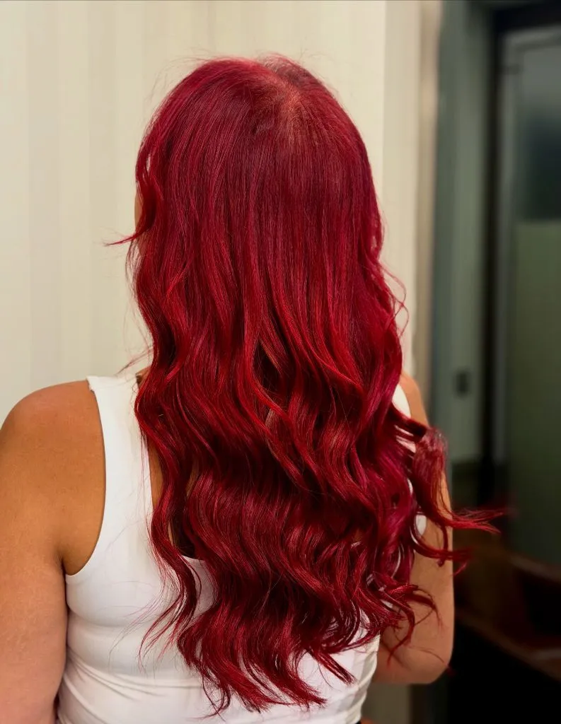
The white ribbed-looking tank is the only supporting decision, and it is the right one — a neutral, high-value garment that outlines the hair’s silhouette without adding a second color. Skin at the shoulders provides a warm middle value that stops the red-and-white pairing from turning graphic. The clearest endpoint is not the hemline, which is layered and slightly wispy, but the shoulder line, where crimson meets white in the sharpest edge in the image.
This is the most demanding shade in the set by a wide margin. Direct red dyes are large molecules that leave quickly, so expect visible loss after a handful of washes and plan for cool water and colour-depositing conditioner. It is also not a background look; it will be the first thing anyone notices.
13. Bronze Lowlights Separate Face-Framing Pieces
A dark espresso base holds the top of the head, and bronze-caramel sections begin at temple level, running down the front panels in wide, soft-edged strips. The length is well past the chest, curled in large barrel waves, and the lighter strips sit on the outside of those waves, so the effect is a series of warm crescents against a much deeper interior.

The black tee and mid-blue denim keep the lower half cool and quiet, which throws all the warmth upward into the hair and skin. Palette-wise, the bronze sits within a shade of the skin’s warm undertone, and that proximity is why the highlighting flatters rather than floats. Contrast is highest at the parting and at the cheekbone, where the darkest and lightest values meet directly; through the lengths, the two tones interleave and the difference relaxes.
Compared with the fine caramel threading earlier in this set, this is a broader, bolder approach to the same base color — panels instead of threads. The trade-off is precision: wide strips need to be placed with the parting and the face in mind, because they cannot be softened later the way a fine weave can.
14. Beige Streaks Sit Against Mushroom Brown
The base here is a cool mushroom brown, and the interest comes from thin beige streaks concentrated at the parting and along the front lengths. Both are close in value, so the picture reads as one soft mid-brown from a distance and only resolves into two tones up close. Length falls past the chest with loose bends and a slightly piecey, tapered hemline.
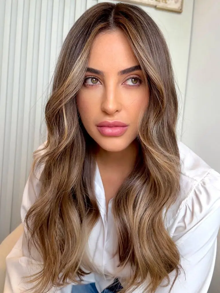
A crisp white shirt sets the top boundary and lifts the whole frame, and it is the reason the beige registers at all — against a dark garment these streaks would disappear into the base. Warm makeup, defined brows, and a pinkish lip pull the eye to the centre of the face, leaving the hair to work as a frame rather than a focal point. The brightest passage is a narrow band beside the part line, and it stops well short of the root.
For anyone drawn to trendy winter hair color ideas that will not announce a salon visit, this is the model: minimal lift, placed where light naturally falls. The limitation is that it photographs faintly, so if you want visible change from a single appointment, this will feel underwhelming.
15. Rose Mauve Overtakes a Dark Canopy
A dusty rose-mauve occupies almost the entire length, but the crown stays a dark brown-black, and the split between those two zones is abrupt — roughly a hand’s width below the parting. Above the split, the hair is straight and flat; below it, wide curls catch light and reveal the pink in several tones, from ash mauve in the shadows to a warmer rose on the wave crests.
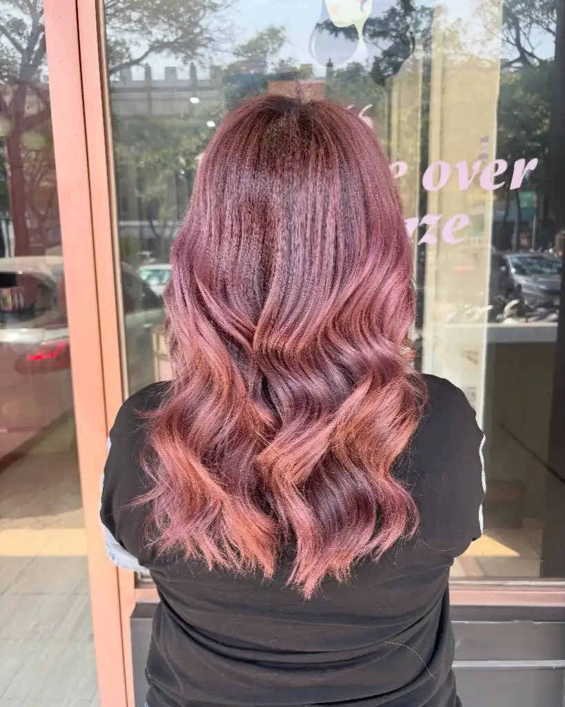
Daylight through the salon glass is unfiltered, which is generous to pink and unforgiving to placement — you can see exactly where the lift started. The dark tee below removes any lower distraction, so the eye travels straight down the gradient and stops at the curled hemline. The reflected shopfront lettering behind adds a matching pink note, which is coincidental but does make the picture feel colour-coordinated.
Pastel work on dark hair is the least forgiving proposition in this whole set. It requires lift first, then a deposit that fades faster than anything else here, and the mid-length break will grow more visible each week. If you want the tone with less commitment, a rose-tinted gloss over an existing light base gets a fraction of the intensity for a fraction of the cost in condition.
16. Burgundy Gloss Wraps a Shoulder-Length Fringe
Shoulder-length hair with a full soft fringe carries a single burgundy tone from root to tip, deepest at the crown and warmest where the ends flick outward. Nothing in the color is broken up — no lighter panels, no root shadow, no ribboning — and because the cut sits above the shoulder with visible movement at the ends, the shape rather than the placement supplies the dimension.
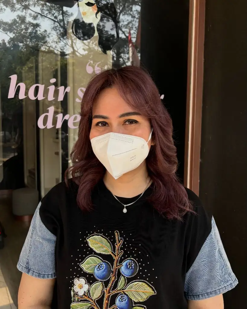
The garment does something unusual: a black tee with blue and green embroidery-looking detail, plus pale denim sleeves. Those cool blues sit directly opposite burgundy on the colour wheel, which is why the hair reads more purple here than it probably would against beige. Sunlight on the right side produces the only bright passage in the frame, and it is where the burgundy shows its red rather than its brown.
The transferable idea is that a single-tone colour needs a cut with edges to stay interesting. Take the same burgundy onto uniform, one-length hair and it flattens immediately. Beside the plum-ribboned version earlier in this set, this is the simpler build — less depth, but no placement to maintain as it grows.
17. Platinum Cools a Wavy Lob
Cool platinum blonde fills the length, brightest through the mid-lengths and ends and slightly deeper at the root, where a shadow of beige-brown keeps the parting from reading solid white. The cut is a collarbone lob with a soft, uneven perimeter, waved loosely and swept to one side so the volume gathers on the left of the frame.
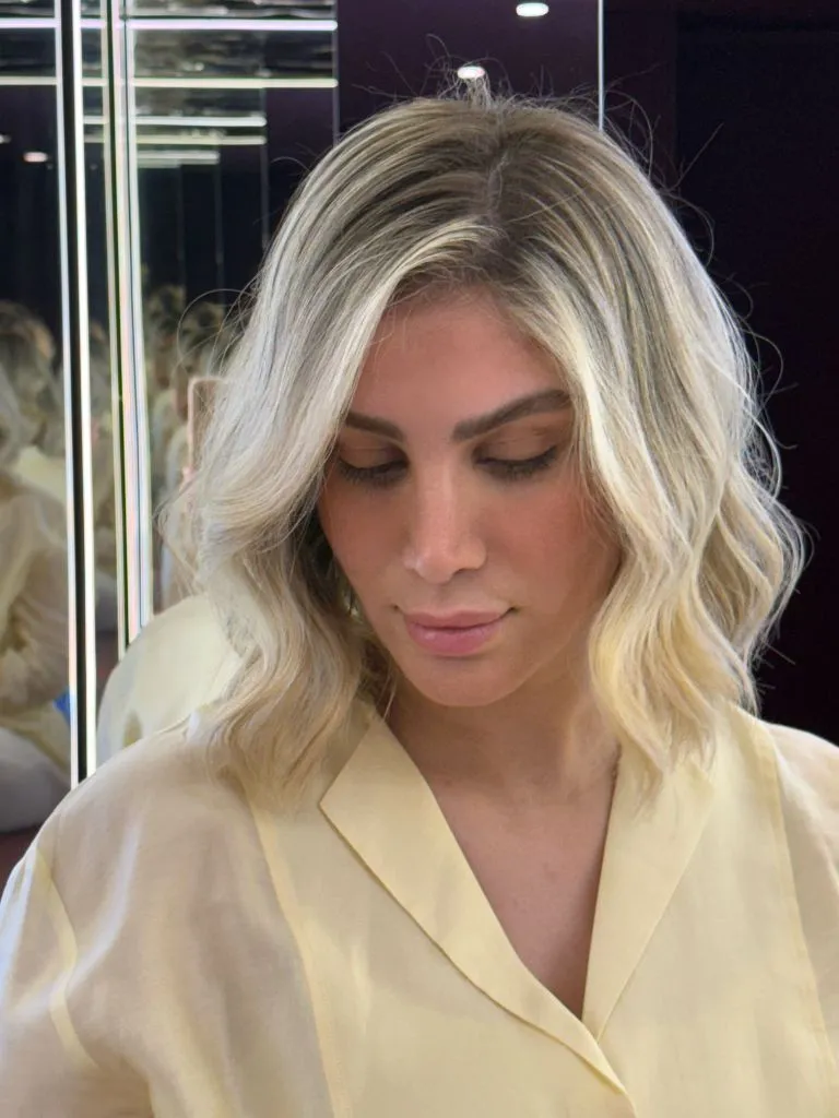
A pale butter-yellow shirt is the surprising element, and it works because it is the only warm value in an otherwise cool picture — the mirrored panels behind are white and near-black, the makeup is a soft taupe, and the lip is barely tinted. That single warm garment note stops the platinum from turning grey by comparison. Contrast lands at the crown, where the darker root meets the brightest sections just behind the hairline.
The honest cost of this shade is condition. Platinum at collarbone length means the oldest hair has been lifted repeatedly, and the slightly translucent look at the ends is the visible result. A blunter trim and a violet-leaning gloss will do more for how it reads than any further lightening.
18. Crimped Texture Multiplies Blonde Ribbons
Texture leads, not colour. Long hair is crimped into a tight, repeating zigzag from crown to hem, and because every millimetre of the wave changes direction, the highlights inside it break into hundreds of small light points instead of long bands. The base is a deep cool brown at the root, opening into ash and beige blonde from roughly the shoulder down.
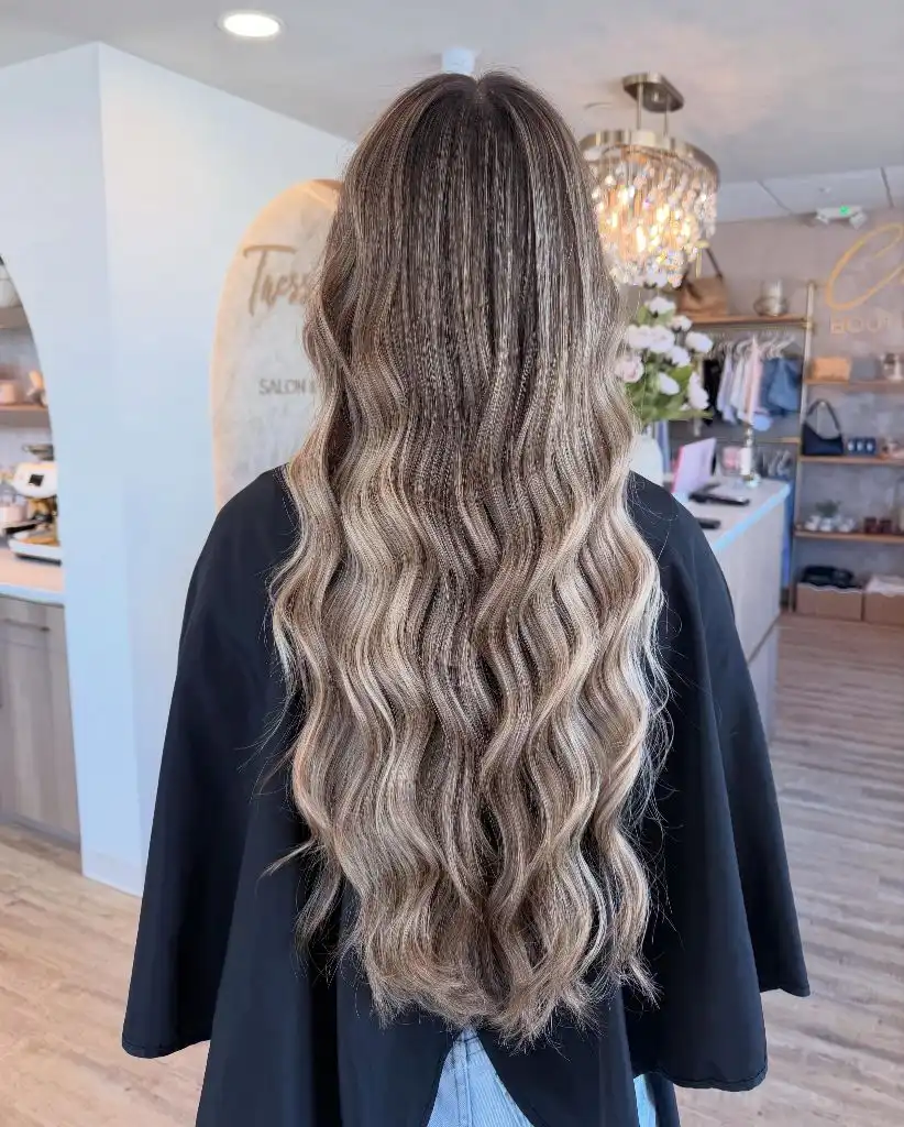
The black cape and the bright salon interior split the background into dark and light halves, and the hair sits across both, which flatters the middle of the gradient more than either end. Length is a factor in itself: the hem reaches the lower back, so the blonde zone alone is longer than most of the haircuts in this set. The clearest endpoint is a slightly ragged, tapered hemline where individual crimped strands separate.
The takeaway is about how styling multiplies colour work. The same balayage on smooth hair would read as three or four wide ribbons; crimped, it reads as an all-over shimmer. That is worth knowing if you like the effect but not the appointment — texture can add perceived dimension without additional lightening.
19. Long Ombré Stretches the Transition Zone
A hand lifts the top section forward, exposing the full vertical structure: dark cool brown occupying the first third, a long blended middle, and a pale sandy blonde in the last quarter. The transition zone is unusually wide, spanning most of the mid-lengths, which is what keeps such a wide value range from looking like two separate colours stacked on top of each other.
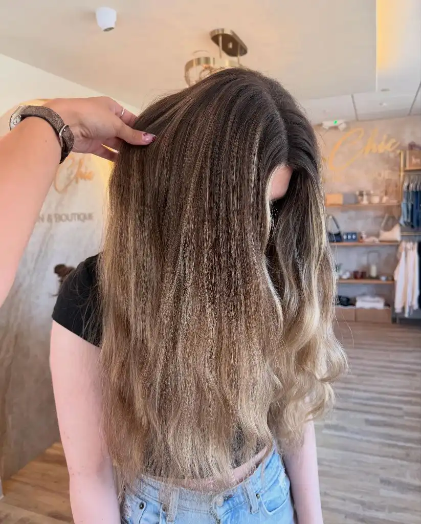
Light denim-looking shorts at the bottom of the frame echo the sandy ends almost exactly, and a black tee sits behind the darkest section, so the garments unintentionally repeat the hair’s own gradient. Surface differs top to bottom too — the root section looks smooth and dense, the ends looser and more separated, which is typical of lifted hair and reads as texture in this light rather than as damage.
Where this differs from the shadowed-root version earlier is span. That one compressed its change into a few centimetres near the crown; this one spreads it over twenty or more, which is the more forgiving approach for anyone who stretches appointments. The cost is that the root will always look distinctly darker in a ponytail.
20. Honey Gold Fills a Smooth Wave Pattern
Warm honey blonde runs the whole length at a consistent saturation, and the wave pattern is the most controlled in this set — deep, even S-bends set in the same direction, brushed out just enough to soften the ridges. Slightly deeper gold at the root grades imperceptibly into brighter mid-lengths, and the hem finishes in one thick, level line just below the shoulder blades.
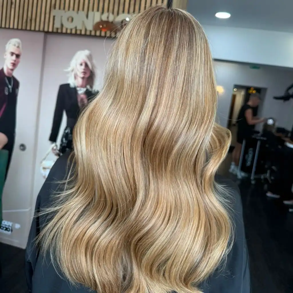
The salon behind is a busy field of pink, black, and white, and the hair holds against it because its own value range is narrow and its surface is highly reflective. Continuous highlight bands run down each wave crest, and those bands, not the placement, create nearly all the perceived depth. A dark cape below cuts the composition cleanly at the hem, so the endpoint is unmissable.
Set beside the cooler blonde work above, this is the warm counterproposal — golden rather than ashy, and considerably easier to maintain because brassiness is not being fought but used. The trade-off is temperature: honey gold reads warmer against cool-toned clothing and warmer still in artificial light, which flatters some complexions and washes out others.
21. Toffee Panels Lighten a Rolled-Under Shape
The dominant feature is a shape, not a shade: shoulder-length hair curled firmly under so the ends roll inward and the silhouette closes at the bottom. Colour is a light toffee brown with finer, brighter panels through the top and side sections, and because the roll gathers the hair into a smooth curve, those panels bend with it and pool light at the turn.
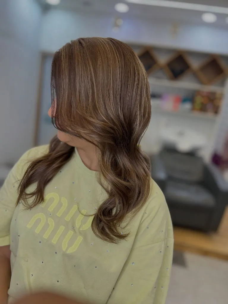
A pale lime-yellow tee sits directly beneath, and it is the loudest thing in the frame — bright, cool-warm, and close in value to the lightest hair sections. That proximity is why the colour reads soft here rather than defined; against black, the same panels would look considerably stronger. Behind, a blurred salon interior in whites and greys keeps everything else neutral.
If you like the effect, the lesson is that a rolled-under finish concentrates highlights at the curve and hides them elsewhere. Colour placement of this kind appears throughout current September hair color trends as well, and it translates easily to longer hair. The limitation is that it lives and dies by the styling — brushed straight, the panels lose most of their effect.
22. Espresso Brown Sharpens a Flicked Bob
Dark espresso brown, deep and nearly uniform, sits on a jaw-length bob with a full, slightly disordered texture. The volume gathers at the sides and the ends flick outward in every direction, so the perimeter is jagged rather than blunt. Warmth appears only in the outer layer, where light picks up a faint chestnut cast; underneath, the colour reads almost black.
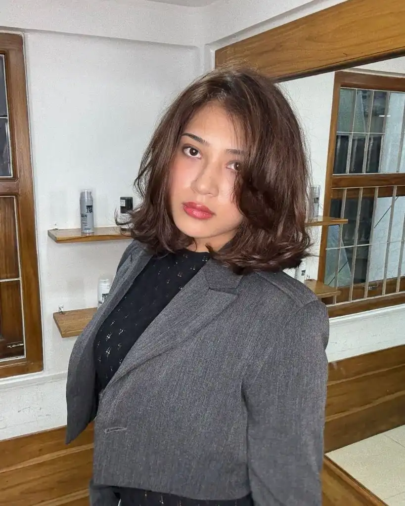
The supporting palette is entirely grey and black — a grey structured blazer-looking jacket, a black perforated top, and a wood-and-white interior behind. A strong red lip is the only saturated element, and it does the job of two accessories, pulling attention to the centre of the face and picking up the faint warmth already present in the hair. Contrast is highest between the dark hair and the pale wall, which turns the bob into a clean silhouette.
The honest note is that a single dark shade shows every flaw in a cut, because there is no colour variation to distract from the line. Here the texture is working in its favour. On straighter, finer hair, the same espresso would need either a shadowed root or a lighter perimeter to keep the shape reading.
23. Bronzed Balayage Rides Loose Beach Waves
Mid-brown with bronze and gold woven through it covers a long, layered length that is waved irregularly — some sections coiled, others nearly straight. Placement is heaviest around the parting and the front, where the brightest gold sits right at the temple, and it thins toward the back, leaving the interior noticeably deeper. The hemline is soft and tapered rather than blunt.
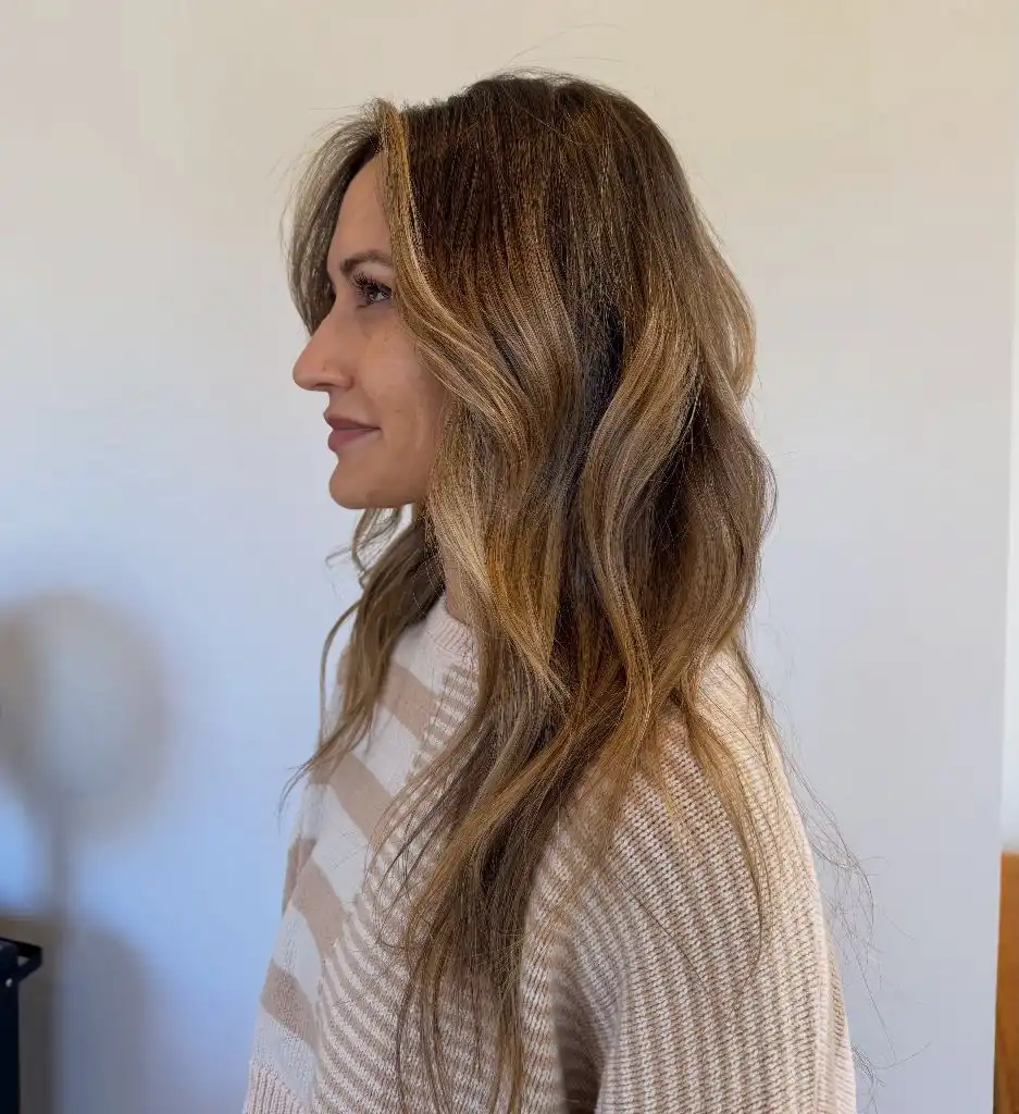
A cream-and-taupe striped knit-looking sweater repeats the hair’s two dominant values almost exactly, which is why the whole picture reads as a single warm neutral scheme. The white wall behind keeps everything else out of the way. Surface variation is the clearest difference from the polished waves elsewhere in this set: individual strands stand away from the mass, and that looseness is what makes the balayage look sun-placed rather than sectioned.
The transferable principle is that irregular texture forgives irregular placement. If your colour is heavier on one side or grown out unevenly, a deliberately undone wave pattern will absorb it. A smooth blow-dry, as several of the earlier examples show, will do the opposite and expose every line.
24. Golden Ends Balance a Warm Brown Top
Warm mid-brown holds the crown and the parting, then loosens gradually into gold and pale wheat through the last third of the length. The hair is long, layered, and swept to one side over the shoulder, with the waves largest at the ends and barely present near the root. That arrangement puts the lightest colour and the strongest movement in the same place — low, near the hem.
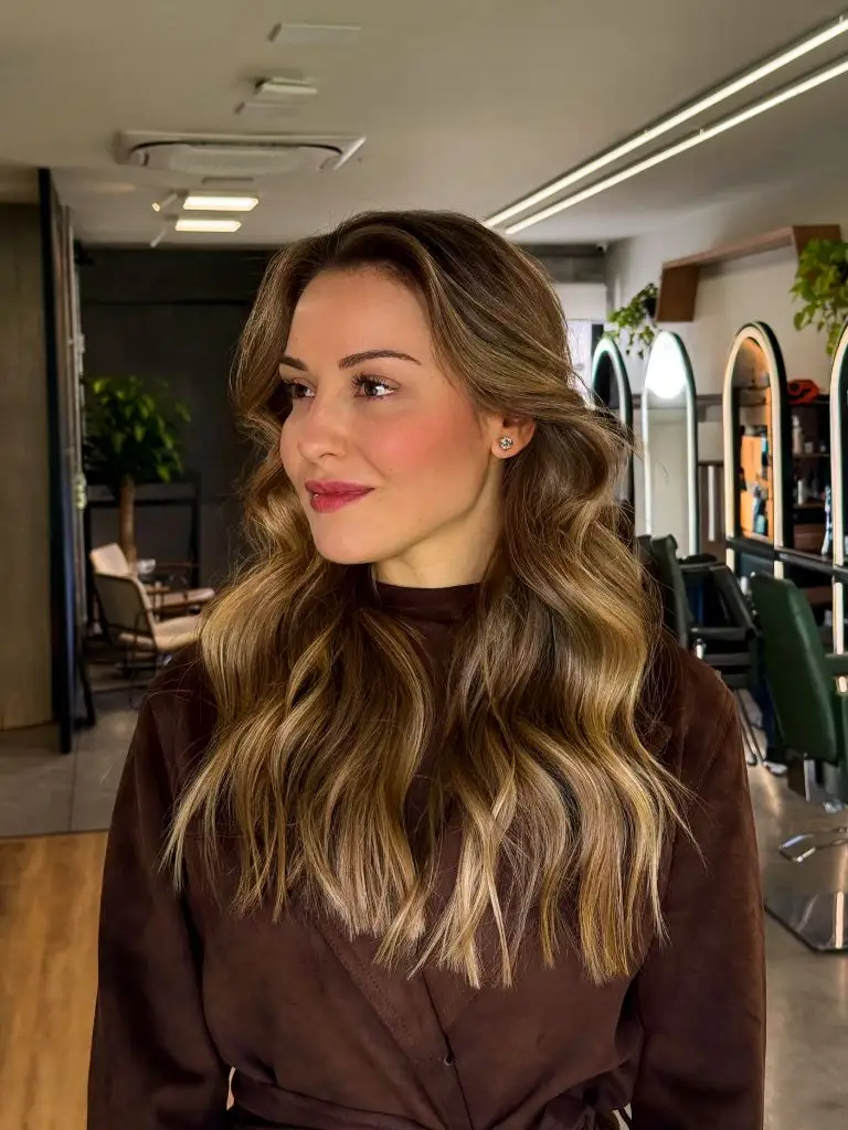
A chocolate brown suede-looking coat sits directly under the darkest hair sections and repeats their value precisely, so the top of the composition reads as one continuous brown field and the golden ends become the only bright note below the face. Behind, a green-and-white salon interior supplies cool relief. The sharpest contrast falls where the wheat-toned tips cross the dark coat — a clean, high-value endpoint.
That garment echo is the detail I would borrow first. Matching your darkest hair value to a top or coat makes lightened ends read as intentional placement rather than grow-out, and it costs nothing. It is a small trick, but across a whole winter of dark coats it changes how the same colour photographs.