There is a particular way of judging winter hair colors that has little to do with naming shades. Look past the individual highlight or the single copper streak and study how the whole head is composed: where the darkest point sits, how much of the length carries the brightest tone, how wide the transition band is, and how much of the perimeter is left as a quiet colour field. Composition explains more than any swatch name.
Before scrolling, decide what you are actually comparing. Notice first where the eye lands — root, mid-length, or the last few inches — then work out what made it land there: contrast width, tonal temperature, or the shape of the curl catching light. Weigh brightness against grow-out visibility, and depth against how much shine the finish can hold. None of these arrangements is a formula, and none of them transfers whole.
1. Copper Takes Over the Whole Length
Saturation does all the work here. A single high-chroma copper runs from the parting to the ends with almost no tonal interruption, so the head reads as one continuous colour field rather than a set of placed pieces. The length falls past the mid-back, and the only visible variation comes from light bouncing off the crown and the wave banding near the ends.
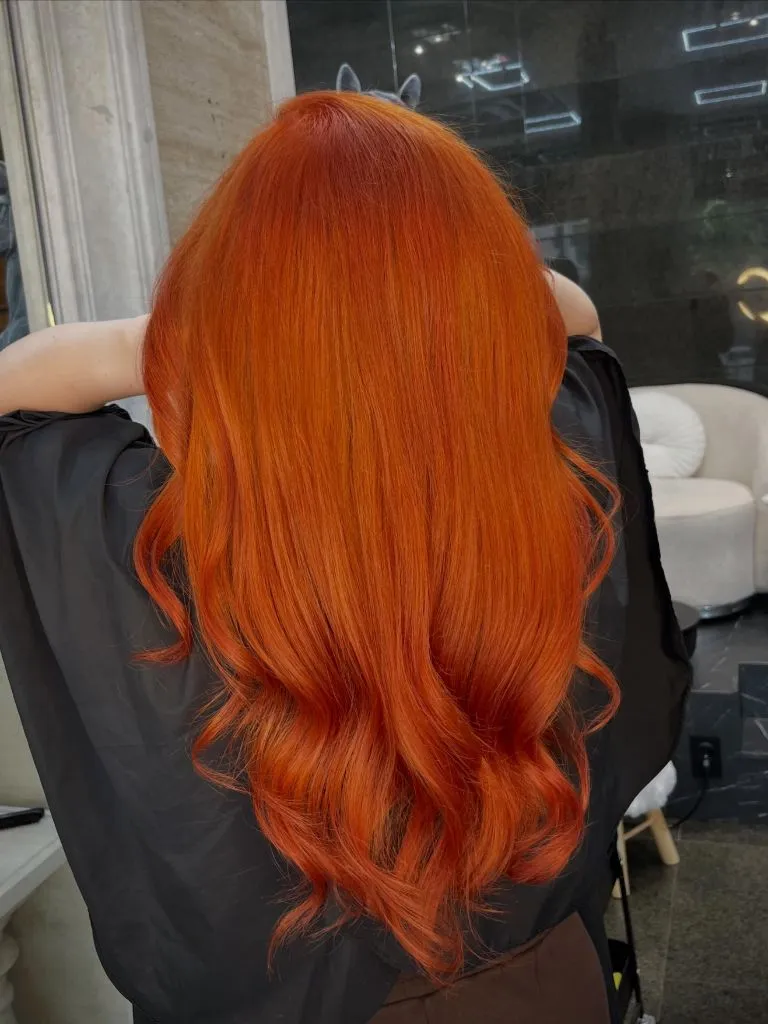
Everything around it stays deliberately mute. The black cape gives the copper a hard border on both shoulders, and the grey-and-marble background behind offers no competing warmth, so the orange has nowhere to bleed. The root is a fraction deeper than the mid-lengths, which keeps the top from looking flat, and the sharpest contrast falls at the cape edge rather than anywhere inside the hair itself.
The honest limitation is upkeep. Copper at this intensity sits mostly on the outside of the hair and rinses down noticeably within weeks, so this is a colour you maintain rather than one you visit. If that sounds like too much, the same effect at half the saturation holds its tone far longer while keeping the single-field look.
2. Mahogany Depth Frames a Softer Face
Instead of brightness, this one leads with depth. A dark mahogany brown covers the full head, lifted only where a hand holds a section away from the crown and the light finds a red undertone inside it. The shape is mid-length with soft layers around the cheekbone, and the colour sits low enough in value that the face, not the hair, holds the focal point.
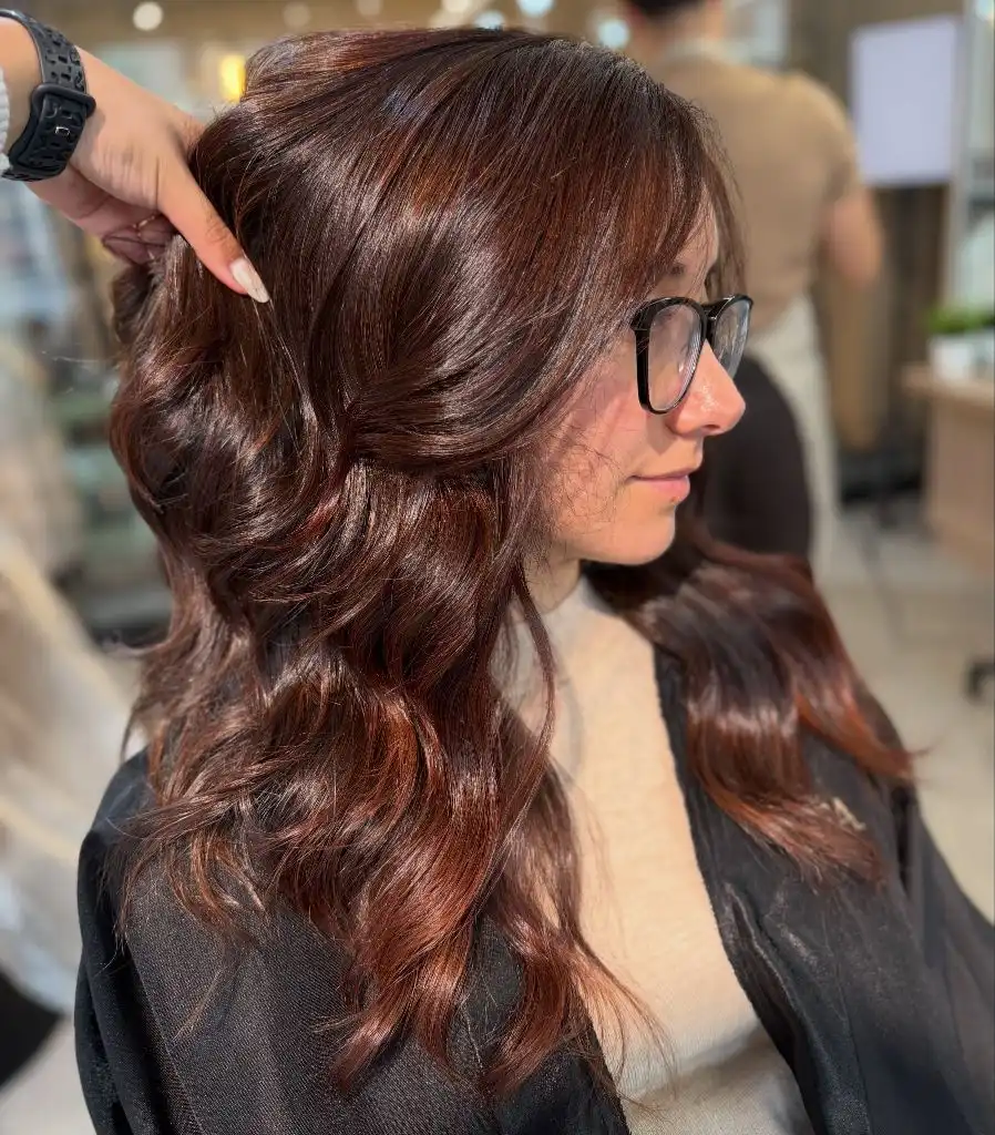
The support comes from the sheen rather than from any second tone. Where the wave turns, the surface throws a warm red-brown band; where it falls flat, it reads almost neutral. Dark glasses and a black cape repeat the darkest value in the hair, which is why the red never looks applied on top — it appears to be coming from underneath. The material is not identifiable, so the visible gloss is the useful detail, not any product claim.
Compared with the copper above, this is the low-risk version of a warm red. The line where new growth appears is soft rather than sharp, and the tone drifts toward a plain brown rather than a brassy one as it fades. I like the restraint of keeping the red inside the shine instead of on the surface.
3. Red-Warm Highlights Cut Through Cool Brown
Direct sunlight is part of the composition here. A medium chestnut base carries fine red-warm highlights that run from close to the root all the way down, and because the light is overhead, the top section reads several shades brighter than the length beneath it. The pieces are thin and closely spaced, which builds the impression of a single warm brown rather than visible stripes.
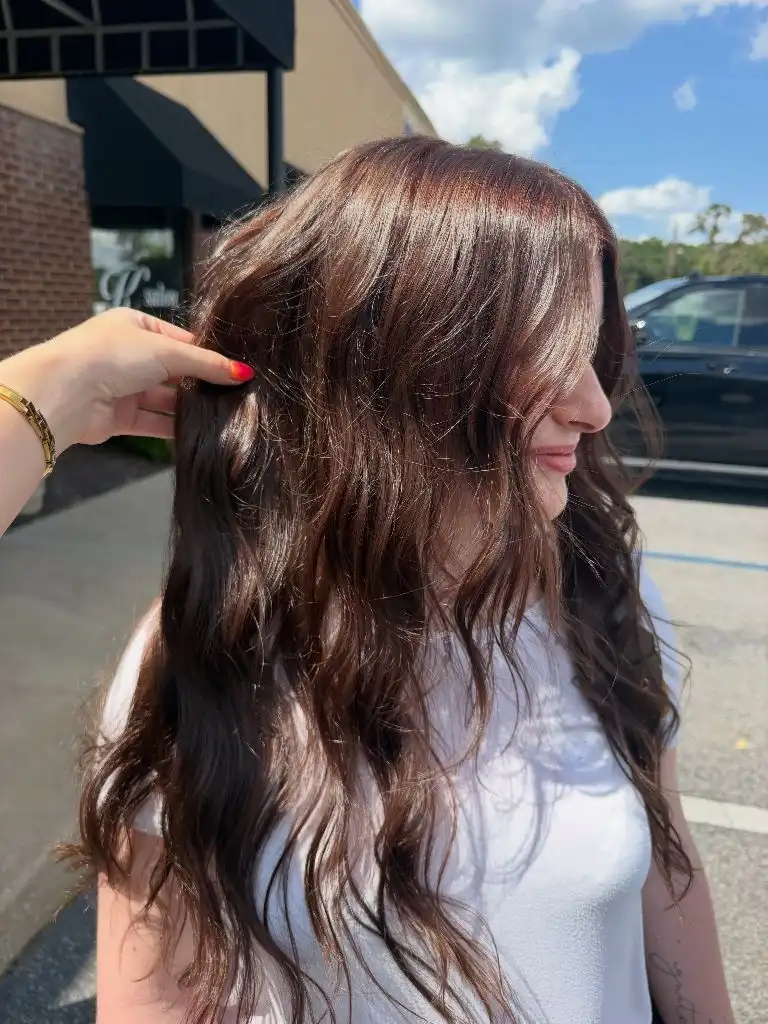
The white top matters more than it looks. It sets the brightest point in the frame at the shoulder, so the hair does not have to compete for attention, and it keeps the red-brown from reading heavy. Flyaways along the crown catch the sun and add a halo of lighter tone at the perimeter, while the mid-lengths hold their depth. The clearest endpoint is the uneven wave line just below the chest.
Among winter hair colors, this is a useful example of a highlight that adds warmth without adding lightness. If you want it calmer, ask for the fine pieces to start below the parting rather than at the root, which removes the bright top panel that daylight exaggerates in shots like this.
4. Honey Ribbons Break Up Dark Curls
The pattern is what dominates, not the base. Broad honey and caramel ribbons wrap around a dark brown curl structure, and because the curls are loose and irregular, the light tone appears in curved segments rather than continuous lines. Roughly a third of the visible surface is light, concentrated from the mid-lengths down, with the crown left deliberately dark.
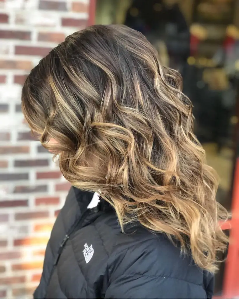
The dark puffer jacket absorbs the bottom of the frame and stops the warm tones running out of the image, while the red-brown brick behind echoes the base colour closely enough to sit against it without clashing. Contrast is highest where a honey ribbon curves directly beside an unlit dark section, which happens most often around the ear and along the outer edge of the shape. Nothing in the palette competes with that pairing.
The transferable principle is about placement following texture. On curly or wave-set hair, lightness reads as scattered dots unless the pieces are wide enough to survive the bend, which is why thin foils often disappear here. Wider sections, fewer of them, is the adaptation worth asking for.
5. Caramel Sweeps Lift a Mid-Length Wave
Even distribution sets the tone in this one. A warm caramel runs through a mid-brown base across the entire mid-length, with the lightest concentration sitting between the ear and the ends, and the crown holding a slightly deeper shadow. The cut is a collarbone-length wave with a rounded perimeter, so the colour reads as a soft gradient from top to bottom rather than a series of individual pieces.
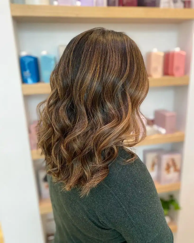
Behind the shoulder, pastel product boxes on pale shelves keep the background cool, which pushes the caramel forward without any styling trick. The dark green knit repeats the low value of the root, closing the composition at the bottom. Where the wave crests, the surface looks glossy; where it hollows, the tone drops to the base brown, and that alternation is what gives the shape its apparent thickness.
This is a quieter arrangement than the ribboned curls above, and it grows out with less visible line because the transition begins high and stays gradual. Anyone building a dimensional brunette hair colour will find this a sensible reference point for how much lightness a brown base can carry before it stops reading as brown.
6. Thin Auburn Streaks Interrupt Near-Black Hair
Value contrast is narrow here and the effect depends on it. A very dark brown, close to black at the root, carries fine auburn strands that appear mainly along the outer surface of the waves from the ear down. Because the streaks are thin and the base is deep, the red only becomes legible where a wave turns toward the light, giving the whole head a flickering rather than striped appearance.
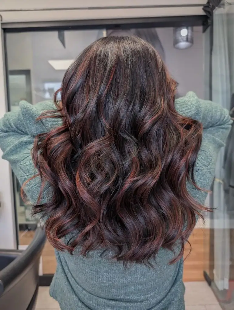
The pale sage sweater is the palette’s counterweight, cool enough to make the red-brown read distinctly warm instead of muddy. The crown stays almost entirely dark, which builds a solid colour field at the top and keeps all the movement in the lower two thirds. The sharpest contrast falls at the individual strand level rather than anywhere structural, so the hair looks textured before it looks coloured.
The trade-off is visibility. On dark bases this level of red is almost invisible in flat indoor light and obvious in sunlight, so you are buying a colour that appears conditionally. If you want it present all day, the pieces need to be wider or lifted one shade further before the red is deposited.
7. Espresso Base Anchors Soft Face Framing
A near-uniform espresso brown holds the whole shape together. The length runs well past the chest in a loose wave, and the only lighter tone appears as slim warm-brown pieces around the face and along the top of the parting, brightening the fringe area by a shade or two. Everything from the ear back stays deep and unbroken, which weights the composition toward the front.
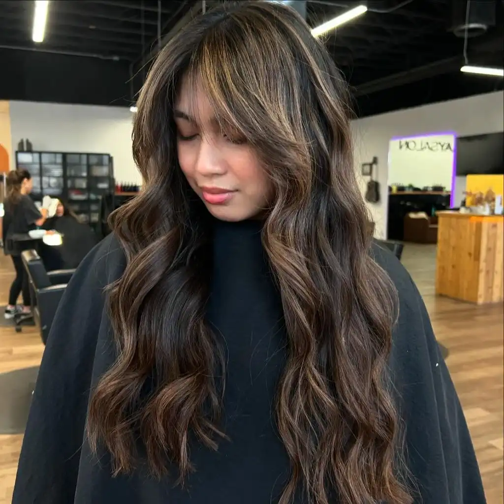
The black cape does something specific: it removes the body entirely, so the hair’s outline becomes the silhouette. Against that, the face-framing pieces are the only bright note in the frame apart from the salon lighting, and they land exactly at cheekbone height. Warm floor tones behind repeat the brown’s undertone at low intensity, which is why the background does not read as a separate colour block.
Compared with the flickering auburn above, this places its lightness by position rather than by scatter, and that makes it far easier to maintain. The lesson is about intent: a small number of pieces where the eye already goes will always do more than the same amount distributed evenly.
8. Dark Roots Meet Icy Silver Ends
The composition splits cleanly into two bands. A deliberately dark root covers the top few inches, then the colour breaks into a cool silver-blonde that carries the entire remaining length. The transition sits high, just below the crown, and it is blurred rather than blocked, so the eye reads a vertical gradient with the coolest, brightest tone concentrated in the bottom half.
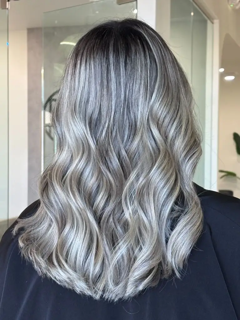
Fine ribbons of light and mid-tone alternate down the waves, and that alternation prevents the blonde from flattening into a single sheet. The black top at the shoulder repeats the root value and closes the frame, while the pale glass and white walls behind keep everything cool. The clearest endpoint is the wave line at the bottom, where the brightest silver collects on the outer curls.
Within winter hair colours, the built-in dark root is the practical part rather than the aesthetic one. It buys weeks of grow-out before the line matters, and it lets the ends stay far lighter than a solid application would allow. The cost is that the top of the head never reads bright, even in strong light.
9. Ash Blonde Extends Past a Shadow Root
Seen from the side, the same two-band idea reads differently. A soft brown root sits across the top of the head, and cool ash blonde takes over from roughly eye level down, widening as it reaches the ends. The wave pattern is uniform and closely set, which turns the colour into stacked horizontal bands of light and shadow rather than the vertical sweep of the previous look.
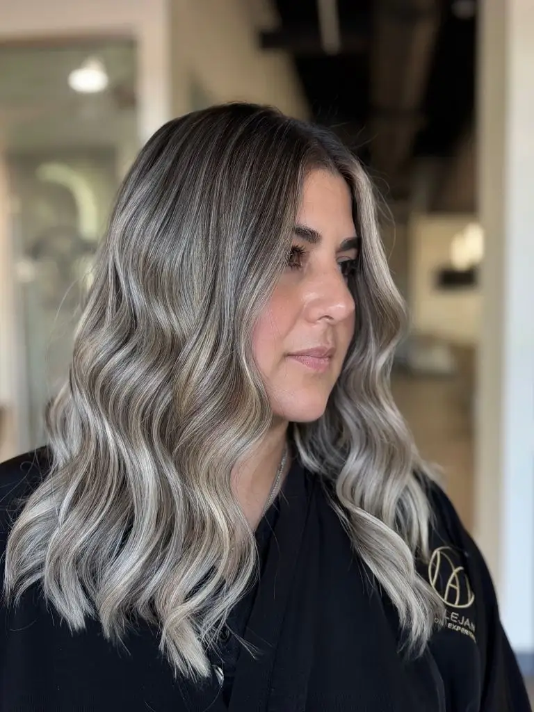
The black robe with its small pale monogram is the only competing element, and it sits low enough to act as a base rather than a distraction. Face-framing pieces at the temple are noticeably lighter than the crown, which keeps the brightness near the face without lifting the parting. Where each wave turns under, a grey-brown shadow appears, and that repeated shadow is what makes the ash tone read as cool rather than simply pale.
Push it further by lightening only the front two sections another half shade; soften it by letting the root creep a centimetre lower before the blonde begins. Either adjustment changes the balance without touching the overall proportion, which is the part doing the real work.
10. Deep Auburn Leads a Long Layered Shape
Length and depth arrive together. A dark auburn, closer to red-brown than to copper, covers the full head and falls well below the waist in long sweeping layers. The colour is solid throughout, with variation coming only from the way the layers stack: the top panel catches light and reads several shades brighter, while the under-layers stay dense and almost brown.
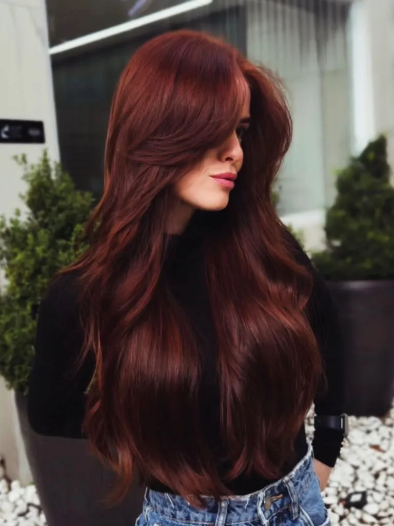
The black top removes any competition from the upper body, and the denim at the waist introduces the only cool note in the frame, which sharpens the red by contrast. Greenery and pale planters behind sit far enough back to stay as texture rather than colour. The sharpest edge in the whole composition is the sweep of the side-parted top layer as it crosses the cheek, and that diagonal is what gives the shape its direction.
Compared with the single-tone copper at the start of this set, deep auburn holds its saturation far longer because the pigment sits closer to the natural depth of most brown hair. That makes it the more forgiving choice of the two warm reds here, if not the more striking one.
11. Perimeter Curl Sets the Copper’s Endpoint
Returning to that same copper, the detail worth isolating is the bottom edge. The last four or five inches break into loose S-waves that turn outward, and because the colour is uniform, every fold of that curl reads as a shift in brightness rather than tone. The result is that the perimeter, not the root, becomes the most visually active part of the head.
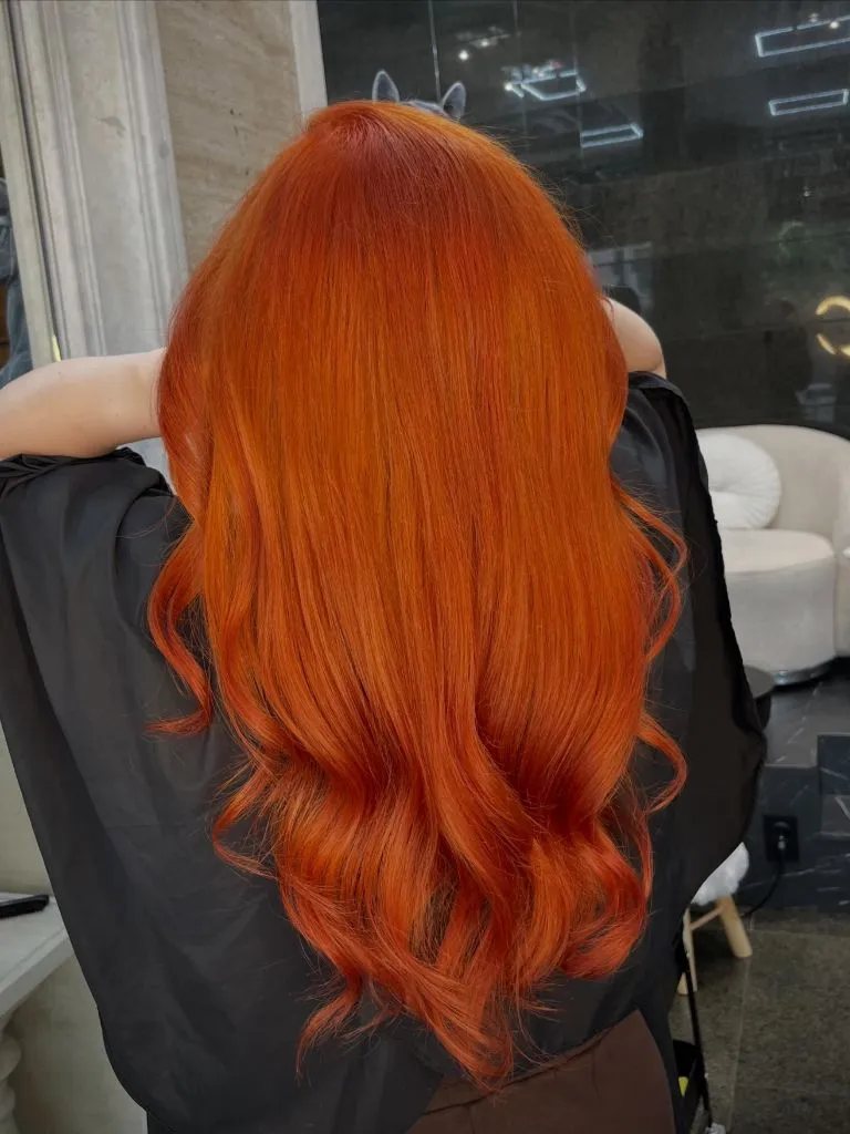
The upper two thirds stay almost still by comparison — smooth, flat, and consistent from the parting down. That stillness is what allows the waved ends to function as an endpoint instead of getting lost. The cape’s matte black behind the curls raises their apparent gloss, and the small warm reflections in the window glass repeat the copper at a fraction of its intensity, which keeps the frame coherent.
Where a colour is genuinely single-tone, styling has to supply the dimension, and this shows how little of it is required. One waved section at the bottom, everything above left smooth: that ratio is transferable to any solid shade, dark or light.
12. Pearl Platinum Softens a Grown-Out Root
Brightness sits almost everywhere in this one. A pearl-toned platinum covers the length from just below the crown to the ends, and the root is left as a soft mushroom blonde rather than pushed dark. Because the two values are close, the transition is barely a line at all; the head reads as one pale colour field with a faint shadow at the top.
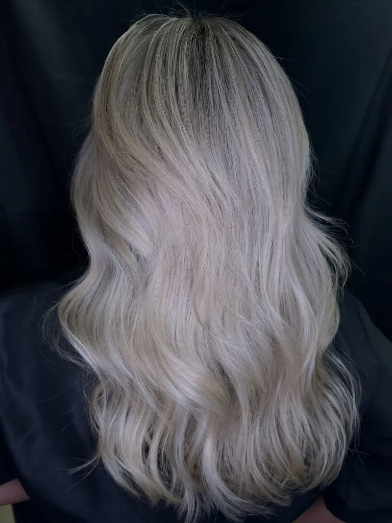
The dark backdrop is doing an enormous amount of work. Against it, the pale hair separates completely, and the fine grey-beige strands running through the mid-lengths become visible as texture rather than dirt. A few darker strands sit near the parting and stop the crown from looking bald under the light. The clearest contrast in the frame is the outline of the hair against the black, not anything internal.
The honest limitation is condition. Platinum this even requires most of the length to be lifted repeatedly, and the paler the result, the more the ends depend on styling to look dense. If your hair is fine, the shadow-rooted version in the earlier silver look gives similar brightness with less of the length processed.
13. Bright Blonde Separates From a Dark Crown
Here the divide is stated rather than blended. A dark brown occupies a band across the top of the head, and a bright cool blonde takes the rest, with the change happening within a couple of inches. Seen from behind, that gives a clear horizontal split: dense dark at the crown, then a broad, high-value blonde field covering everything from the nape down.
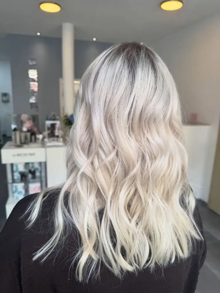
Fine dark strands escape into the blonde around the parting, which softens what would otherwise be a hard band, and the same dark reappears at the very edge of the perimeter where under-layers show through. The black knit at the shoulder holds the bottom of the composition, and the warm salon lighting above adds a slight golden cast to the crown that keeps the split from reading as two unrelated colours.
For anyone drawn to bolder winter hair colour work, this is the version that trades subtlety for longevity. The dark section is real hair, so it grows out invisibly, but the trade-off is a visible boundary in every ponytail and every updo. That is worth deciding on before the appointment, not after.
14. Golden Blonde Carries a Blunt Lob
Structure leads, colour follows. A warm golden blonde covers a straight, blunt-cut lob that stops just below the shoulder, and because the hair is smooth and the perimeter is unbroken, the colour reads as a flat panel with fine vertical striping through it. The darkest tone appears at the root and along the parting; the brightest collects on the outer surface where the light hits.
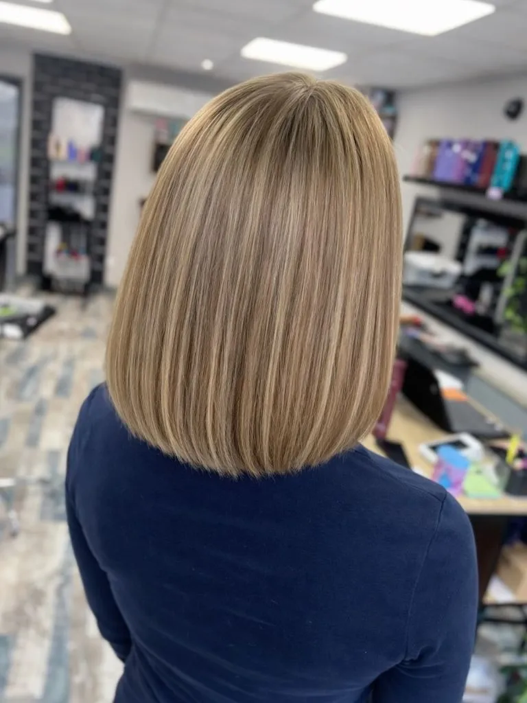
The navy top is the sharpest contrast in the frame, and its clean shoulder line echoes the blunt hem of the cut, which is part of why the whole thing looks deliberate. Highlights sit close together and vary by only a shade or two, so instead of stripes you get an impression of density. The busy salon background stays out of the way because everything in it is low in saturation.
Compared with the wave-set blondes above, straight hair shows highlight placement with total honesty — every mismatched piece is visible along its full length. That makes it the harder finish to colour well, and the more convincing one when it works.
15. Silver Lowlights Balance a Bright Mid-Length
The interplay here runs in both directions. A cool silvery blonde covers most of the length, but darker beige and grey-brown lowlights are woven back through it, appearing as narrow bands that follow the wave pattern down the back. The root is mid-brown, the mid-lengths are the most mixed, and the ends are the palest section of all.
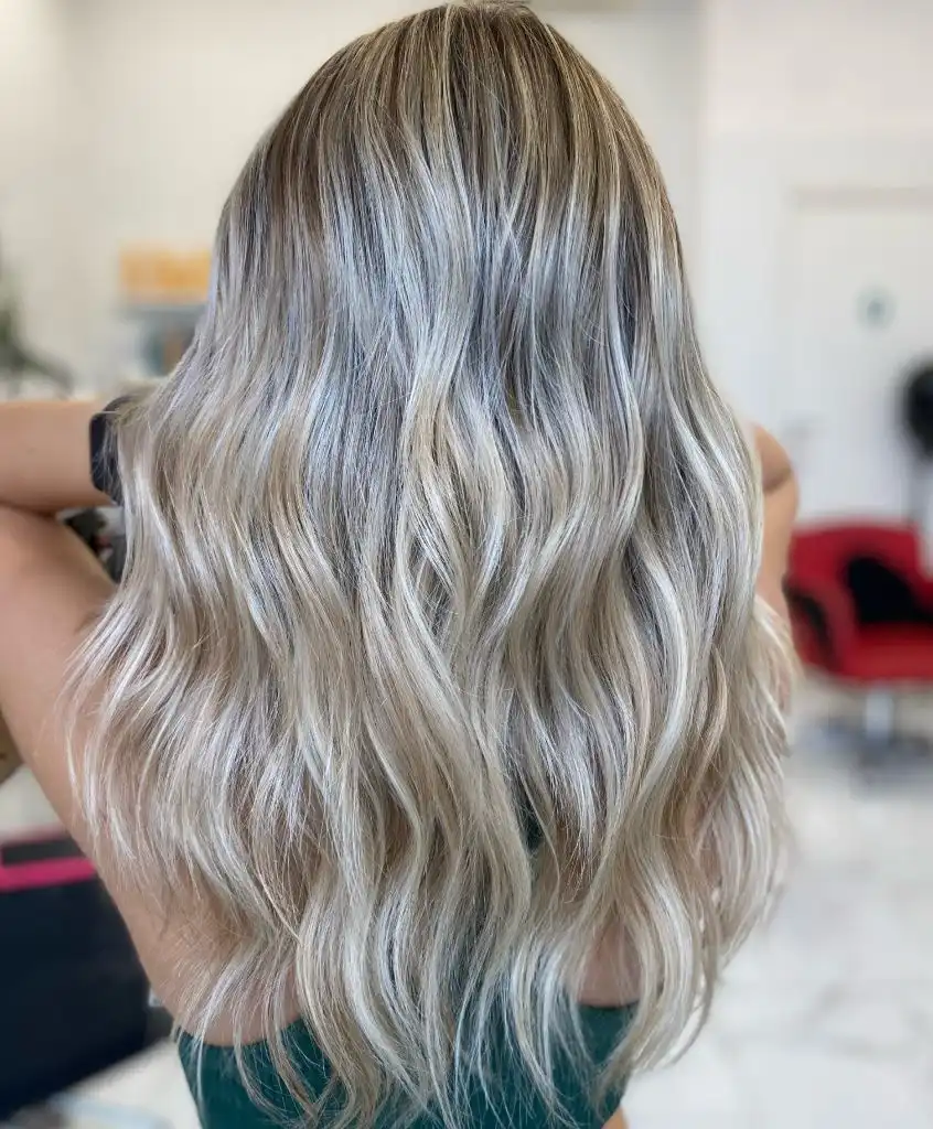
Because the lowlights are cool rather than golden, they read as shadow instead of as a second colour, and that is what keeps the head from looking striped. A dark green top at the base of the frame anchors the bottom, and the single red chair behind is the only saturated thing in the shot, which paradoxically makes the blonde look cleaner. The strongest contrast sits mid-back, where a pale ribbon runs directly alongside a dark one.
The transferable principle concerns re-adding depth. Once hair is lifted to this level, dimension has to be put back rather than left behind, and cool lowlights do it without the brassy warmth that beige ones can introduce. It is more work than a straight all-over blonde, and it looks like less.
16. Wine Red Sharpens a Straight Finish
Gloss is the dominant feature before colour even registers. A deep wine red covers the full length, poker-straight, with a knotted half-section at the back that folds the colour over on itself. The surface is so smooth that a broad band of light runs vertically down the centre of the length, splitting the red into a bright core and two deeper edges.
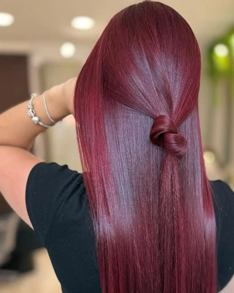
The knot is the only structural interruption, and it works as a focal point precisely because everything else is uninterrupted. A black top repeats the darkest value in the hair, a silver bracelet at the raised arm adds a single cool accent, and the beige salon background sits far enough from red on the wheel to keep the tone unambiguous. The material is not identifiable, so the sheen is the useful detail rather than any claim about the finish used.
Deep reds like this fade toward pink and then toward copper as they wash out, which is a slower and less awkward path than most warm shades take. Still, this is not a background colour, and it will read as a decision in every photograph you appear in.
17. Buttery Blonde Warms a Rounded Wave
Warmth, not brightness, sets the register. A buttery golden blonde covers a shoulder-length wave, with a slightly deeper honey shade at the root and through the interior of the curls. The waves are loose and rounded, held away from the shoulder by a hand at the left, so the shape reads wide and soft rather than long.
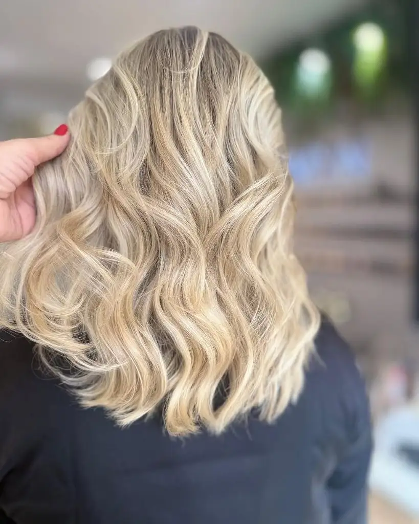
Inside the wave pattern, thin pale ribbons alternate with warmer beige ones, and the difference between them is small enough that the whole head reads as one shade with texture rather than two shades competing. The black top removes the lower half of the frame from consideration, and the single red nail is the sharpest small accent in the image. Blurred greenery behind adds a cool cast that stops the gold from turning yellow.
Among winter hair colors, warm blonde is the one most often talked out of the chair in favour of something ashier, which I think is a mistake in low winter light. If it feels too golden, a single cool gloss over the top two inches will settle it without stripping the warmth from the ends.
18. Cool Espresso Holds a Curled Endpoint
Depth returns, and this time it is genuinely cool. A dark espresso brown with no visible red runs the full length, straight through the top two thirds and then breaking into defined ringlet curls from the mid-back down. The upper section reads almost as a flat dark panel; the curls below scatter the light into small bright crescents.
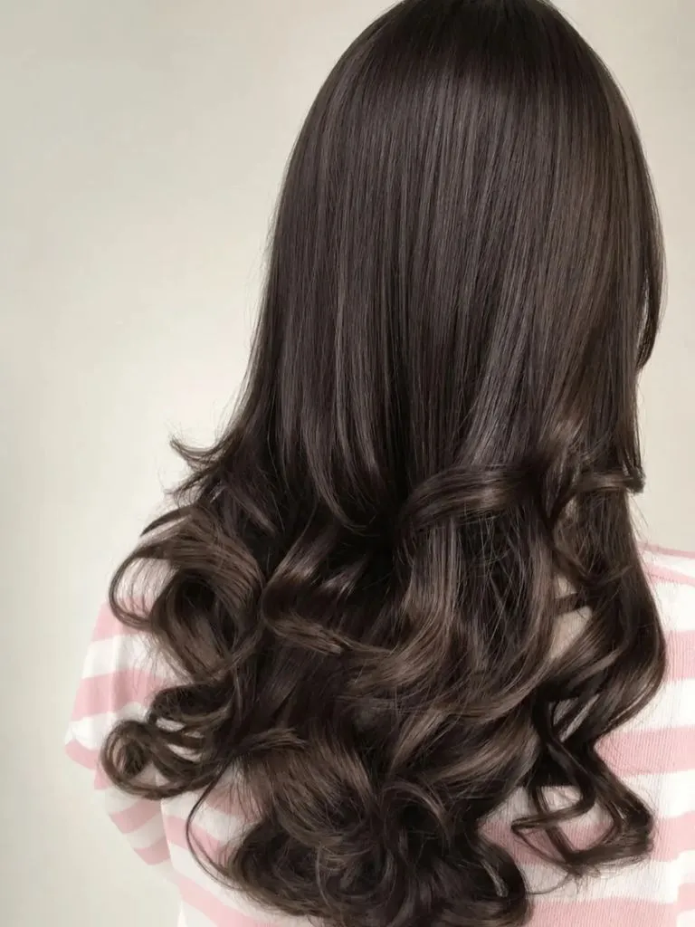
The pale cream background is unusual in this set and it changes everything: with nothing dark behind, the hair’s outline becomes the strongest line in the frame, and the negative space around the curls is what makes them legible. A pink-and-white striped sleeve at the shoulder is the only pattern in the image, and its light value keeps the brown from looking heavy. The sharpest contrast falls where the curl’s inner edge turns away from the light.
After the two reds above, this reads notably quieter, and that is its argument. Cool brown at this depth needs no maintenance beyond a gloss, and the entire effect depends on shine, which makes it the lowest-commitment option in this whole set.
19. Strawberry Copper Wraps a Bouncy Blowout
Volume and colour are inseparable in this one. A warm strawberry copper covers a mid-length blowout with strong body through the crown and outward-flicking ends at the jaw and shoulder. Because the sections are large and smoothly brushed, the colour arrives in wide sweeping planes, each one a slightly different brightness depending on how it faces the light.
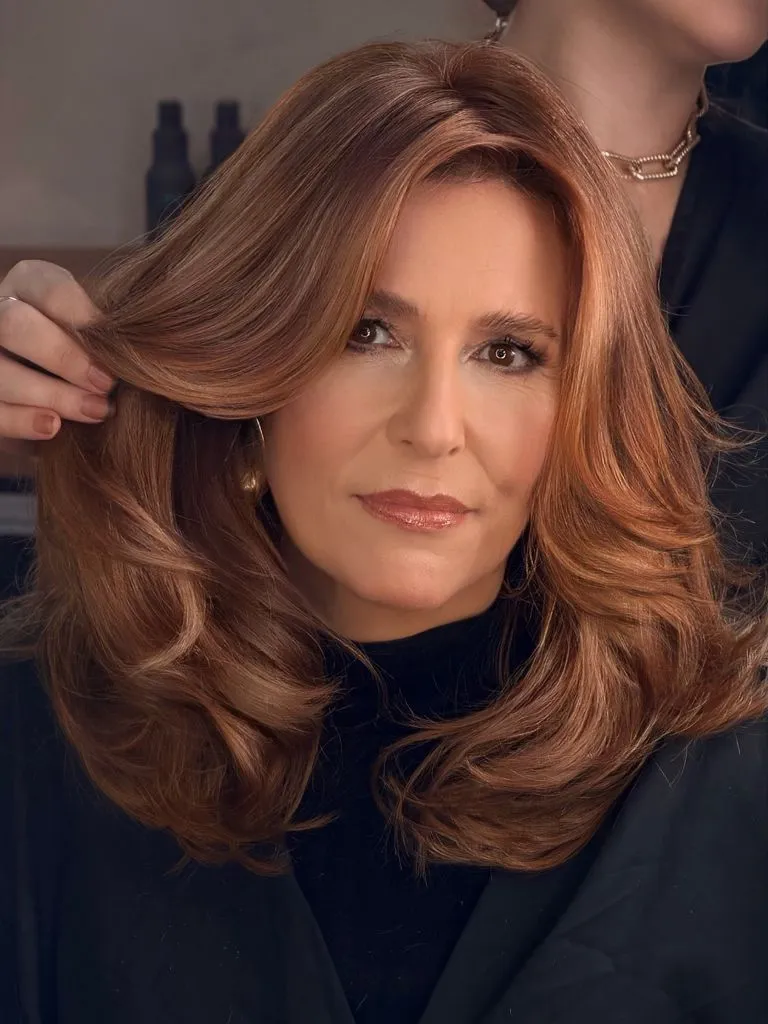
Finer golden pieces run through the top surface and along the front section being held up by a hand, and those are what give the shade its strawberry cast rather than a flat orange one. A black high neck erases the shoulders, gold earrings echo the warmest tone in the hair, and the dark blurred background contributes nothing but depth. The clearest endpoint is the rolled under-curve where the length turns at the collarbone.
The lesson here is about scale of section. Copper on large, smooth planes looks expensive; the same tone broken into fine pieces looks scattered. If you have this shade and it reads dull, the fix is often in the blow-dry rather than in the colour.
20. Bronde Root Fades Into Icy Waves
The gradient is the whole design. A warm bronde occupies the top third, cooling steadily through the mid-lengths until the ends land as an icy grey-blonde, with the change spread over so much length that no boundary is identifiable anywhere. Deep uniform waves start at roughly chest level and run to the bottom, stacking the pale tone into repeating horizontal bands.
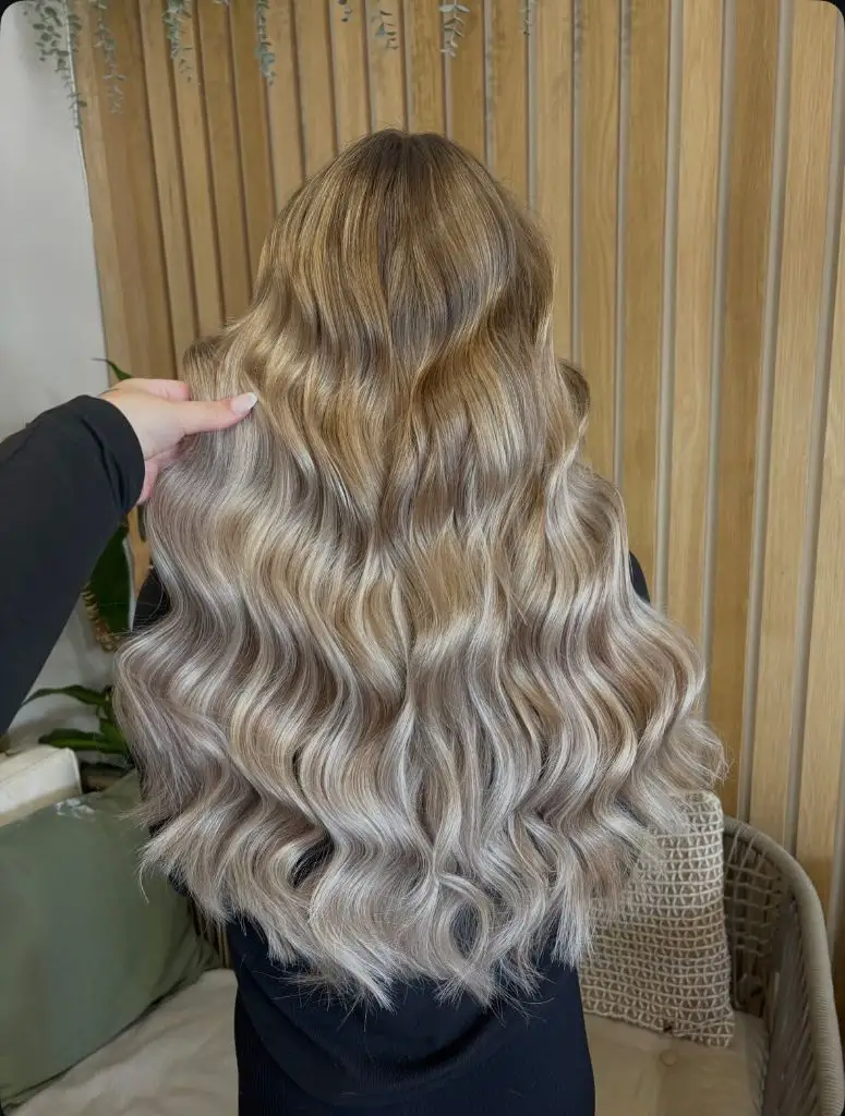
Wooden slats and a sage cushion behind supply warmth that the ends deliberately do not have, which is what makes the coolness at the perimeter read as a choice. Within the waves, darker beige shadows appear at every turn, and they are the reason the icy sections look bright rather than washed. The black top at the shoulder closes the bottom edge, as it does in most of the images here.
Push this further by extending the cool zone two inches higher; soften it by adding a warmer gloss to the mid-lengths only. Either way, the long transition is what makes the grow-out painless, and losing it in the name of brightness at the root is usually a bad trade.
21. Mushroom Ash Follows a Glossy Wave
Set pattern dominates before colour does. A mushroom ash blonde over a slightly deeper root has been styled into uniform, tightly aligned Hollywood waves that run from the temple to the chest in continuous ridges. Because every ridge sits at the same interval, the colour reads as alternating stripes of bright and shadow, and the shade itself looks cooler than it probably is.
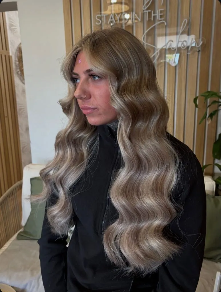
A darker beige runs through the interior of each wave and a pale grey-blonde sits on every crest, and that pairing is the whole colour story — there are no third tones to manage. The black zip top holds the darkest value, and the pale wood and greenery behind stay soft enough to read as background rather than palette. The sharpest contrast in the image is between the crest and trough of a single wave, not between root and end.
Compared with the tousled blondes earlier in this set, the mirrored wave pattern makes the colour look more even than it is, which is worth remembering when you judge a shade from a styled photograph. Air-dried, this same head would read considerably warmer.
22. Icy White Tops a Textured Lob
The brightest section sits highest, which is unusual here. An icy near-white blonde covers a collarbone-length lob, and while a soft grey-beige shadow sits at the root, the crown and the top surface are the palest parts of the whole head. The cut is textured with an uneven perimeter, so the bottom edge breaks into separated pieces rather than a solid line.
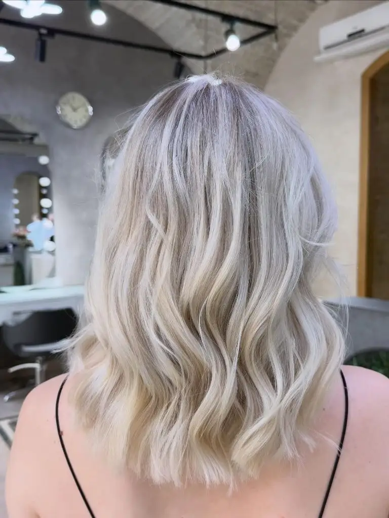
Bare shoulders and thin black straps put the only strong dark note at the very base of the frame, and the pale concrete walls behind match the hair’s value closely enough that the outline goes soft at the edges. Inside the length, faint beige ribbons appear where the waves overlap, and those are the only thing keeping the white from flattening completely. The clearest endpoint is the choppy hem just past the shoulder.
Among winter hair colours, white blonde is the least forgiving on grow-out and the most dependent on toning, and the visible root shadow here is what buys it time. If that upkeep is not realistic, the icy-ends look from earlier in this set delivers a similar impression from a much darker top.
23. Soft Beige Blonde Rounds the Volume
Shape leads more than tone. A soft beige blonde sits across a mid-length blowout with heavy rounded volume through the crown and a deep side sweep crossing one eye. The shade is close to uniform, slightly warmer at the ends and slightly deeper at the parting, so the head reads as a single continuous mass of light colour with the styling supplying all the dimension.
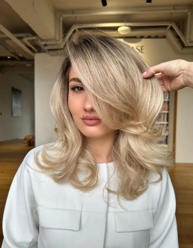
The white shirt with its two front pockets keeps the lower frame as bright as the hair, which removes the outline entirely and lets the volume become the silhouette. Fine darker strands run through the underside of the sweep and along the back of the crown, and they are what stop the pale tone from looking papery. Warm wooden flooring behind repeats the beige undertone at a lower intensity.
If you like this level of softness, the practical approach is to build the colour as a close-toned beige blonde rather than chasing brightness, because volume this rounded already reflects a great deal of light. The shade only needs to stay clean; the blow-dry does the rest.
24. Fringe Divides Sandy Blonde at the Face
The fringe reorganises everything. A sandy beige blonde with visible mid-brown roots falls in loose lengths on either side of a soft, wispy fringe that sits just above the brows, and because the fringe is finer than the rest, the light passes through it and it reads paler. The parting is barely visible; the fringe replaces it as the structural line at the top of the head.

Warmth increases downward — the ends are noticeably more golden than the root — and that reversal is what makes the grown-in top look intentional. The black high neck removes the shoulders and puts every bright value in the upper third of the frame, while the strip lighting overhead flattens the tone and shows the shade at its most honest, without the flattering shadow the wave-set images rely on.
The most useful comparison in this whole set is between this and the blunt golden lob above: same broad family of blonde, entirely different reading, because one has an unbroken perimeter and this one is cut into. Colour rarely changes a face; where the hair stops does.