Long and medium layers photograph well when the eye can trace a clear path from root to tip, and the Trendy Haircuts 2027 reading here rewards anyone who steps back from the individual wave or highlight and studies how the whole shape is composed. Proportion between crown and mid-lengths, the spacing of lighter pieces, and where the perimeter finally lands are doing more work than any single styling decision. That framing makes the comparisons ahead considerably easier.
Before scrolling, decide what you want to notice first: the density of the colour field at the root, the point where the layers begin to break the silhouette, or the way the ends either taper or stay blunt. Weigh the trade-off between visible contrast and quiet grow-out, and between movement-heavy layering and the calmer weight of a one-length finish. No single formula on this page is a rule.
1. Icy Platinum Carries a Beach-Wave Perimeter
The dominant element is the near-white platinum, a cool silvery field that runs from a soft root shadow all the way to the ends. Against a burgundy top and a dim hallway, that pale colour reads as the brightest thing in the frame by a wide margin. The waves are loose and uniform, sitting at chest level and below, which lets the tone rather than the shape carry the look.
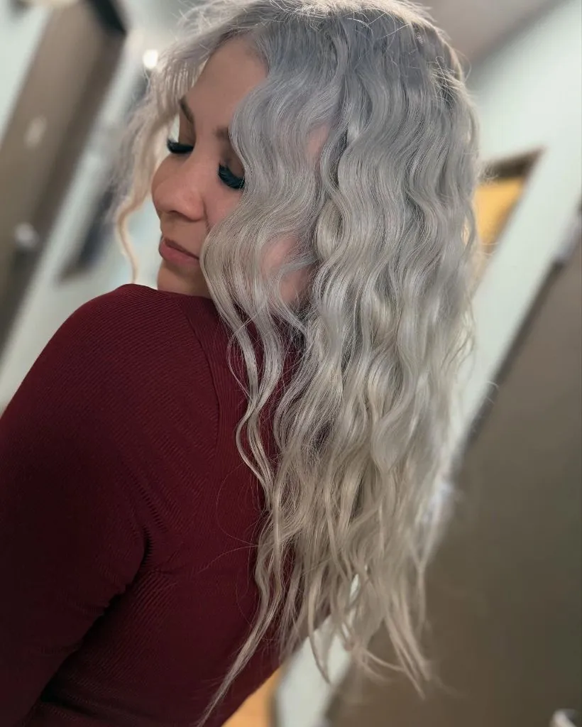
Everything else stays deliberately quiet. The makeup is a single dark lash line, the top is a solid saturated red with no pattern, and the light is warm enough to keep the platinum from turning blue. The waves are dense but even in scale, so no one section pulls focus. The sharpest contrast falls between the pale hair and the burgundy shoulder, giving the composition one clean endpoint rather than several competing ones.
The transferable principle is that platinum this cold needs a warm or saturated neighbour to keep it from reading clinical. Upkeep is the honest limitation here, since a tone this pale shows regrowth quickly and relies on regular toning to stay silver rather than yellow. If the commitment feels heavy, a soft root shadow like the one visible here is the practical compromise.
2. Face-Framing Money Piece Leads a Bronde Base
The composition is built around a warm bronde base with a lighter face-framing section that lands just under the cheekbone. That brighter piece is the first thing the eye finds because it sits directly against the skin and catches the room light. Length falls a few inches below the collarbone, and the waves are soft rather than defined, which keeps the emphasis on colour placement rather than curl pattern.
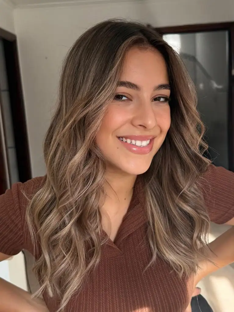
The supporting cast is a mid-brown root that grounds the lighter pieces so nothing floats. Highlights are ribboned rather than solid, echoing the same tone as the money piece further back through the mid-lengths. A rust-brown top repeats the warmth in the base, and the natural daylight keeps everything on the golden side of neutral. The clearest endpoint is the pale strand curving around the jaw.
Among Trendy Haircuts 2027, this is a useful example of how a single brighter section near the face can do the work of a full highlight without the maintenance. To soften it further, choose a bronde only a shade or two lighter than the base; to push it, take that same piece another two levels up and keep the rest untouched.
3. Natural Curl Pattern Sets the Whole Silhouette
Here the shape is dictated entirely by the curl itself. Ringlets of varying diameter build outward from a centre part, creating a rounded, roughly triangular silhouette that widens at the mid-lengths before tapering slightly at the ends. The base is a medium brown with subtle warmer pieces lit through the surface. The salon cape crops the frame at the shoulders, so all visual weight lives above the collarbone.
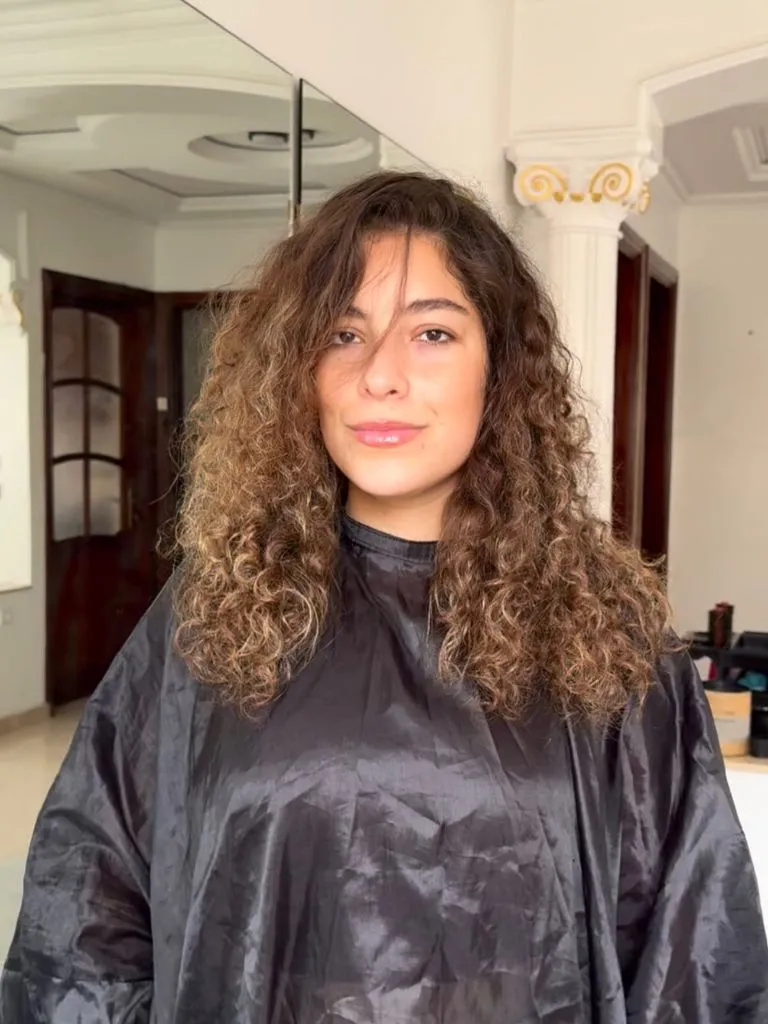
The palette is quiet on purpose. The cape is a matte black that flattens the lower half of the image and pushes every bit of texture upward. Warmer caramel pieces sit mostly around the face and through the ends, which is where the curl catches the most light. There is no styling product visible enough to change the pattern, so what you see is the hair’s own scale and density rather than a set look.
Compared with the beach waves in item one, this reads as an entirely different mechanism: the curl is the cut, and the cut lives or dies by how the layers are placed inside it. The honest limitation is that curl this dense needs internal layering to avoid a heavy triangle, and any highlight has to be painted with the pattern in mind rather than in horizontal foils.
4. Ribboned Highlights Break Up a Dark Base
The dominant reading is a dark espresso base threaded with fine, cool-toned highlights that run from mid-shaft down. Seen from the back, the hair falls to mid-back in loose, brushed-out waves, and the highlight pattern is thin and evenly spaced rather than chunky. The overall value stays dark; the lighter pieces work as thin ribbons of contrast rather than a second colour field.
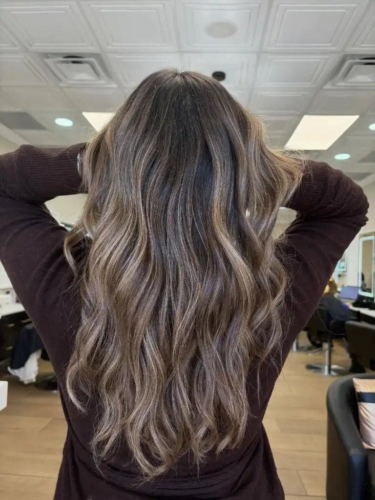
The supporting elements confirm the intention. The maroon sweater keeps the palette in a cool-warm neutral zone, and the salon background is muted enough that the hair does not have to fight for attention. The sharpest contrast sits between the near-black crown and the ashy pieces just below it, giving the eye a clear place to start. The waves are brushed rather than defined, so the ribboning reads as vertical movement rather than curl.
For anyone drawn to Trendy Haircuts 2027 that keep dark hair looking dark, this is the practical benchmark: enough dimension to catch light, not so much that regrowth becomes a problem. The trade-off is that ashy highlights on an espresso base can pull warm over time, so a cool-leaning gloss every few months is part of the routine rather than an optional add-on.
5. Copper Waves Frame a Side Profile
The dominant element is a warm copper-brown that reads uniformly across the length, with slightly brighter pieces catching light around the crown and through the front. The subject is turned in profile, so the wave pattern is visible in a clean single plane: soft S-bends beginning around the ear and continuing to mid-chest length. The striped knit in the foreground keeps the visual field organized in strong horizontal lines.
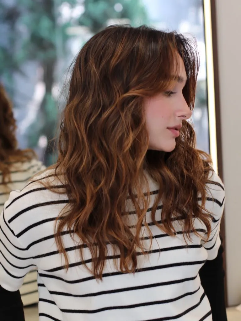
Palette-wise, the copper repeats warmth already present in the skin, and the black stripes in the top act as a rhythmic counterpoint to the vertical fall of the hair. Highlights are subtle rather than mapped, functioning as gloss more than colour. The clearest endpoint is the point where the waves meet the striped shoulder, since that is where value contrast is highest. Everything else stays intentionally low-volume so the tone can lead.
The lesson here is about how a single warm colour can carry an entire look when the styling stays restrained. To push it further, a slightly deeper root would give the copper more depth; to soften it, a half-shade cooler gloss would pull it toward auburn without abandoning the warmth entirely.
6. Sunlit Balayage Meets a Soft Middle Part
What controls the image is the way the balayage sits: darker at the root through the top third, then opening into a mix of honey and beige from the mid-lengths down. Length is well past the shoulders, the part is centred and soft, and the waves are relaxed enough to read as brushed rather than freshly curled. The frame is tight, so the palette does most of the heavy lifting.
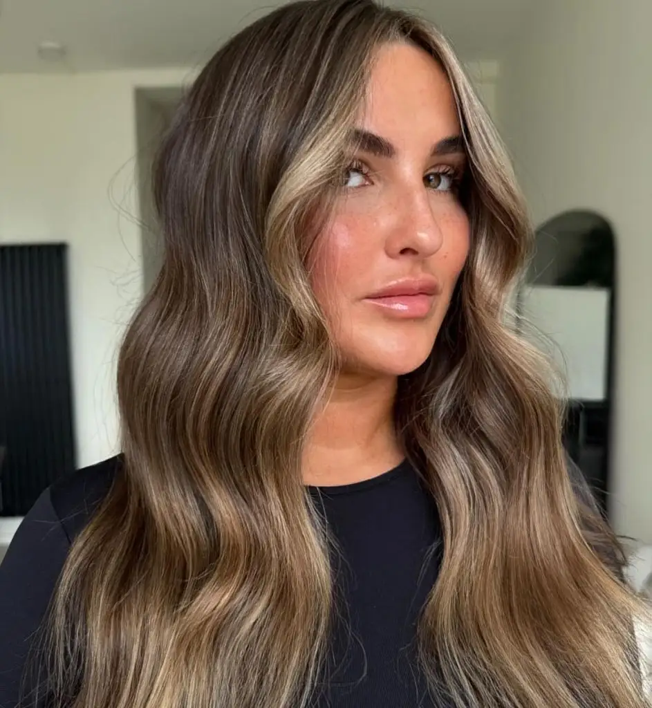
The secondary details reinforce the gradient. A plain black top keeps the lower portion of the image visually silent, and the background is a neutral off-white, so nothing competes with the tonal shift in the hair itself. The lighter pieces cluster around the face, which serves the same function as a money piece but distributed more gradually. The sharpest contrast falls between the deeper root and the sun-lit lengths, giving the composition an implied top-to-bottom direction.
Compared with the fine ribboning earlier, this is a broader, sunnier reading of the same idea — placement over saturation. The honest limitation is grow-out visibility: because the darker root is intentional, it needs to be re-shadowed periodically or it starts to read as an accidental band rather than a designed one.
7. Cool Highlights Cut Through a Deeper Root
The dominant piece is a strong cool contrast between an almost-black root and pale ashy highlights that begin high on the head. In profile, the composition splits neatly into three horizontal zones: dark crown, brightly highlighted mid-length, and looser curled ends that mix both. The overall shape is long, one-length, and glossy, with the curl held just enough to show the lightest pieces spiralling.
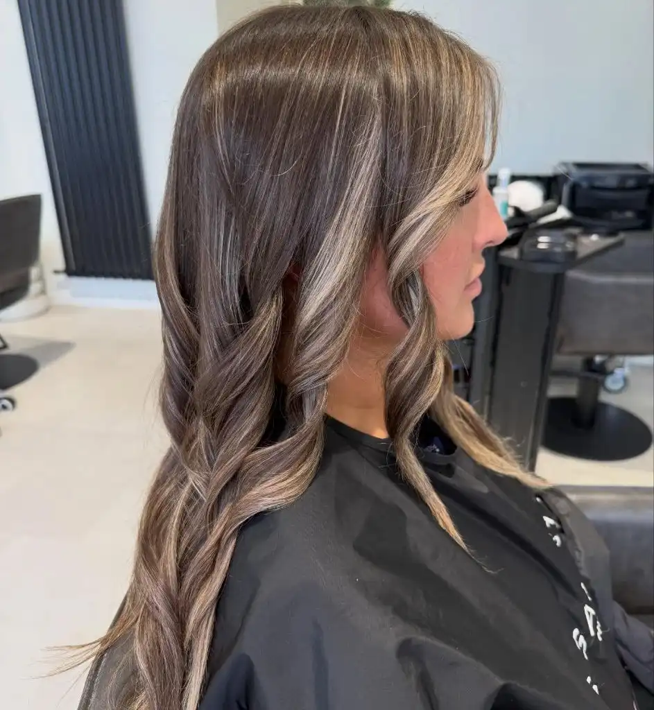
Everything else is arranged to hold that hierarchy. The black cape and dark studio equipment behind the subject remove any competing tone, which lets the ashy highlights read as the brightest thing in the frame. The curl is a soft barrel wave rather than a beach wave, so the lighter strands stay legible instead of dissolving into texture. The sharpest endpoint sits where the pale spirals catch the light near the mid-back.
I like the restraint of that lower taper — the curls narrow rather than fan out, which is what keeps the contrast from turning heavy. The trade-off is upkeep: high-contrast ashy work on this dark a base is one of the more demanding colour choices on the page and does best with a considered toning schedule and a bond-building routine.
8. Buttery Blonde Sits on a Warm Beige Root
Here the emphasis is a warm buttery blonde with a slightly deeper beige root shadow. Length falls to mid-chest, and the waves are loose and soft, with a centre part that lets the root tone act as a subtle frame around the face. There is no strong contrast band; the whole colour field reads as one continuous warm blonde with small gold variations lit through it.
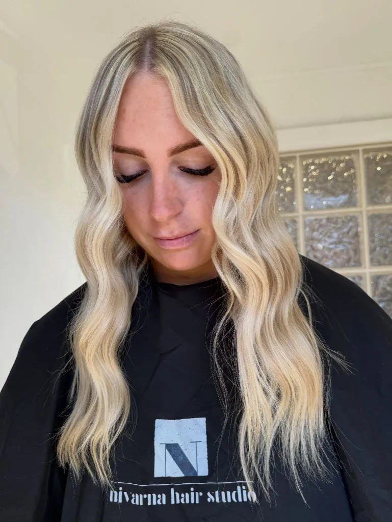
The supporting choices keep everything in the same key. A matte black cape closes off the lower half of the frame, and the natural light through a glass-block window is warm rather than harsh, which encourages the yellow-gold to read as honey rather than brass. Makeup is minimal — a defined lash line and a nude lip — so the face does not compete with the surrounding tone. The clearest endpoint is the point where the waves land on the cape.
Among Trendy Haircuts 2027 for anyone tired of ashy blondes, this is the calmer alternative. To pull it a shade cooler, a beige-based gloss would neutralize the gold without going cold; to push it warmer, leaving a hint more depth at the root would edge it toward a soft bronde.
9. Uneven Perimeter Signals a Growing-Out Blonde
The dominant reading is a blonde that has been pushed hard and now shows it. Seen from behind, the mid-length hair has a pale, slightly straw-toned surface with visible dryness along the perimeter. The lightest sections sit through the mid-lengths, and the ends splay outward in fine, wispy pieces that break the outer line rather than forming a clean edge. This is a documentary shot, not a finished style.
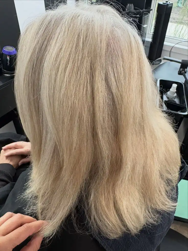
The context tells you what you are looking at. A styling station with a purple-toned bowl is visible on the left, and the hair is sitting flat rather than styled, so texture and porosity are on full display. The palette outside the hair — matte black chair, plain window, small houseplant — is deliberately unimportant. What stands out is the difference in density between the fuller crown and the thinner, more translucent ends.
The useful judgement here is more about diagnosis than aspiration. When a blonde reaches this level of surface roughness, the practical move is often a small perimeter trim, a bond treatment series, and a slightly deeper root shadow to disguise the density loss visually. Compared with the polished blondes elsewhere in this set, this is the honest before-picture the others rarely show.
10. Smoky Green-Ash Balayage Extends Long Layers
The controlling element is an unusually cool balayage that leans smoky green-ash rather than beige. Against a very dark root, the mid-lengths and ends carry a matte, almost mossy tone that softens into a warmer neutral near the very tips. Length is well past the bust, the layers are long and internal rather than face-shaping, and the waves are polished into loose S-bends.
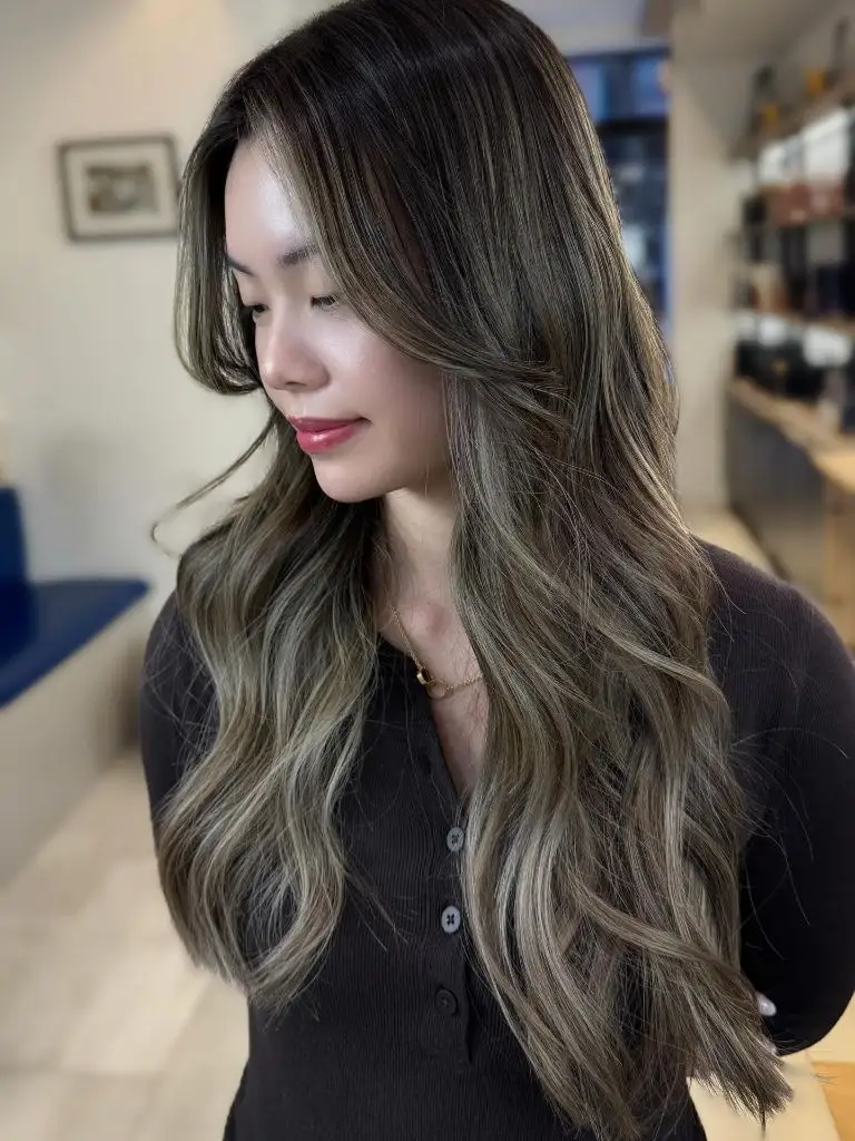
The rest of the frame supports the unusual tone. A soft, warm salon interior with pale wood floors adds enough yellow to keep the ash from reading grey, and the black button-front top removes any competing colour from the bottom third of the image. Face-framing pieces are notably brighter than the interior sections, which gives the composition a clear focal band around the jaw. The sharpest endpoint sits at the curled tips just past the elbow.
Compared with the buttery blonde two items back, this is the same technique used in almost the opposite palette, which is a good reminder that balayage is a placement decision before it is a colour decision. The trade-off with a green-ash direction is that it reads dramatic in daylight and can flatten under warm indoor bulbs, so choose it knowing where you spend most of your time.
11. Bold Blocks of Gold on Espresso
The dominant element is high-contrast chunky highlighting on an espresso base — thick, near-solid bands of warm gold running from root to end. Seen from above and behind, the pattern reads almost as stripes, with dark negative space between each block. Length is roughly mid-back, and the hair is styled straight, which makes the highlight placement legible in a way no wave pattern would allow.
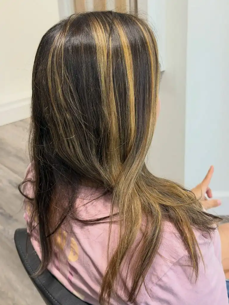
The supporting cast is minimal on purpose. A pale pink top and a matte black chair keep everything outside the hair in a low-saturation register, so the gold-on-black contrast in the hair itself becomes the only real event in the frame. There is no gloss or shine spray softening the edges, which is what allows the blocks to read as blocks. The clearest endpoint is where a single gold section wraps forward over the shoulder.
The lesson here is about scale: this is the opposite of the ribboned work earlier in the set, and it commits to that difference rather than hedging. If chunky highlighting appeals but this feels loud, the practical adaptation is to keep the same width but drop the contrast a level, so the gold sits closer to a caramel and the base closer to a dark chocolate.
12. Beachy Blonde Rides a Deeper Shadow
The composition centres on a broad, sunlit beach-blonde palette that begins with a well-defined darker root and opens into mixed honey, beige, and gold from the mid-lengths down. Length is roughly mid-back and the waves are wide barrel curls brushed out enough to look lived-in. Seen from behind, the pattern of light and dark is symmetrical around a soft centre part.
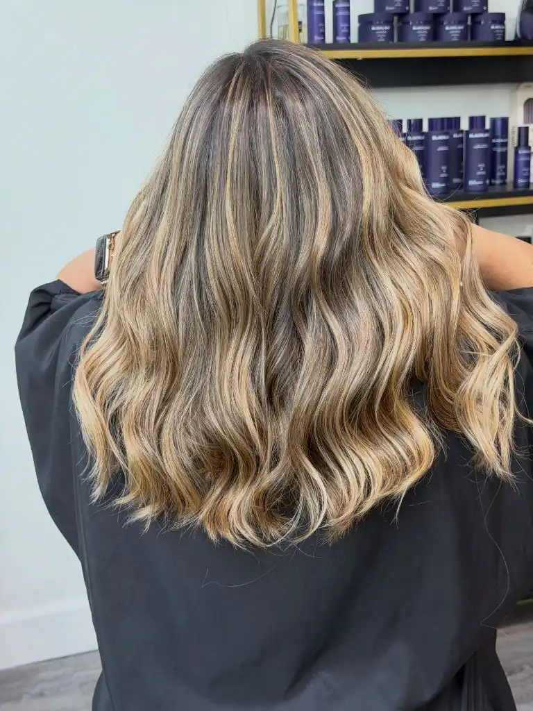
Everything supporting this reading is quiet. A black top and a shelf of dark blue product jars in the background sit outside the warm palette entirely, which is what allows the multiple blonde tones to be read as variations rather than a single flat colour. The waves are consistent in scale, so no one section overpowers the others. The sharpest contrast falls at the crown, where the root shadow meets the brightest highlights.
For anyone drawn to Trendy Haircuts 2027 that photograph well without heavy styling, this is a useful reference — you can see how much of the effect is placement rather than heat. The transferable principle is that a slightly deeper root buys longer wear between salon visits, and a wave brushed once through is more forgiving in daylight than a defined curl.
13. Sun-Kissed Ribbons on a Neutral Brunette
The dominant reading is soft. A neutral brunette base carries fine sun-kissed ribbons that concentrate around the face and travel through the mid-lengths in a diagonal pattern. Length is just below the shoulders, the wave is loose and asymmetric, and the front pieces sweep across the forehead. The frame is close, so the palette relationship between skin, hair, and top does the compositional work.
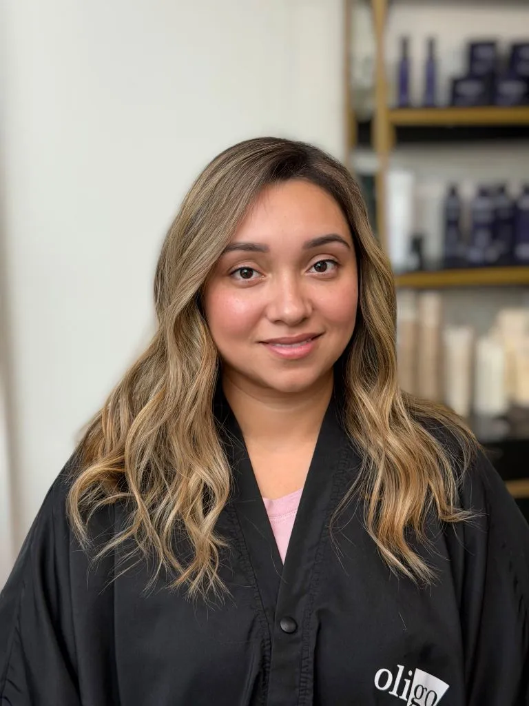
The supporting elements are all understated. A black salon jacket sits low in the frame, and the pale pink tee just visible at the neckline echoes the warmth in the skin without competing with the hair. The background shelves are blurred into vertical bands that mirror the vertical fall of the highlights. The sharpest endpoint is the brightest piece curving across the cheekbone, which is where warm light lands most directly.
Compared with the chunky gold two items back, this reads notably quieter. The honest limitation is that fine ribbons like these can look almost invisible in cool indoor light, so this is a technique best matched to someone who spends real time in daylight and does not need the colour to read as a statement from across a room.
14. Contrast Roots Anchor a Bright Money Piece
Here the dominant element is a strong, high-placed money piece: two thick bright sections framing the face against a much darker root and mid-length. In profile, the composition splits vertically — a dark canopy at the top, a bright band along the front, and a mix of both through the waves below. Length falls past the bust, and the curl is a soft, brushed-out barrel wave.
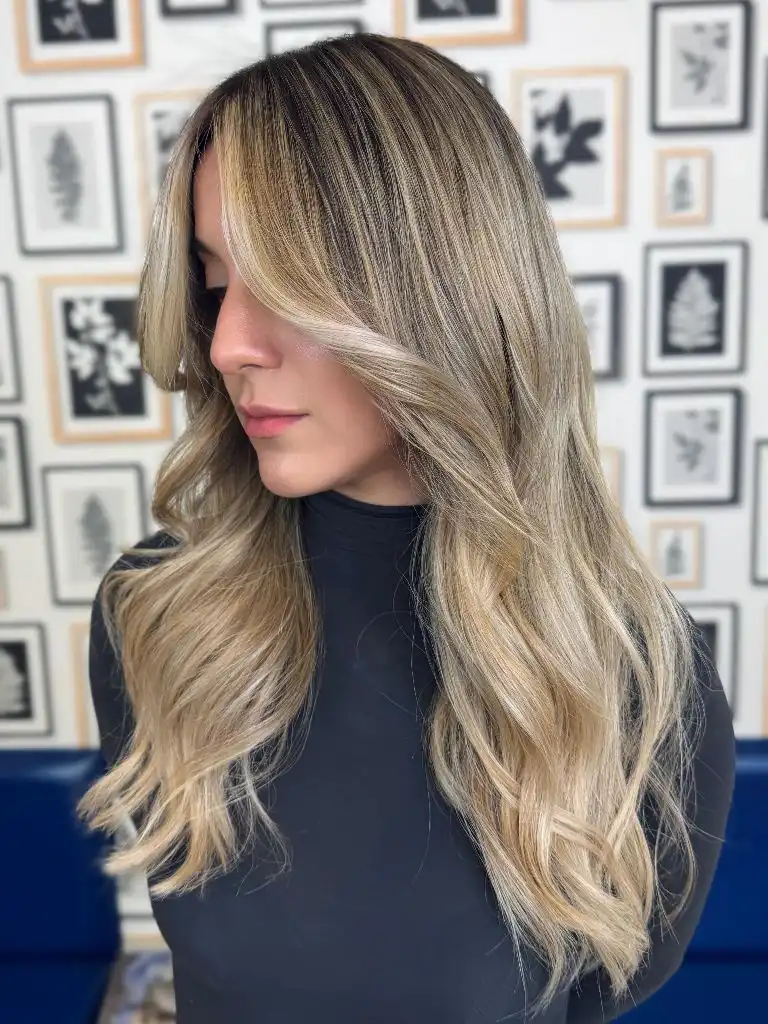
The supporting details keep the eye on the frame. A black turtleneck removes any lower-body distraction, and the wall of small black-and-white botanical prints behind the subject creates a neutral, patterned field that echoes the contrast in the hair itself. The lightest pieces sit exactly where they will be visible when the hair is worn down or tucked, which is the whole practical case for a money piece placed this high. The sharpest endpoint is the lightest strand along the jaw.
The transferable principle is placement over percentage: this is not a lot of light hair by volume, but its position makes it read as more. If you want the effect without the commitment, test-drive the idea with a temporary root shadow first and see how the contrast reads in your usual lighting before booking a full appointment.
15. Silvery Highlights Stack Against a Sandy Base
The dominant reading is layered rather than blended. A cool sandy blonde base is stacked with clearly separated silvery highlights that run in narrow columns from root to end. In profile, those columns line up almost vertically, and the waves at the bottom compress them into a tighter S-pattern. Length is mid-back, and the fringe area sweeps forward across the eye.
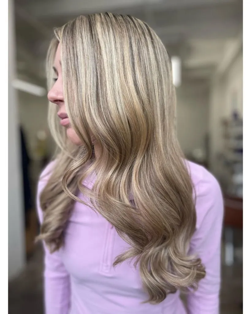
Supporting the composition, a pale lilac quarter-zip top brings a cool cast into the lower half of the frame that quietly echoes the silver in the hair. The background is a blurred neutral salon interior, so nothing competes with the vertical rhythm above. Highlights stay narrow rather than expanding into the base, which is what keeps the pattern legible as stacking rather than blending. The sharpest endpoint sits at the curled tip that catches the ceiling light.
Compared with the softer sunny ribbons earlier, this is a much more deliberate, structural approach to the same base tone. The trade-off is that stacked highlights are easier to see when they start to grow out — a well-placed root shadow at the six-week mark is essentially part of the plan rather than a repair.
16. Hollywood Waves Extend Ash-Beige Mid-Lengths
The dominant element is the wave itself: uniform, glossy Hollywood-style S-bends that fall in a nearly perfect vertical column from crown to mid-back. The colour is a cool ash-beige with a deeper shadow at the root, and the wave pattern is where light and shadow alternate most rhythmically. From the back, the composition is symmetrical around a centre part, and the ends curl inward rather than flicking out.
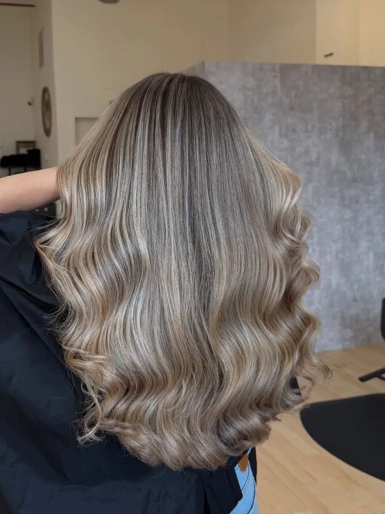
Everything else in the frame supports the wave. A textured grey wall and pale wood floor keep the palette neutral, and a black cape closes off the shoulders so the waves become the entire subject. The gloss on the surface is what allows the ash tones to read as expensive rather than dull — matte finishing on the same colour would flatten it considerably. The sharpest endpoint is the point where the last curl finishes just above the waist.
Among Trendy Haircuts 2027 that lean formal, this is the reference to save. The honest limitation is that a wave this defined is a styled look rather than a background one; the cut and colour translate to everyday wear, but the specific S-pattern shown here will not survive a full day and a night without a reset.
17. Bright Mid-Section Divides a Waved Blonde
The controlling piece is a bright, almost silvery mid-section that sits between a shadowed root and warmer-toned lower waves. In profile, the composition reads as three horizontal bands: darker at the crown, brightest at ear-to-shoulder level, and slightly warmer through the curled ends. Length is a little past the bust, and the waves are polished but relaxed.
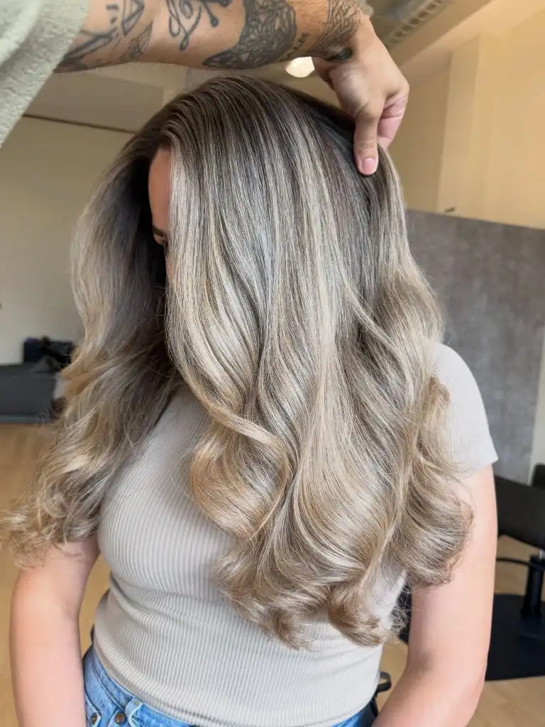
The supporting cast is quiet and warm. A cream ribbed top and pale denim keep the lower half of the frame in low contrast, which is what allows the tonal banding in the hair to be read clearly. A tattooed hand lifting a section adds a small dark accent near the top of the frame that mirrors the dark root, giving the composition a symmetry it would not otherwise have. The sharpest endpoint sits at the brightest strand catching the ceiling light.
Compared with the Hollywood waves in the item just above, this is a looser, more casual read of similar cool tones. The transferable principle is that placing the brightest value in the middle rather than at the ends is a way to make the face-framing zone feel lit without committing to a full ombré.
18. Long Layers Frame a Warm Chestnut
The dominant element is a warm chestnut brown cut into long layers that fan outward from the crown. In profile, the layering is visible as a series of soft steps: shorter pieces flick away from the face at cheek and chin level, while the length continues past the bust. The curl is a large barrel wave that opens the shape outward rather than compressing it down.
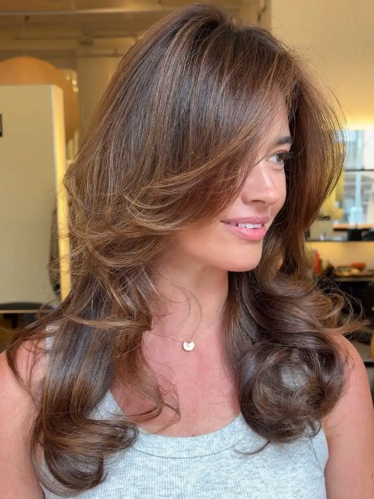
The supporting details keep the emphasis on movement. A pale grey ribbed tank and a small gold pendant sit low and neutral in the frame, letting the volume in the hair be the loudest thing on screen. Warm interior light picks up subtle bronze pieces through the surface, which reads more as gloss than as highlight. The sharpest endpoint is the outward flick just below the jaw, which is where the layering announces itself most clearly.
For anyone weighing long layers versus a blunter one-length shape, this is the clearer argument for layers: the movement is built into the cut rather than into the styling, so the shape survives brushing. The trade-off is bulk management — this much volume needs internal thinning at the right density or it can read helmet-shaped.
19. Cool Slivers Move Through a Dark Base
The dominant reading here is subtlety. A near-black base carries very fine, cool slivers of highlight that only reveal themselves when the light catches the surface. In profile, most of the hair reads as one continuous dark colour field, with occasional narrow pieces of grey-brown running through the mid-lengths. Length is well past the bust, and the wave is loose and slightly wind-blown.
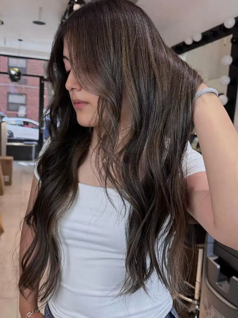
The rest of the frame reinforces the low-key palette. A plain white tank and a mirror-lit vanity in the background keep the visual field bright but empty, so the eye is pulled back into the darker mass of the hair to look for the small tonal shifts. The city view through the window adds neutral grey buildings that quietly echo the ashy highlight tone. The sharpest endpoint is a single lighter piece falling forward across the chest.
Compared with the strong contrast pieces earlier in the set, this reads as almost the ambient version of the same idea. The lesson is that dimension does not need to be visible from across the street to be worth doing — some of the most flattering colour work is only obvious in direct light.
20. Deep Violet Red Anchors a Glass Finish
The dominant piece is colour and shine at once: a deep violet-red — plum leaning toward mahogany — worn at mid-back length with an unusually glassy surface. Seen from the back, the hair is styled into wide, brushed S-waves that hold enough tension for the light to run along the curve of each bend. The tone is dark enough to read almost black in shadow and clearly violet in highlight.
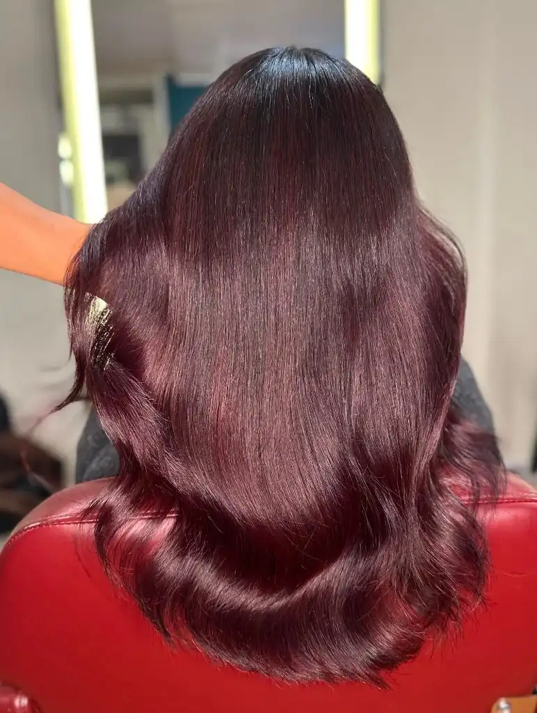
Supporting the reading, a red leather-looking chair below and a dark grey top in the background push the palette firmly into the warm red family without ever repeating the exact hair tone. The material of the chair is not identifiable, so the visible sheen is the useful detail rather than any fabric claim. The gloss on the hair is the sharpest single feature; without it, the same colour would land considerably heavier. The clearest endpoint is the inward curl at the waist.
Among Trendy Haircuts 2027 for anyone considering a saturated departure from natural, this is the safer entry point — dark enough that it grows out gracefully, saturated enough to read as a decision. The trade-off is that violet-reds fade faster than most other colour families and rely on colour-safe washing and cool water to hold their tone between refreshes.
21. Copper Tips Warm a Mahogany Canopy
The dominant reading is a two-tone gradient: a rich mahogany brown across the crown and mid-lengths, opening into clear copper through the last third of the hair. Seen from behind, the transition is placed low, so most of the visual weight stays dark and the warmer tone reads as an accent rather than a takeover. Length is well past the bust, and the wave is a polished barrel curl.
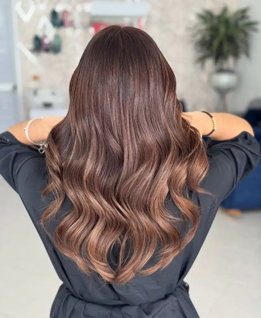
The supporting cast is warm and quiet. A black wrap top, a pale tiled floor, and softly out-of-focus salon decor keep the surroundings in a low-contrast neutral register, which lets the mahogany-to-copper shift be the single tonal event in the frame. Gold jewellery at both wrists picks up the copper without repeating it exactly. The sharpest endpoint sits at the brightest copper piece where the wave curls under.
Compared with the violet-red in the item just above, this is the daytime version of a saturated warm-tone: less commitment at the root, more play at the ends. The transferable principle is that a colour melt placed this low is one of the most forgiving ways to try warmth, since grow-out happens above the transition rather than at it.