There is a particular kind of pressure that settles in around the question of color after fifty. Somewhere along the way, dressing well became confused with dressing quietly, and trendy outfits for women over 50 started to mean safe outfits in muted tones. You do not owe anyone a subdued palette. You get to wear the orange polo and the pink coat and the full leather suit, and the only thing that needs to work is the proportion.
The useful question here is not whether a color is age-appropriate but whether the outfit holds together when you step back and look at the whole frame. A good outfit decision starts before the color — it begins with silhouette, with where the hem falls, with how much structure sits at the shoulder versus how much drape moves at the ankle. This article looks at twenty-three real outfits and judges them by four variables: the color choice and how much of it there is, the proportional balance between the top and the bottom half, the role of accessories in anchoring or interrupting the look, and the texture contrast that keeps a single-color story from going flat. Those are the things that make color feel considered rather than accidental.
1. A Cable Knit Polo Sharpens Relaxed Denim
The strongest visible detail here is the saturated burnt orange of the short-sleeve cable knit polo, which reads as a deliberate warm-season anchor against pale chambray wide-leg pants. The knit has a fitted body with a collar and a single button closure, and the cable pattern adds surface texture that keeps the solid color from reading flat. The pants sit at a natural waist with a drawstring detail and fall in a full, relaxed leg.
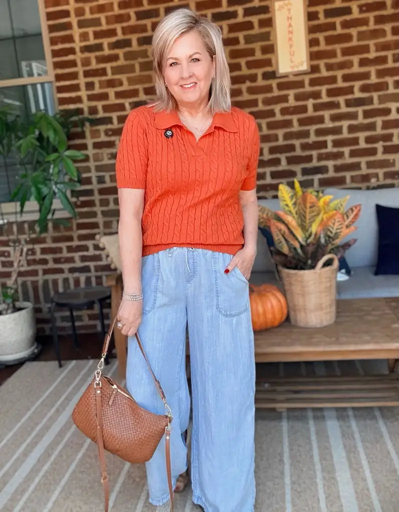
Photo via Instagram
The proportional logic works because the fitted, cropped knit top contrasts the volume below. The brown woven crossbody bag picks up the warm family of the orange without matching it exactly, and the visible brick wall behind reinforces the warm palette as a whole. The eye travels from the collar down to the waistline where the two pieces meet, and that junction is clean because the knit ends right at the waistband. There is smart color pairing in casual separates happening here without any fuss.
The appeal is in how much personality a single color swap introduces. Replace that orange with white and this becomes a background outfit. The lesson is that one richly saturated top piece, fitted and textured, can carry an entire relaxed bottom half without needing a third layer or any jewelry to arbitrate.
2. Burgundy Grounds a Dark Trouser Silhouette
A burgundy crewneck sweatshirt sits above dark navy or black relaxed trousers that taper slightly at the ankle. The sweatshirt is pushed up at the sleeves and reads as a midweight knit or french terry. A dark quilted crossbody bag with a chunky gold chain detail sits at the hip, and tan suede loafers provide the only lightness below the knee. Sunglasses rest on the face and a watch is visible on the wrist.
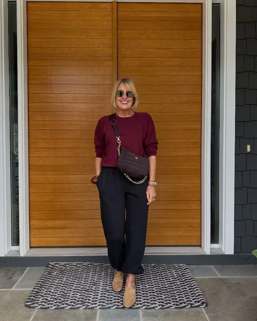
Photo via Instagram
The tonal depth between the burgundy and the near-black trouser keeps the outfit in a narrow value range, and that is what gives it its quiet authority. The loafers interrupt the darkness just enough to prevent the lower half from disappearing, and the gold chain on the bag echoes the warm metal of the watch. Against the warm wood of the door behind, the overall read is considered and autumnal without any pattern or print doing the work.
This is a study in tonal dressing that still separates. The burgundy is close to the trouser value but not identical, and that sliver of contrast is what keeps two dark pieces from merging into one block. Anyone building a darker outfit can take the principle that a single lighter shoe grounds the hemline and gives the viewer a place to land.
3. A Coral Tank Carries White Linen Below
The visible anchor is a coral-orange sleeveless tank in what appears to be a lightweight linen or jersey, tucked or half-tucked into white wide-leg linen pants. The pants have a relaxed, slightly crinkled texture with visible patch pockets and a full-length leg that nearly reaches the ground. Flat sandals in a neutral tone keep the base minimal. A delicate chain necklace is the only accessory.
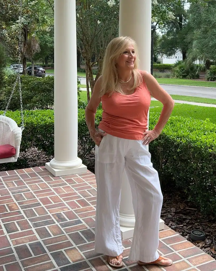
Photo via Instagram
The two-piece color logic is simple — warm top, white bottom — but the proportions earn it. The fitted tank defines the shoulders and torso while the wide linen leg adds generous volume below the hip, creating the inverted triangle that naturally draws the eye upward. The backdrop of white porch columns and brick flooring reads as Southern or coastal, and the relaxed linen texture aligns with that setting rather than fighting it. The coral is warm enough to function as a color statement but soft enough that it does not compete with the white expanse below.
The strength here is restraint in accessories. No bag, no belt, no layered bracelets — the outfit carries itself on two pieces and lets the color contrast do the talking. That is a transferable idea: when the bottom half is white and generous, the top only needs to deliver one clear color to complete the frame.
4. Green Knitwear Frames a Floral Scarf
A bright kelly green crewneck sweater is the starting point, and then a floral scarf in green, blue, and cream tones is draped around the neck, tying the sweater into a broader palette. Dark straight-leg jeans sit below, ending just above white sneakers. A structured blue handbag, possibly leather, is carried at the elbow. Large tortoiseshell sunglasses and gold jewelry — a bracelet, earrings — complete the visible accessories.
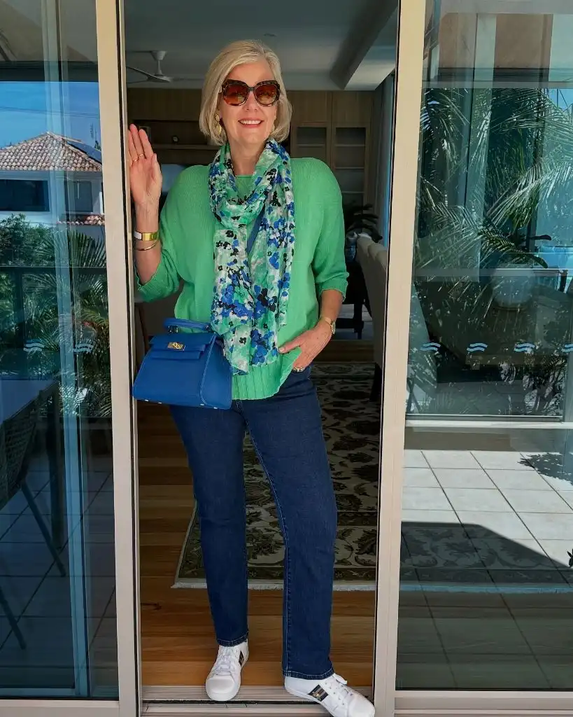
Photo via Instagram
The scarf does the most important work because it introduces blue and cream into a green story that might otherwise read as monochrome. The blue bag picks up the scarf’s blue tones and repeats them lower in the frame, which creates a vertical color thread from neckline to hand. The white sneakers provide a clean break at the bottom and keep the dark jeans from making the lower half feel heavy. Through the glass door behind, warm interior tones are visible, giving the green a context that reads as vacation or resort.
I like the way the scarf acts as a bridge between the sweater and the bag. Without it, the green top and blue bag would sit in two separate color zones with nothing connecting them. The principle is that a printed accessory at the neckline can unite two distinct solid colors by carrying traces of both, and this works especially well in casual layered outfits where the pieces are simple on their own.
5. Black Leather Layers Build a Single Texture Story
The entire outfit reads as one material: a black leather or faux-leather moto jacket sits open over a light grey crewneck tee, and black leather or faux-leather straight-leg trousers with an elastic waistband continue the material below. The trousers have a slight sheen that matches the jacket. Glasses with translucent frames are the most personal visible accessory. The background is dense green foliage with a stone garden ornament partially visible at the base.
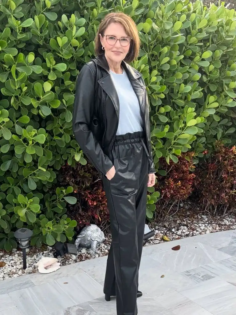
Photo via Instagram
The grey tee is doing critical work here — it creates a break between two expanses of the same dark material, preventing the outfit from collapsing into a single black column. The elastic waistband on the trousers signals comfort and easy movement, which softens the edgier associations of leather. The foliage behind adds a strong green contrast that makes the black read richer and more deliberate by opposition. This is a look that benefits from context: the garden setting keeps the leather from feeling too urban or too severe.
This is the kind of outfit that proves leather trousers do not need heels or evening light to function. The elastic waist and the simple tee make the material approachable, and the jacket layers without adding a different texture. The transferable idea is that committing to one material across two garments works best when a contrasting mid-layer in a lighter value opens up a breathing space at the center.
6. A Striped Knit Tank Anchors Wide White Pants
A sleeveless knit tank in cream with horizontal navy stripes is tucked loosely into white or off-white wide-leg cargo-style pants with visible patch pockets. The pants have a relaxed fit and end above black slide sandals with a platform espadrille sole. A black crossbody bag or backpack-style bag hangs over one shoulder. The setting is an interior hallway with pale wood flooring and a modern glass door.
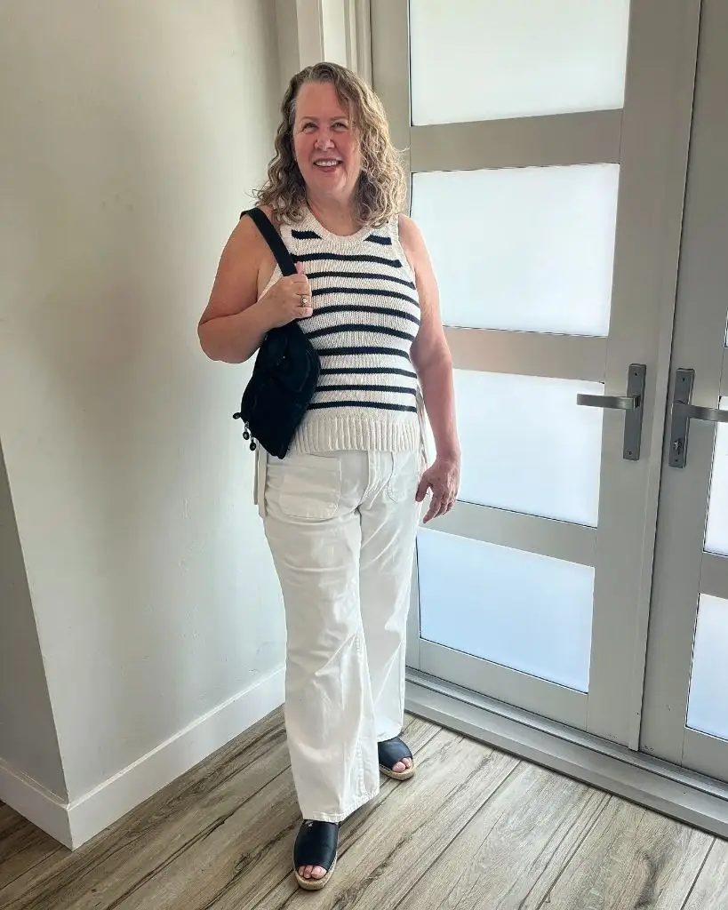
Photo via Instagram
The stripe width is generous — these are not pinstripes — and that gives the top enough visual weight to hold its own against the wide white expanse below. The black bag and black sandals create a secondary color thread that bookends the look, appearing at the shoulder and the foot but nowhere in between. The white pants and cream tank share a value range that keeps the outfit feeling light and unified, while the navy stripe introduces enough contrast to prevent everything from washing out together.
The value is in the deliberate simplicity. Three colors — cream, navy, black — and three pieces, with no competing prints or layered accessories. The takeaway for anyone working with wide white pants is that a bold horizontal stripe on a fitted tank gives the upper body enough graphic weight to counterbalance volume below, and a dark shoe at the base gives the whole column a definitive endpoint.
7. Red Eyelet Lifts Crisp White Shorts
A red eyelet or broderie anglaise blouse with flutter cap sleeves and a V-neckline is tucked into white tailored shorts with a black leather belt. The shorts have a clean, pressed appearance with visible front pockets. Black slide sandals with a buckle or strap detail sit at the base. Gold hoop earrings and a stack of gold bracelets are the visible jewelry. The setting is an elegant hallway with dark hardwood floors, a runner rug, and traditional architectural details.
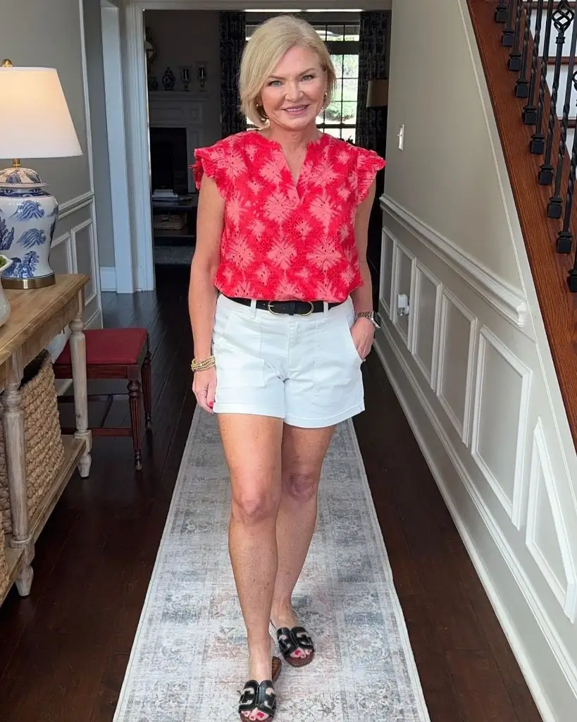
Photo via Instagram
The eyelet texture in the red blouse is the detail that separates this from a simple red-and-white combination. The perforated pattern creates small shadows within the fabric, adding dimension without introducing a second color. The black belt at the waist draws a clean horizontal line between the two halves and gives the eye a place to register the transition. The flutter sleeve keeps the shoulder soft and avoids any structured or boxy read. Against the traditional hallway setting, the outfit reads as polished warm-weather dressing rather than casual beachwear.
The best detail is the texture within the red. A smooth red blouse would still work with white shorts, but the eyelet adds an interior rhythm that makes the piece worth looking at longer. The transferable idea is that choosing a textured version of a bold solid — lace, eyelet, jacquard — adds depth without adding color complexity, and that single material upgrade can shift a basic pairing into something more considered.
8. Mixed Textures Interrupt a Burgundy Leather Coat
This outfit layers multiple textures and materials in a way that resists easy summary. A long burgundy coat combines what appears to be patent or high-gloss leather panels with a sherpa or teddy-textured collar and partial lining. Beneath it, a patterned high-neck blouse in grey tones with small disc-like embellishments is visible. The lower half shows layered skirts — a dark outer layer and a grey tulle or pleated underskirt. Black platform lace-up boots anchor the base. Silver-grey hair, round glasses, and statement rings complete the visible details.
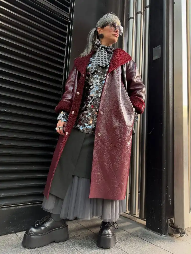
Photo via Instagram
The sheer volume of texture in play here — gloss, sherpa, disc embellishment, tulle, matte fabric, chunky boot sole — would overwhelm most outfits, but the narrow color range holds it together. Everything sits within burgundy, grey, and black, so the eye registers variety without chaos. The platform boots are essential to the proportional logic because the heavy skirt layers need a substantial base to avoid dragging the silhouette downward. The industrial metal backdrop reinforces the urban, avant-garde context.
The effect is intentional maximalism within tonal discipline. This photograph openly shows a more editorial and directional approach to dressing over fifty than many of the other images here, and that is its value — it demonstrates that restraint can live in color choice rather than in the number of pieces. The principle is that multiple textures coexist peacefully when they share a color family and when the footwear is substantial enough to support the visual weight above.
9. A Camel Coat Warms a Tonal Cream Base
A camel or light brown wool-blend coat with a single-breasted closure sits open over a cream button-front shirt and cream or stone-colored drawstring trousers with a wide leg. The trousers have a visible piped seam detail running down the front. Tan platform loafers or moccasins are partially visible at the hem. The person is taking a mirror selfie, and the warm-toned living room behind — beige sofa, wood floors, wood slat room divider — reinforces the tonal palette.
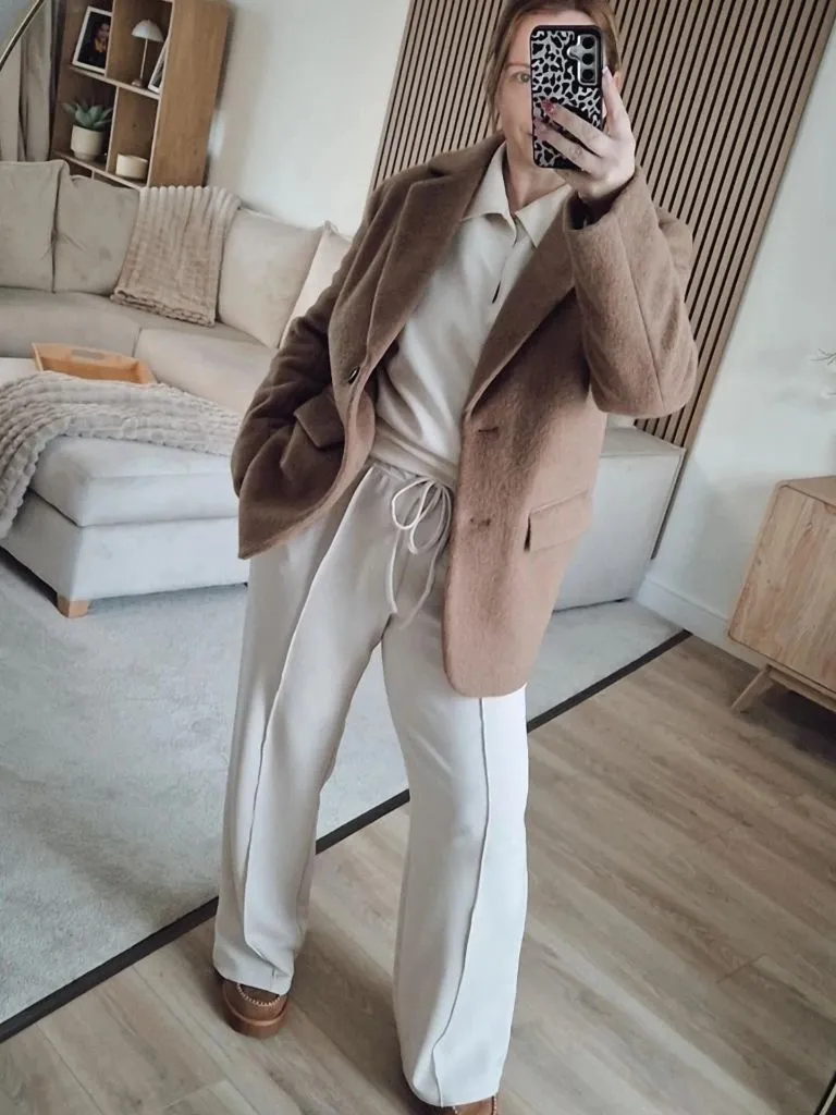
Photo via Instagram
The tonal range here is extremely narrow: everything from the coat to the trousers to the shoes lives within a cream-to-camel spectrum. What prevents it from feeling washed out is the value step between the darker coat and the lighter pieces beneath it, plus the visible seam detailing on the trousers that adds a subtle vertical line. The drawstring waist keeps the silhouette relaxed rather than tailored, and the coat provides the only structured element. The living room setting underscores the comfort-first read.
This is a lesson in tonal dressing that works through value variation rather than color contrast. The coat is the darkest note, the shoes are mid-range, and the shirt and trousers are the lightest, so there is a gentle gradient from top layer to base layer. For anyone building a neutral layered outfit, the transferable principle is that a coat two or three shades deeper than the base separates the layers enough to keep the look readable at a distance.
10. Gingham Volume Balances a Simple White Tee
A white crewneck tee with slightly oversized short sleeves is paired with a full gingham midi skirt in black and white. A burgundy or wine-colored sweater is draped over the shoulders and tied loosely at the chest. Dark slide sandals and a small cream pouch bag are held in one hand. Oversized dark sunglasses complete the visible accessories. The setting is a mirror selfie in what appears to be a bedroom with neutral, textured decor.
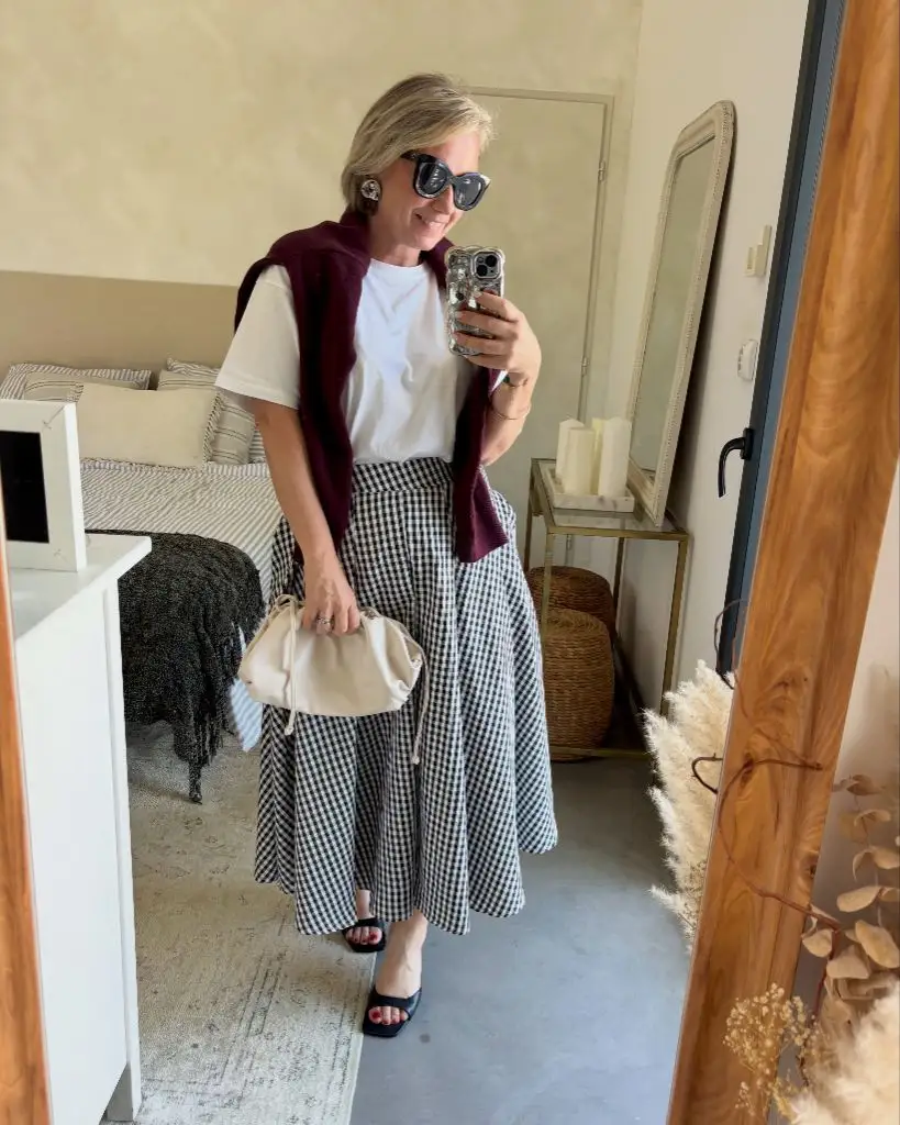
Photo via Instagram
The skirt is the main event — the gingham print is bold in scale and the full, gathered volume creates movement and visual weight in the lower half. The plain white tee acts as a deliberate pause above the pattern, giving the eye a resting point before the gingham begins. The draped sweater in burgundy introduces a warm third tone that prevents the outfit from reading as purely black and white, and the drape itself softens the shoulder line. The cream pouch bag echoes the warmth of the sweater without matching it.
What stands out most is the balance between pattern volume and top simplicity. The skirt could easily overwhelm if the top competed, but the plain tee steps back and lets the gingham carry the visual interest. The transferable principle is that a bold-print full skirt pairs best with the quietest possible top, and that a shoulder-draped knit in a warm accent color can unify the two halves without adding another pattern layer.
11. A Grey Blazer Drapes Over Quiet Neutrals
The visible frame is a seated figure in what appears to be a cafe or lobby. A grey blazer sits draped over the shoulders rather than worn through the sleeves, over a light grey or off-white V-neck tee. Dark wide-leg trousers are partially visible. The most prominent accessory is a chunky multi-strand necklace in gold and dark tones. Tinted sunglasses with a geometric frame, stacked bracelets, and a warm-toned iced drink in hand complete the picture.
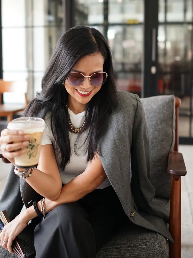
Photo via Instagram
The drape of the blazer is doing something specific — it signals formality without committing to it, keeping the structured shoulder visible while allowing the arms and torso to read as relaxed. The chunky necklace is the loudest element and sits at the focal center, drawing the eye to the neckline where the tee’s V-opening creates a frame. The iced drink and the cafe setting contribute to a reading of understated personal style that does not try too hard but clearly considers each detail.
The appeal is in the shoulder-draped blazer as a deliberate styling choice rather than a moment of convenience. It adds structure to the silhouette outline without restricting movement or adding heat. The principle worth taking is that a blazer draped rather than worn shifts the formality level of any outfit down by half, and a bold necklace can take over the focal point that the blazer vacates when it leaves the front of the body.
12. Black Lace and Velvet Create Evening Depth
This is a portrait-style image that shows a black top or dress with sheer lace sleeves featuring large floral velvet applique over a nude or skin-toned mesh base. The neckline is high — a mock or turtle neck — and the velvet floral motifs are substantial, covering the upper body and arms. Dark wavy hair falls below the shoulders, and a red lip provides the single point of color contrast. The background is dark and neutral, which pushes all the attention onto the garment and the face.
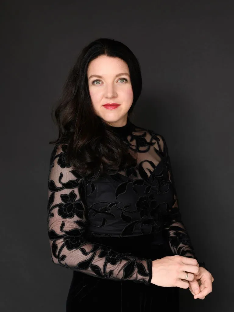
Photo via Instagram
This photograph does not show a full outfit — the image is cropped above the waist, so the reading is limited to the upper body and the material decisions visible there. The sheer mesh panels make the velvet floral motifs appear to float, and that transparency creates visual lightness in a garment that could otherwise read as heavy and opaque. The red lip is critical because it introduces the only warm tone in an otherwise monochromatic frame, and its placement at the face ensures the eye travels upward.
This is where the image limits the analysis honestly: without seeing the lower half, the proportional discussion stops at the waist. What is visible, though, demonstrates that sheer and opaque textures within the same garment can create depth without color, and that a single contrasting detail — here, the red lip — anchors the entire composition. That is a principle that works from neckline to hemline regardless of what sits below.
13. Green Outerwear Commands a White Base
A bright green quilted puffer-style jacket with ribbed knit cuffs and hem is zipped up over an unseen base layer, paired with white straight-leg or slightly flared trousers. Metallic green loafers or flats pick up the jacket color at the foot. Sunglasses sit on the head. The setting is a simple stucco wall with a terracotta tile floor, giving the outfit a Mediterranean or Southern European context.
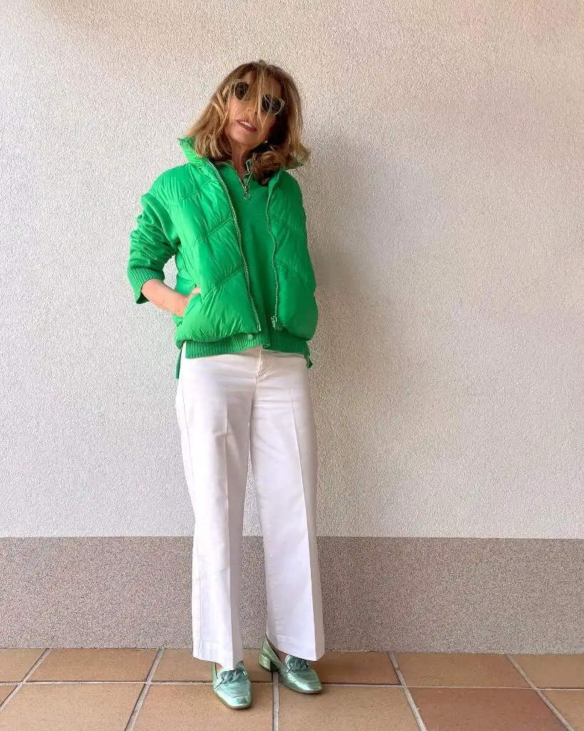
Photo via Instagram
The color commitment is the story — the green appears in both the jacket and the shoe, which creates a top-and-bottom bracket that sandwiches the white trousers between two matching color points. This bracketing technique keeps the green from feeling random; it reads as a system rather than an accent. The white trousers serve as negative space between the two green elements, and the clean terracotta floor adds a warm undertone that prevents the overall palette from reading too cool.
The strength here is the shoe-to-jacket echo. Many outfits introduce a bold outerwear color and then let the rest of the body default to neutral, but repeating the green at the foot closes the loop and makes the whole column feel intentionally coordinated. The principle is that a bold jacket color gains authority when it reappears at least once below the waist, even in a small detail like a shoe.
14. A Camel Coat Softens a Striped Breton Layer
A long camel coat with patch pockets and button details is worn open over a black-and-white Breton stripe crewneck. Medium-wash straight-leg jeans and black ankle boots with studded or embellished hardware complete the lower half. A black structured bag with a chain strap sits on the ground beside. Large tinted sunglasses with a gradient frame and a statement dark ring are the visible accessories. The setting is an outdoor commercial area with concrete and glass surfaces.
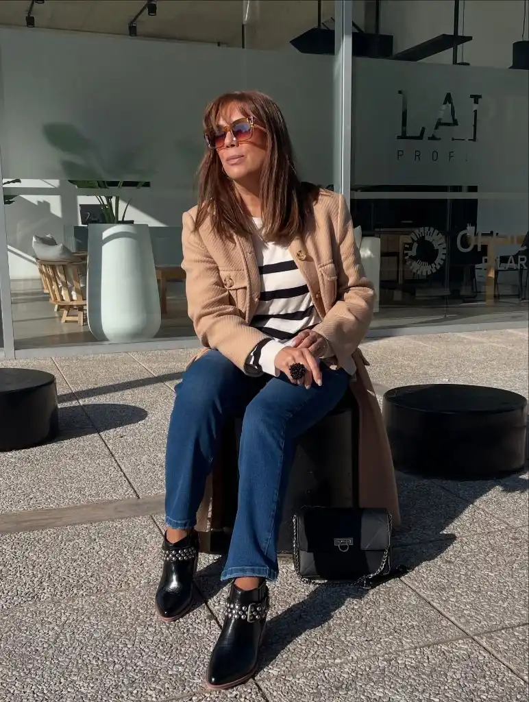
Photo via Instagram
The camel coat is the frame and the Breton stripe is the focal content within it — the coat’s neutral warmth sets up a border that lets the graphic stripe pattern sit at the center of attention without fighting the outerwear for dominance. The medium-wash denim introduces a third value between the camel and the black-and-white, and the studded boots add an edge detail that the rest of the outfit does not explicitly signal. The overall read sits between Parisian classic and something slightly harder-edged because of the boot hardware.
The best detail is the relationship between the coat and the stripe. Camel and Breton stripes are a well-established pairing, but what makes this version work is the coat’s length — it extends well below the hip, which gives the stripe a proportionally smaller window and keeps the print from dominating. The principle for trendy outfits for women over 50 is that a long outer layer in a warm neutral can temper any bold inner pattern by reducing how much of it the viewer actually sees.
15. A Cocoon Coat Opens Red Trousers Upward
An oversized cocoon-shape coat in a pale oatmeal or light beige wool drapes around the shoulders and hangs to about mid-thigh. Below, wide-leg red trousers fall in a straight column to the ground, and matching red gloves extend from the coat sleeves. A dark top is barely visible at the neckline. A tan structured crossbody bag with a gold clasp sits at the hip. The setting is an outdoor park in late autumn or early winter, with bare trees, mossy rocks, and muted natural tones.
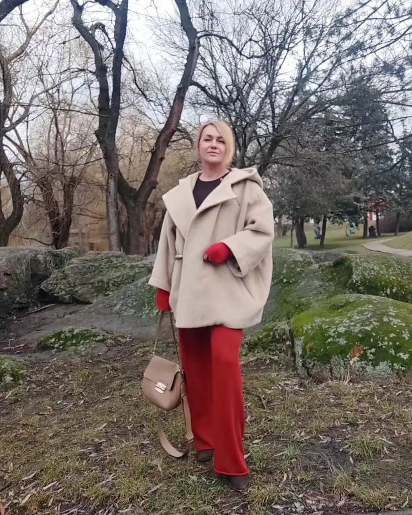
Photo via Instagram
The red trousers are the color event, but the coat is the shape event, and they work together because the oversized, rounded coat creates width at the shoulder and chest while the straight red leg creates a vertical column below. The red gloves are a small but important detail — they bring the trouser color up into the coat zone and prevent the red from being isolated in the lower half. The tan bag echoes the coat’s warmth without competing, and the park setting with its muted greens and browns makes the red feel even more vivid by contrast.
The effect is that bold color in wide trousers becomes wearable because the coat above is neutral and voluminous enough to balance it visually. The principle is that a high-volume, low-color coat and a high-color, straight-line bottom half create a conversation about proportion that keeps both halves interesting. Red trousers need a substantial partner on top, and a cocoon coat delivers that without formality.
16. A Leather Blazer Sharpens a Knit Dress
A fitted black leather or faux-leather blazer sits open over what appears to be a beige or oatmeal knit tunic dress that falls to mid-thigh. Black knee-high boots with a straight shaft create a strong vertical line below the dress hem. A chunky gold chain necklace is the primary accessory, and gold hoop earrings are also visible. The setting is an interior room with tile flooring, houseplants, and personal decor items visible in the background.
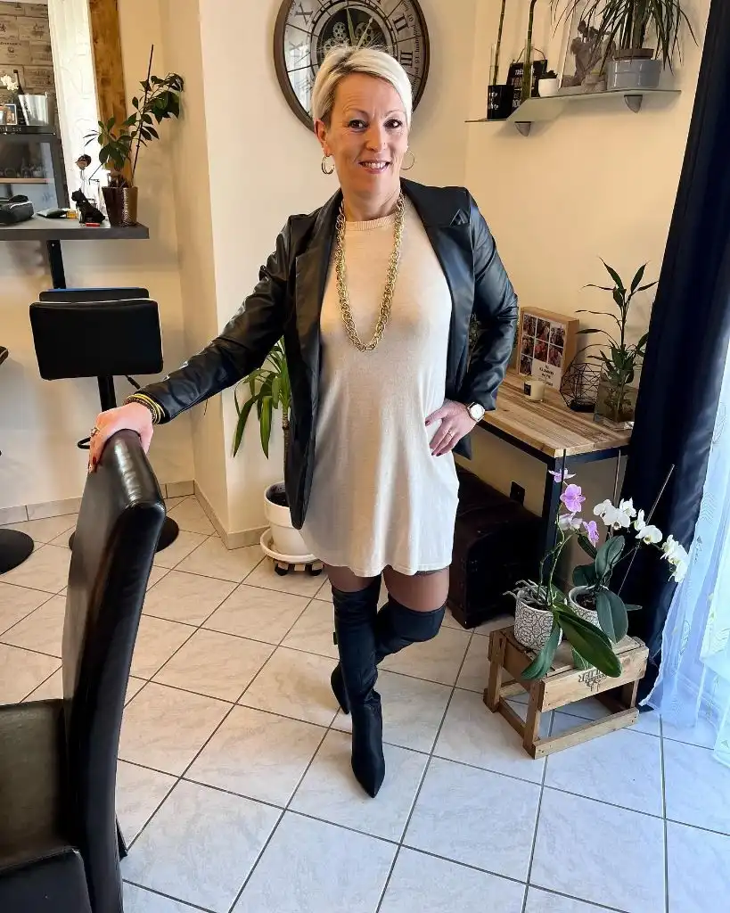
Photo via Instagram
The leather blazer introduces structure and edge into a look that the knit dress and boots alone would keep soft and simple. The gold chain necklace is heavy enough to hold visual weight against the leather, and its warm tone picks up the warmth of the knit fabric. The knee-high boots cover the leg from just below the hem to the floor, which simplifies the lower half into one dark line and keeps the bare leg exposure minimal and proportionally controlled. The home setting keeps the outfit feeling real rather than styled for a specific occasion.
This is a combination that demonstrates the value of mixing textures in everyday outfits. Leather over knit, structured over soft, dark over light — each contrast is doing work to prevent the look from settling into one register. The principle is that a sharp blazer over a soft dress needs one bold accessory to arbitrate between the two textures, and a chain necklace in warm metal fills that role without adding another color.
17. A Belted Vest Layers Over a Crisp White Shirt
A cream or off-white ribbed knit sweater vest sits over a white button-front shirt with the collar visible and the shirt sleeves extending past the vest’s armholes. A thin tan or camel belt with a gold buckle cinches the vest at the waist, giving the layered combination a defined shape. Medium-wash straight-leg jeans sit below. A watch or bracelet and small hoop earrings are the visible accessories. The setting is an outdoor grassy area with scattered autumn leaves on a path.
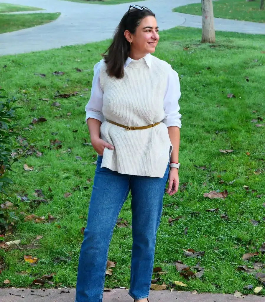
Photo via Instagram
The belt is the key decision. Without it, the vest and shirt combination would read as boxy and academic, but the belt introduces a waistline that the vest does not naturally create on its own. The gold buckle is small but catches light, and it sits at the color intersection where the cream and white meet, drawing the eye to the middle of the frame. The jeans provide color contrast against the all-light upper half, and their straight leg mirrors the vertical fall of the shirt sleeves.
The value is in one accessory changing the entire proportional read of a layered top. The belt costs nothing in terms of visual complexity — it is thin and tonal — but it converts a loose academic layer into a shaped, intentional silhouette. The principle for anyone layering a vest over a shirt is that a belt at the natural waist can transform the drape from accidental to architectural, especially when building a preppy fall look from simple neutral pieces.
18. Cream Knitwear Meets Tapered Tan Trousers
A cream ribbed knit cardigan or jacket with button closures sits over what is visible as a tonal base. Tapered tan or camel trousers with a seam detail down the front create a clean leg line that narrows toward the ankle. Black pointed slingback kitten heels add sharpness at the foot. A black structured shoulder bag with a minimal clasp is carried high on the shoulder. Gold hoop earrings are visible. The setting is an outdoor stone stairway with a tree-lined park behind.
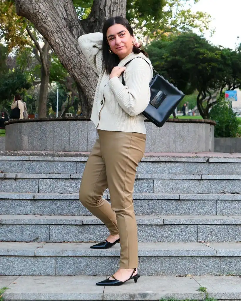
Photo via Instagram
The kitten heel slingbacks do more work than they seem to — they introduce a black point at the base that echoes the black bag at the shoulder, creating a dark frame around the lighter cream-and-tan center. The tapered trouser leg ensures the silhouette narrows as it moves down, which counterbalances the slightly relaxed knit above. The front seam on the trousers adds a pressed, intentional detail that lifts the entire lower half out of casual territory. The outdoor setting with stone and trees keeps the palette grounded.
The appeal is in how the black accessories structure an otherwise soft palette. Without the black shoes and bag, the outfit would read as entirely warm and tonal. With them, it gains edges and endpoints that make the neutral tones between them feel more deliberate. The transferable idea is that sharp black accessories in small doses — a pointed shoe, a structured bag — can frame a warm neutral outfit the way a dark mat frames a light photograph.
19. A Pink Coat Carries a Polka Dot Skirt in Paris
A bubblegum pink oversized coat with a double-breasted closure is the dominant piece, worn open over a black crewneck top and a white midi skirt with large black polka dots. Black ankle boots and a black beaded or crocheted bag hang from one hand. The Eiffel Tower is visible in the background down a Parisian street, and green Lime bikes and Haussmann-style buildings provide context.
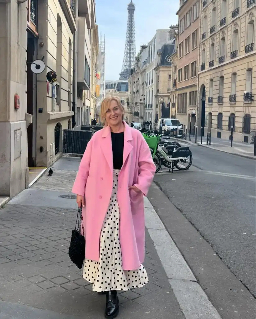
Photo via Instagram
The pink coat is the color event, and everything else is working in black and white to stay out of its way. The polka dot skirt is graphic enough to hold interest on its own, but the coat’s volume and saturation keep it in a supporting role. The black boots, black bag, and black top create a consistent dark thread that runs through the outfit and prevents the pink from floating alone. The Parisian setting with its stone facades and grey sky makes the pink read as even more vivid — it is the only warm color in the frame.
This is a bold coat working exactly as a bold coat should. It does not need the rest of the outfit to match its energy; it needs the rest to provide contrast and structure. The principle for anyone wearing a statement coat is that the pieces underneath should resolve into a simpler color story — here, classic black and white — so the coat can be the single variable that transforms a proven outfit foundation into something people remember.
20. Silver Hair Pairs With a Brocade Sheath
Long silver-grey hair falls past the shoulders in a layered, side-swept style. The garment is a sleeveless sheath or shift in a pale champagne or blush brocade with a visible damask-style floral pattern woven into the fabric. A dark watch sits on the wrist, and a small black bag or clutch is held at the side. The setting is an interior room with warm wood floors, an ornate area rug, and holiday or seasonal greenery visible in the background.
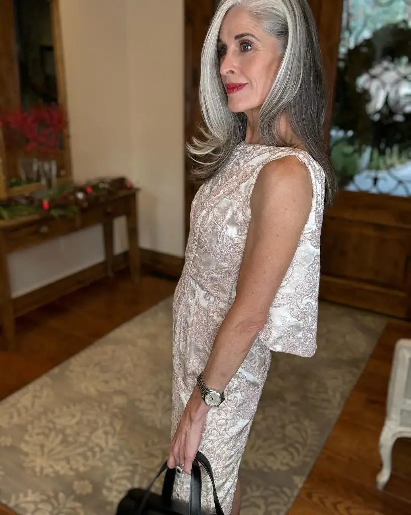
Photo via Instagram
The silver hair and the champagne brocade share a metallic quality that creates a tonal harmony from hair to hem. The brocade pattern is tone-on-tone — the motif is woven in a slightly different sheen than the base fabric — which means the pattern reveals itself in changing light rather than through color contrast. The sleeveless cut keeps the look clean and shows the arm, and the structured body of the sheath provides shape without a belt or waist detail. The warm wood and rug behind add richness that the cool-toned hair and fabric do not supply on their own.
The strength here is in how the hair color and the fabric finish echo each other without being planned to match. Silver hair has a natural affinity with champagne, platinum, and light metallic fabrics because they share a reflective quality. The transferable principle for anyone with silver or grey hair is that tone-on-tone dressing in metallic fabrics can create a cohesive look that treats the hair as part of the palette rather than as something separate from it.
21. A Neck Scarf Interrupts a Cardigan and Midi Skirt
A grey button-front cardigan is paired with a navy midi skirt that falls below the knee in a fluid A-line shape. A mustard or golden-yellow silk scarf is tied at the neck in a knotted ascot style, and it is the single brightest element in the frame. Cream or nude open-toe sandals with a low heel and what appears to be a gold buckle or ornament are visible on the feet. The bench reads “Istanbul Büyü…” confirming an outdoor Istanbul park setting with green grass and trees behind.
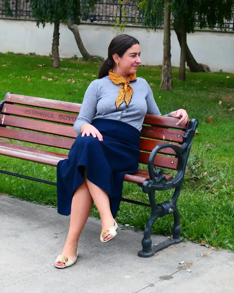
Photo via Instagram
The mustard scarf is doing all the color lifting. Without it, the grey and navy would create a pleasant but unremarkable combination — the scarf’s warmth introduces a third tonal register that prevents the outfit from settling entirely into cool neutrals. The knotted placement at the throat creates a focal point that sits close to the face, which is where the eye naturally wants to land. The nude sandal keeps the foot light and open, which suits the warm-weather park setting visible around the bench.
The effect is a single accessory changing the emotional register of an otherwise quiet outfit. Grey and navy together can read as serious or somber, but the mustard scarf shifts the palette toward warmth and personality. The transferable idea is that a neck scarf in a contrasting warm tone is one of the simplest ways to lift a cool-neutral combination, and the knot style matters — a loose ascot reads more relaxed than a tight wrap and works better with soft everyday separates.
22. A Black Long-Sleeve Tee Grounds Light Denim
A plain black long-sleeve crewneck tee — no visible print, logo, or texture — is paired with light-wash distressed straight-leg jeans. The jeans show small rips or worn areas at the thigh. The setting is a bedroom with a mirror, fairy lights behind a curtain, a couch, and personal items on a dresser. The hair is blonde and shoulder-length with loose waves. The visible styling is minimal — no jewelry, no bag, no layering piece.
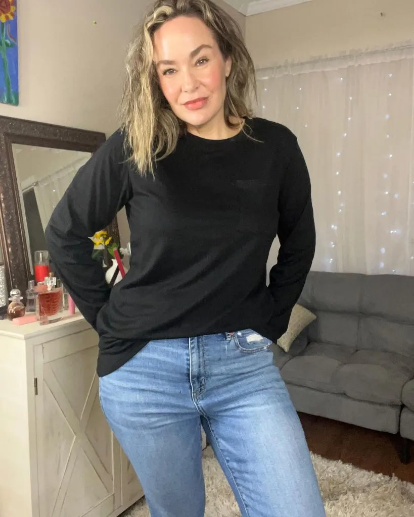
Photo via Instagram
The absence of accessories is itself a statement here. This outfit relies entirely on the contrast between the black top and the light denim below, and nothing mediates between them — no belt, no necklace, no watch. The distressing on the jeans adds texture and informality that the smooth black tee does not share, and that tension between a clean top and a worn bottom creates a casual hierarchy. The bedroom setting and mirror selfie context reinforce the everyday, unperformed nature of the combination.
This is a baseline outfit — the version of trendy outfits for women over 50 that starts at zero embellishment and proves that contrast alone can carry a look. The principle is fundamental: a dark, simple, well-fitting long-sleeve tee against light denim creates enough tonal distance to function as a complete outfit with no help. Every other look in this article is, in a sense, a variation built on top of this foundation.
23. Layered Florals Build Depth Without Repetition
A long coat in a dark teal or emerald brocade with large-scale floral motifs in purple, blue, and green is worn open over what appears to be a midi-length dress or skirt in a contrasting floral print — this one lighter, with a cream or beige base and large pink, purple, and blue flowers. A small pink crossbody bag with a chain strap adds another pink element. Striped socks and black-and-white platform sandals are visible at the hem. Glasses and blonde hair pulled back complete the frame, and a gold-textured border effect surrounds the image.
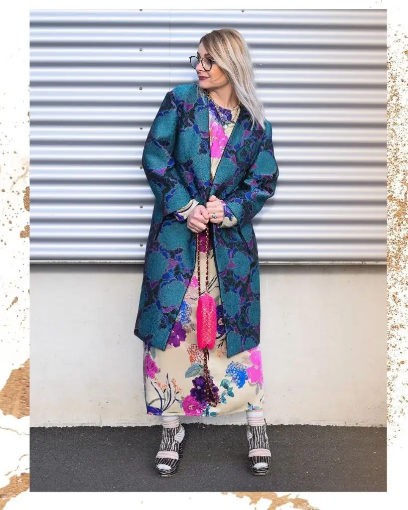
Photo via Instagram
This is the most pattern-dense outfit in the entire set, and the reason it holds together is that the two florals share a color family — pink, purple, blue, green — but differ in scale, background tone, and density. The dark brocade coat has a tight, woven repeat, while the lighter dress beneath has larger, more scattered blooms on a pale ground. The pink bag echoes the pink tones in both prints, and the striped socks add yet another pattern layer that somehow does not collapse the composition because the stripes are small-scale and neutral-toned.
I like the courage of this approach. Pairing two floral prints is often treated as a mistake, but this image proves it works when the shared colors thread through both layers and the scale difference gives each print its own visual territory. The principle is that mixing prints in one outfit depends on shared color, varied scale, and at least one small accessory — like the pink bag — that pulls a common thread from both patterns into a single visible point.