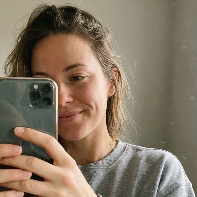
Winter in the city rewards a certain kind of looking. These Winter NYC Outfits become easier to judge once you stop cataloguing individual pieces and start reading the whole frame as a composition: where the visual weight sits, how the palette divides between top and bottom, which surface catches the light, and how much negative space the silhouette allows. Cold-weather dressing exaggerates every choice — a coat is never just a coat, it is the largest colour field in the picture.
Before scrolling, decide what you want to compare. Notice the ratio between the outerwear and what shows below it, the point where the sharpest contrast lands, and whether texture or colour is doing the heavier lifting. Weigh the trade-off between volume and definition — a fuller coat needs a cleaner line somewhere else, a quiet palette needs one anchor. None of these are rules, only pressures the eye responds to.
1. Cream Shearling Frames a Yellow Column
The composition splits cleanly into thirds: a curly cream shearling-looking jacket on top, a long yellow knitted scarf running down the centre like a stripe, and pale wide-leg jeans below. The jacket carries the most visual weight because of its texture, but the yellow column is what your eye actually tracks first. It cuts a vertical line through an otherwise horizontal, fluffy shape and gives the outfit its spine.
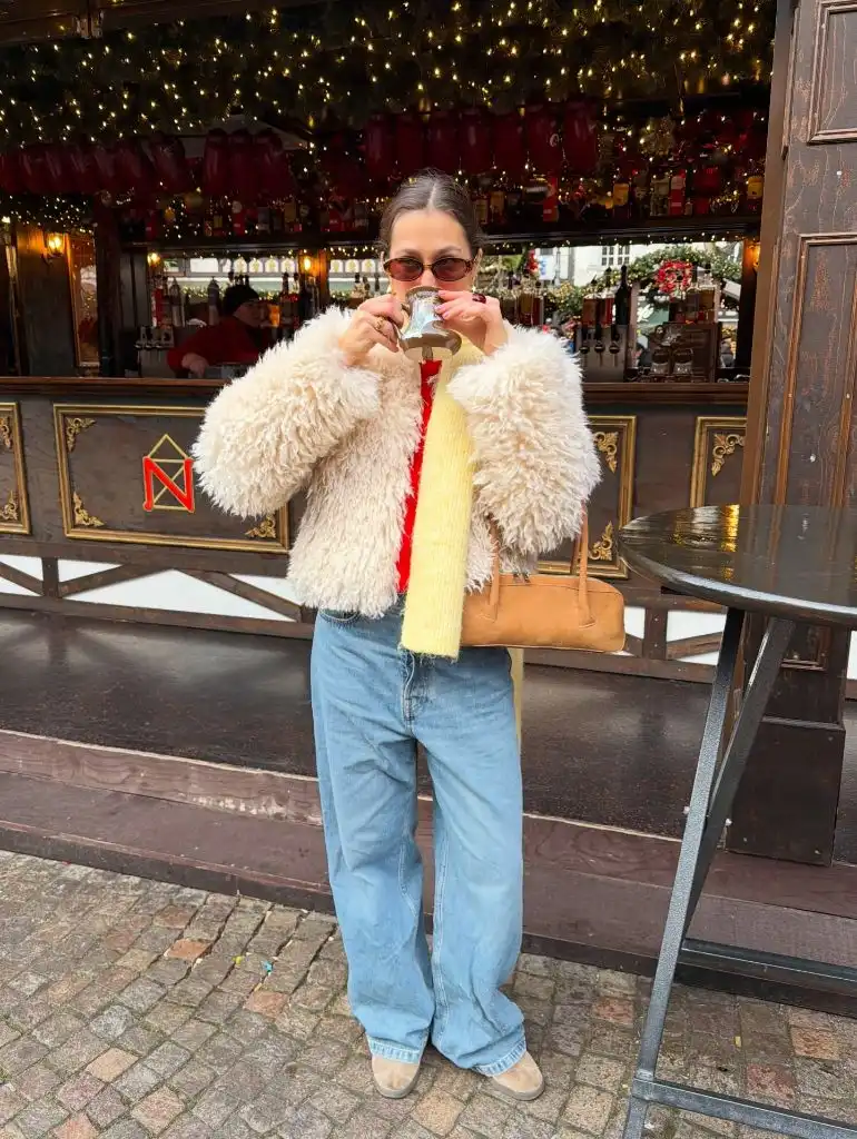
The supporting cast stays deliberately muted. The tan handbag echoes the warm cream of the jacket without matching it, the pale denim keeps the lower half quiet, and the small red sweater peeking through is the only saturated punctuation. Even the tinted sunglasses pick up a warm tone rather than introducing a new one. Everything below the shoulders is chosen so the yellow scarf and the shearling texture can dominate without competing.
The transferable principle here is scale management: when the top half is voluminous and textured, the bottom half needs to read as one continuous colour field. If you wanted to push it further, a cropped boot in cream would extend the palette to the floor. As it is, the lighter footwear already keeps the eye from stopping too abruptly at the ankle.
2. Animal Print Coat Anchors a Quiet Base
A long animal-print coat in grey and black takes up most of the frame, and the pattern does almost all of the talking. The scale of the print is large enough that it reads as a graphic composition rather than a busy surface — big black shapes on a mid-grey ground, arranged with enough negative space to feel organised. Everything underneath is deliberately flat black, so the coat never has to compete for attention.
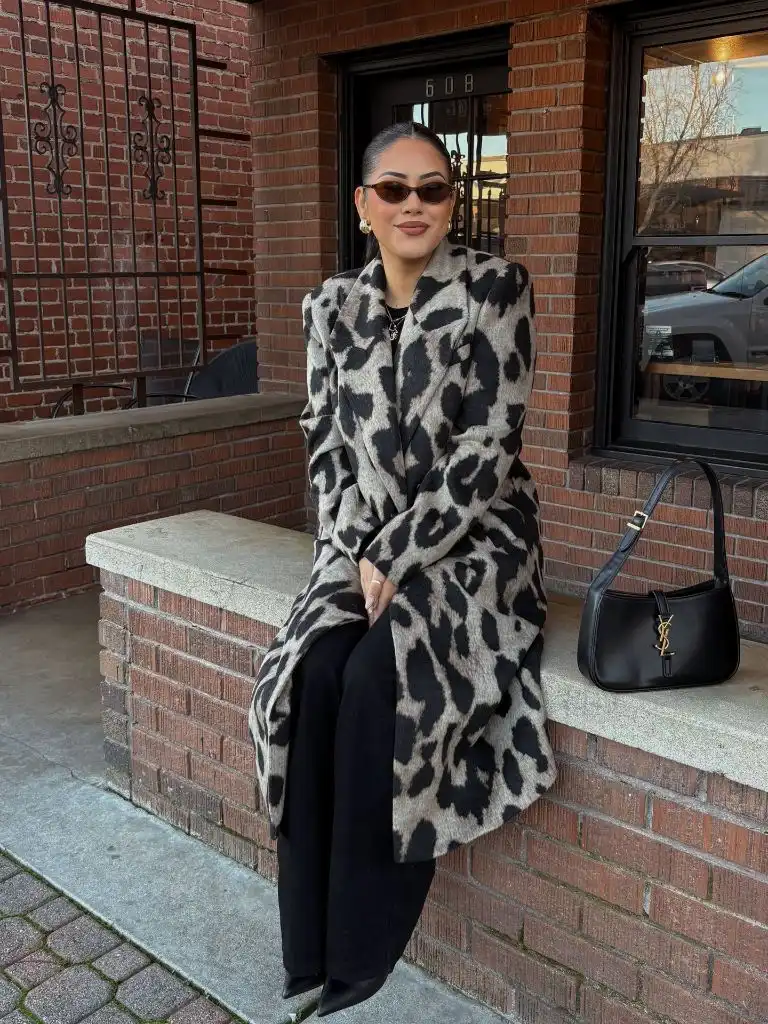
The small black shoulder bag, black pointed boots, and dark trousers form a continuous shadow line along one side of the body, which is what stops the print from feeling chaotic. The tinted sunglasses stay in the warm brown family and don’t introduce a new colour. The gold hardware on the bag is the single glint of contrast — small enough to register only on a second look.
Compared with the softer, textured jacket above, this one uses print rather than pile to carry the outfit. The honest limitation of a print this size is that it dictates the rest of the wardrobe: any competing pattern, or a coloured bag, would collapse the hierarchy. Keeping the base monochrome is less a style choice than a structural requirement.
3. Textured Brown Fur Sits Against Alpine White
Against a bright snow-and-sky backdrop, a mid-brown faux-fur jacket becomes the entire colour event. The warm brown reads even warmer next to the cool white of the mountains, and the leopard-print bucket hat in a similar brown family extends the palette upward so the head and torso feel like one connected shape. Black leggings below narrow the silhouette to a single vertical line.
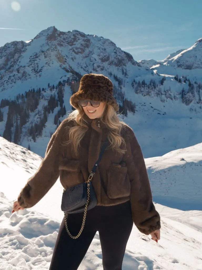
The dark monogrammed crossbody bag with a gold chain does the practical work of breaking up the brown mass across the torso — without it, the jacket would read as one uninterrupted block. The chain also introduces the only metallic in the frame, which is enough. Aviator-style sunglasses in a similar warm tone keep the face inside the palette rather than pulling it out.
Among Winter NYC Outfits translated to a mountain setting, the useful lesson is that a strong single-colour outerwear piece needs one interruption at waist height to avoid reading as a costume. A belt would do the same job. If you wanted to soften the whole look, swapping the bucket hat for a plain knit beanie in the same brown would still keep the head-to-torso continuity.
4. Grey Column Extends From Coat to Trouser
Head to toe in one grey tone is the argument here. A long grey wool-looking coat opens over a matching knit sweater and wide grey knit trousers, and the three pieces read as a single vertical column because they share both hue and value. There is no waist definition, no contrast belt, no bag strap cutting across the torso in a competing colour. The eye travels top to bottom without a stopping point.
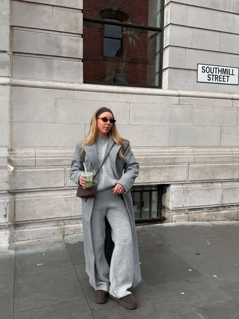
The two allowed disruptions are the small brown woven crossbody bag and the brown suede-looking slip-on shoes, which frame the grey column with warm punctuation at hand and foot. The matcha drink in the hand is an accidental third accent in the same green-brown family. The tortoise sunglasses complete the warm-neutral thread. Every non-grey element sits inside a narrow palette of browns and greens.
The trade-off with a fully tonal look is that texture has to work harder than colour. Here the coat’s smooth weave sits against the knit’s ribbed surface, and that alone gives the outfit its dimension. If the fabrics all matched too closely, the column would flatten. The lesson is that monochrome is really about texture layering in disguise.
5. Deep Black Tones Against Fresh Snow
Against the snow, a black cropped fur-look jacket and matching black fur hat form a dense dark shape that the eye reads first. Below, dark blue wide-leg jeans continue the low-value palette without matching it exactly — the slight tonal shift between black and indigo keeps the outfit from looking uniform. Black gloves and a black drawstring bag repeat the darkest note at the hands.
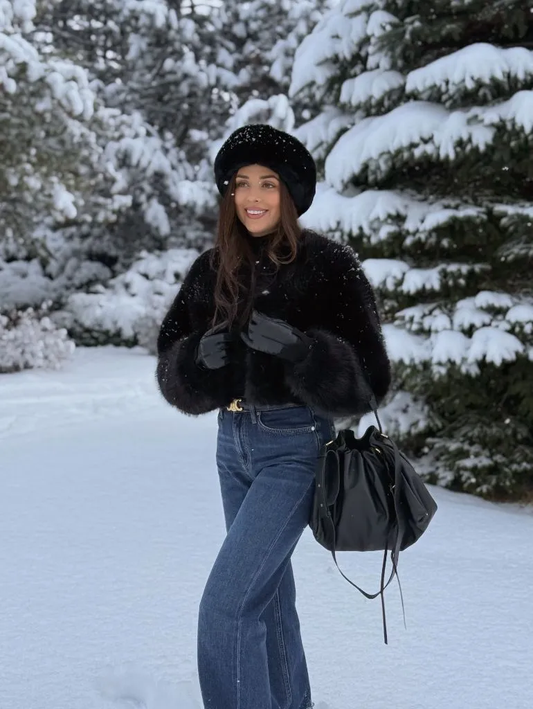
The gold buckle at the waist is the composition’s single bright point, and it is placed exactly where the fur ends and the denim begins — the natural endpoint of the jacket. That small metal detail does a disproportionate amount of work, because it draws the eye to the horizontal seam where the two textures meet. Without it, the black-to-blue transition would feel abrupt rather than intentional.
Compared with the earlier brown snow look, this one leans on drama rather than warmth: high contrast between clothing and setting, cropped rather than covering, glossy leather gloves rather than fabric. The honest limitation is upkeep — a cropped fur jacket needs high-waisted bottoms to stay this proportional. A lower rise would open a gap and undo the geometry immediately.
6. Pastel Fur Meets a Mint Wool Scarf
The frame here is a mirror selfie, but the composition is straightforward: a pale pink faux-fur jacket takes up the width of the shoulders, and a long mint-green wool scarf runs vertically down one side. The two colours sit at almost equal saturation, both muted and slightly chalky, which is why the pairing works rather than shouting. A lime-green chunky knit peeks through the collar as a third, brighter green note.
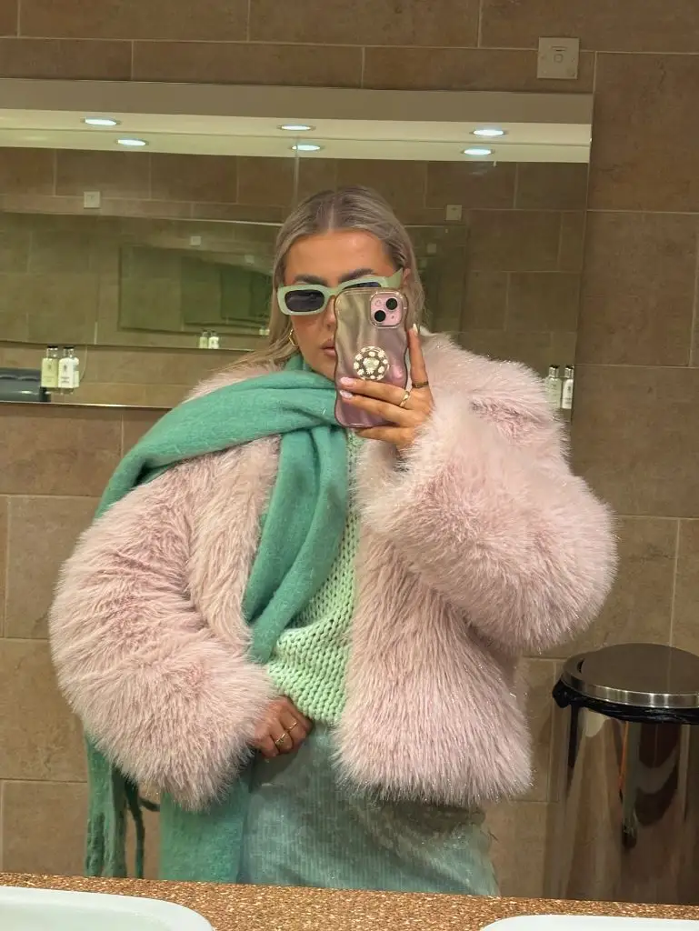
The mint sunglasses repeat the scarf’s colour at the face, which is the strongest palette echo in the picture — top and bottom of the frame are tied together by one shade. The phone case brings a metallic pink that loosely echoes the fur. Everything else, including the beige bathroom tile, stays neutral enough that the two pastels do all the colour work.
The transferable principle is that unexpected colour combinations calm down when both colours share the same value — here, both are pale and slightly dusty rather than one being sharp and one being soft. If you wanted to push it, a saturated jewel-tone green scarf would fight the pink instead of accompanying it. Restraint is what makes this reads as considered.
7. Pink Fur Carries the Frame in Full Daylight
The same pink faux fur appears again, this time outdoors and styled with a mint scarf, a sheer sequinned mint maxi skirt, a mint suede shoulder bag, and mint-and-green trainers. The pink jacket is still the loudest object, but the mint is no longer a single accent — it repeats at scarf, skirt, bag, and shoes, forming a full column of green that the pink sits on top of.
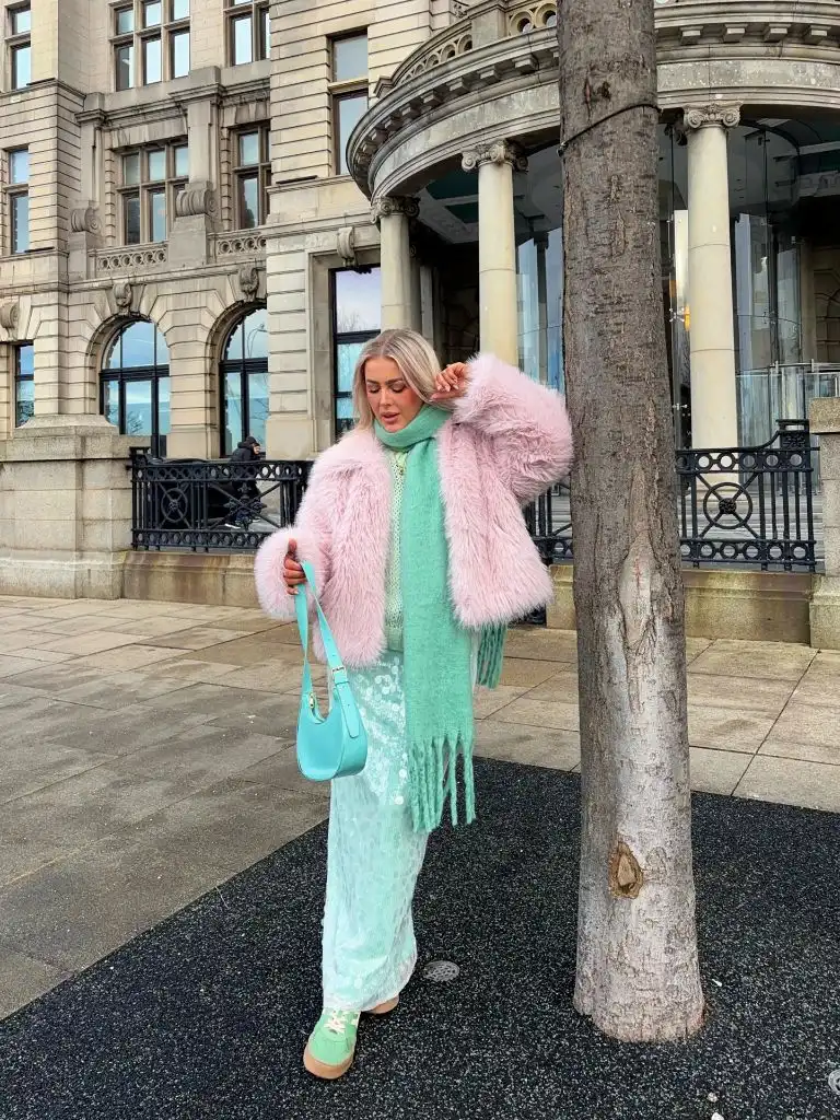
The sequinned skirt introduces a texture the earlier mirror shot didn’t have, and its slight sheen catches the daylight in a way the matte scarf doesn’t — the same colour appearing in three different finishes across one outfit. That variation is what keeps the mint column from looking uniform. The pink fur, by contrast, stays one flat texture, which is why it holds together as the dominant piece.
Compared with the interior mirror version, this outdoor styling commits harder to the pastel pairing and adds a formal element (the sheer skirt) that the first didn’t have. The trade-off is legibility in daylight — pale pink can pick up the surroundings and read cooler than it did indoors. Keeping the accessories firmly on the mint side, rather than adding a third colour, is what stops the picture from wandering.
8. Camel Fur Volume Meets a Sharp Cap Brim
An oversized camel-toned faux-fur jacket dominates the frame — it is genuinely the composition. The volume is exaggerated: the shoulders sit wide, the fur crowds up around the jaw, and the sleeves overwhelm the arms. Underneath, only a small triangle of white top and a monogrammed brown mini bag show. A brown cap in a matching camel tone extends the palette to the head and adds the one hard edge in an otherwise soft picture.
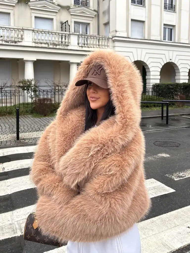
The supporting cast is nearly invisible on purpose. The bag is small and the same warm brown as the cap, so it doesn’t fight the fur. The white below is a bright endpoint the eye reads only after processing the jacket. The pale Haussmannian building behind adds a cool cream that flatters the warm camel, and the black wrought-iron fence provides the darkest note in the frame — the only real contrast.
The honest limitation of this proportion is that it can only work with clean, close bottoms; any added volume below and the whole silhouette would tip into shapelessness. If you wanted to soften it, a longer version of the same jacket would trade drama for coverage. As shown, the cropped-adjacent length and the cap’s sharp brim are what keep the volume from swallowing the wearer.
9. Black Wool Coat Draws a Long Vertical Line
An oversized long black coat with a soft shoulder line reaches almost to the ankle, and the whole outfit is committed to one uninterrupted dark column. Black knit underneath, black trousers, black knee-high boots, and a black bag mean there is no colour break anywhere between chin and floor. The stone columns of the building behind provide the only tonal contrast, which is exactly what a fully black look needs to keep from disappearing.
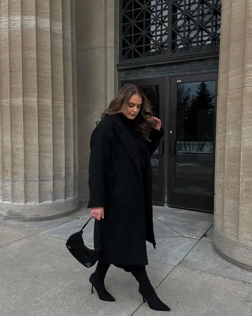
The bag has a slight sheen, the boots have a pointed toe with a heel, and the coat is matte — three different surfaces in the same colour doing the visual work that a palette would normally do. Loose brunette hair falling forward is the softest curve in an outfit made of straight lines, and it stops the composition from feeling architectural. The nude manicure is small but deliberate, keeping the hands from vanishing.
For anyone drawn to Winter NYC Outfits that lean fully monochrome, the practical detail is that boot height matters more than coat length — a boot that meets the trouser cleanly maintains the vertical line, and a shorter boot would create an unwanted horizontal at the calf. For inspiration on styling a similar oversized coat, our guide to long black coat outfits covers the proportion trade-offs in more depth.
10. Cream Layers Blur Into a Single Colour Field
The whole outfit sits inside a narrow cream-to-ivory range. A cream cable-knit dress or coat, a matching cream fringed scarf, and a shearling-style bag with a chain strap all sit at similar values. Because everything is the same brightness, the eye stops trying to separate the pieces and reads them as one soft colour field. The dark stone plinth and black lamp base behind provide the necessary counterweight.
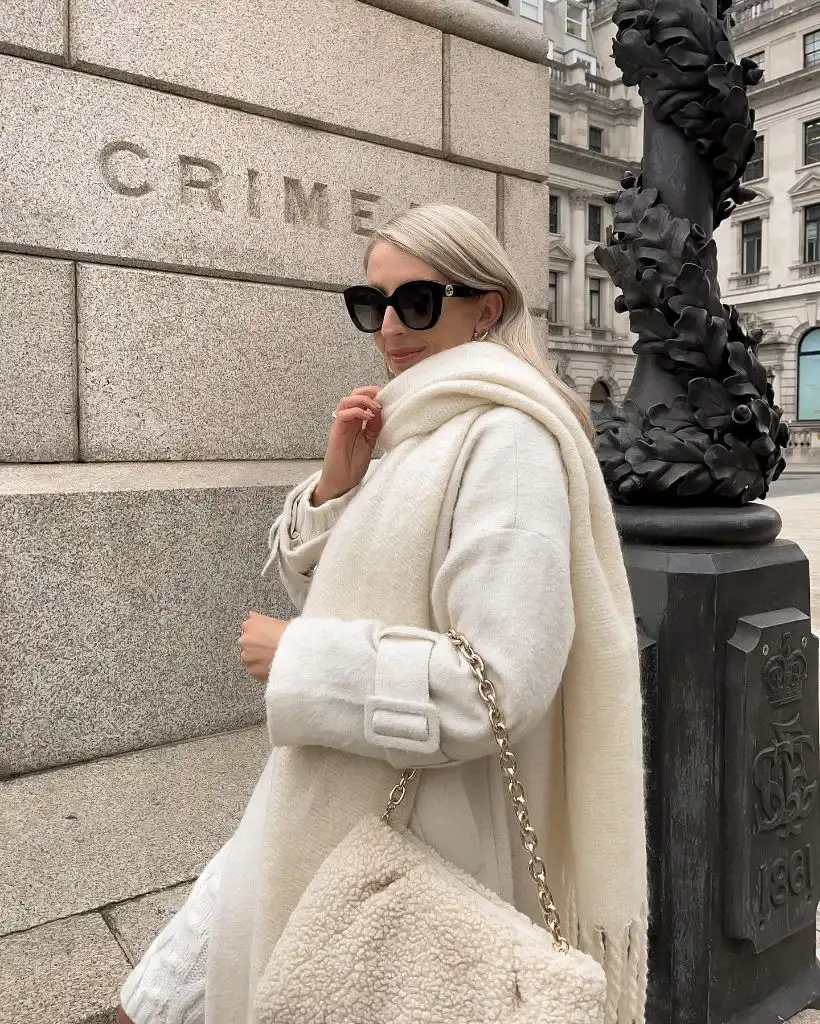
Black sunglasses with a hint of gold hardware are the single dark note on the body, and they land at the face, which is exactly where a viewer’s eye goes first. The gold chain of the bag repeats that small metallic accent lower down, tying face to hand. The stone carving reading “CRIMEA” behind adds engraved texture without introducing a new colour — the environment is doing the contrast work.
Compared with the fully black outfit above, this is the opposite strategy toward the same goal: use one value everywhere, then let a single dark element carry all the definition. The trade-off is dirt — cream this uniform shows wear along cuffs and hem, and the shearling bag needs regular brushing. It is not a low-maintenance formula.
11. Puffer Bulk Balances a Softer Lower Line
A black puffer with a soft, quilted volume takes up the top half of the frame and stops at hip height. Below, wide black knit trousers fall in a straight line to a pair of pale sand-coloured slip-on boots. The proportion is a classic top-heavy silhouette rescued by the trousers’ clean vertical line — without that straight fall, the puffer’s bulk would dominate too much.
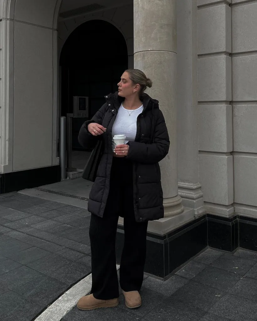
The white top peeking out at the neckline is the single bright accent, and it lands directly under the face, which is where a viewer looks first. The beige boots are the composition’s warm endpoint — they lift the outfit out of pure black and connect it to the sandstone building behind. The takeaway coffee cup adds another warm note in the hand. Nothing in the accessories is trying to be seen.
The transferable principle is contrast placement: with a bulky black top, one soft neutral at the feet does more than an accent bag would. If you wanted to sharpen it, a dark leather boot would keep the outfit stricter but colder. As shown, the beige footwear introduces warmth exactly where the eye rests longest.
12. Wrapped Collar Frames a Narrow Silhouette
A knee-length black coat with a large draped collar wraps the upper body in a way that emphasises the neck and shoulders. The collar is the dominant design element — it curves inward and creates a soft frame around the face. Below, the outfit narrows sharply into slim black trousers and knee-high suede-looking boots. The overall silhouette is an inverted triangle, wide at the shoulders and tapered at the ankles.
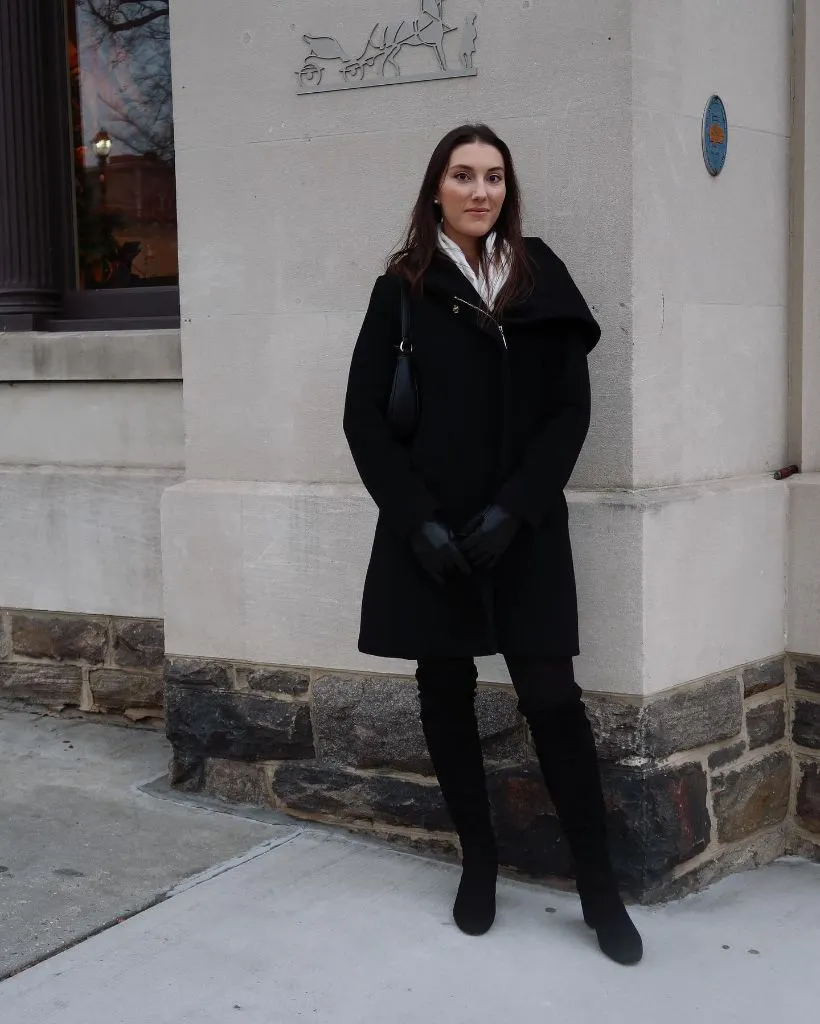
Black leather-looking gloves held in front repeat the coat’s darkest surface at the hands, and the small shoulder bag tucked behind the arm barely registers — everything supporting is designed to disappear. The pale stone corner of the building and the white top just visible at the neckline provide the only lighter notes. Long dark hair falls across the shoulders and softens the coat’s structured line.
Compared with the oversized black coat earlier in this set, this one uses a nipped-in shape rather than an overwhelming one. The honest limitation is that a draped collar reads as more formal than a straight lapel — it commits the outfit to a certain register. Adding a beanie or trainers would fight the collar rather than dress it down.
13. Cream Knit Rests on a Chocolate Base
The palette here is warm and simple: a soft cream jumper on top, chocolate-brown wide-leg trousers below, and glittery trainers with a green star at the foot. The division is horizontal — light half above the waist, dark half below — and the jumper’s slightly oversized cut hides the exact waistline, which softens the transition rather than making it abrupt.
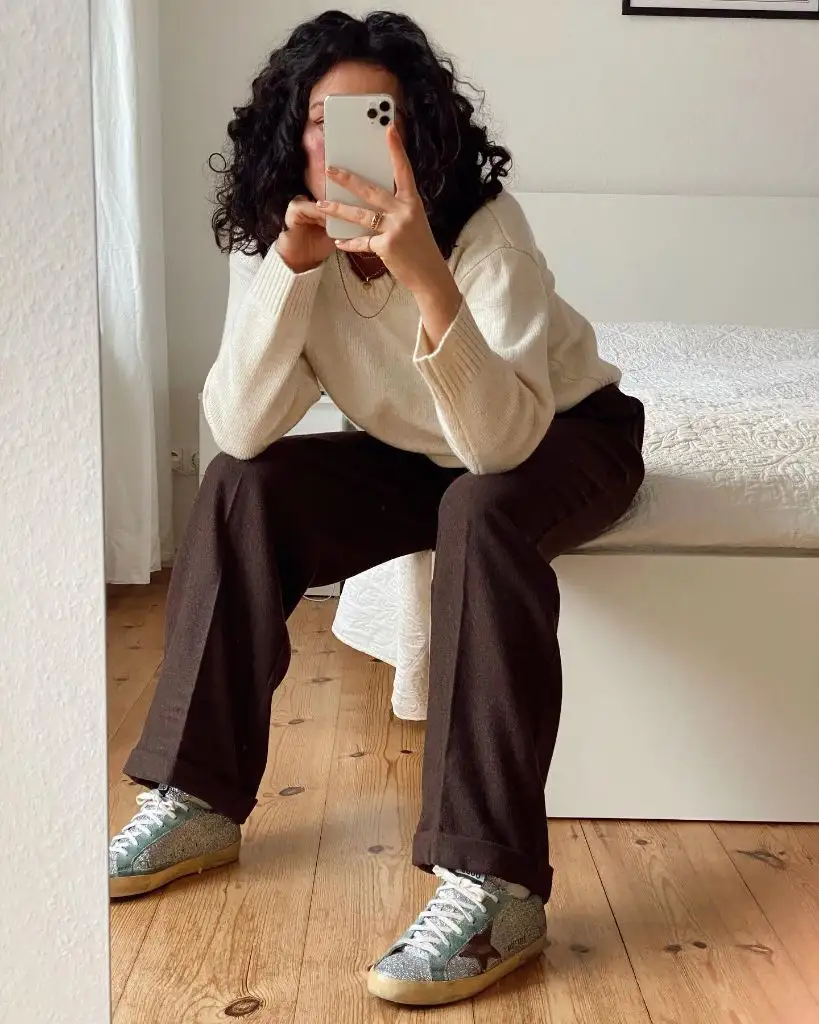
The trainers are the surprise. A glitter finish and a pale green star introduce two elements — sparkle and colour — that the rest of the outfit doesn’t have. Because they sit at the very bottom of the frame, they read as punctuation rather than decoration. The wooden floor and white bed keep the environment neutral, and the layered gold necklaces at the collar add a small warm glint that echoes the trainers’ sparkle from top to bottom.
Among Winter NYC Outfits scaled down to a home mirror, this is a useful example of how one unexpected element at the extremity of a look can carry the whole thing. The lesson is placement: if you want to wear a glittery or coloured shoe, everything else should stay quiet. Move the sparkle to the top and the balance would collapse.
14. White Faux Fur Volume Against Concrete
Against a bare concrete car park, a long-haired white faux-fur jacket takes up nearly the width of the frame. The fur is shaggy and light-catching, and its scale makes it read almost like a garment made of air. Below, blue high-waisted jeans and a black top provide the definition the fur refuses to — a clean vertical line under an otherwise cloud-like silhouette.
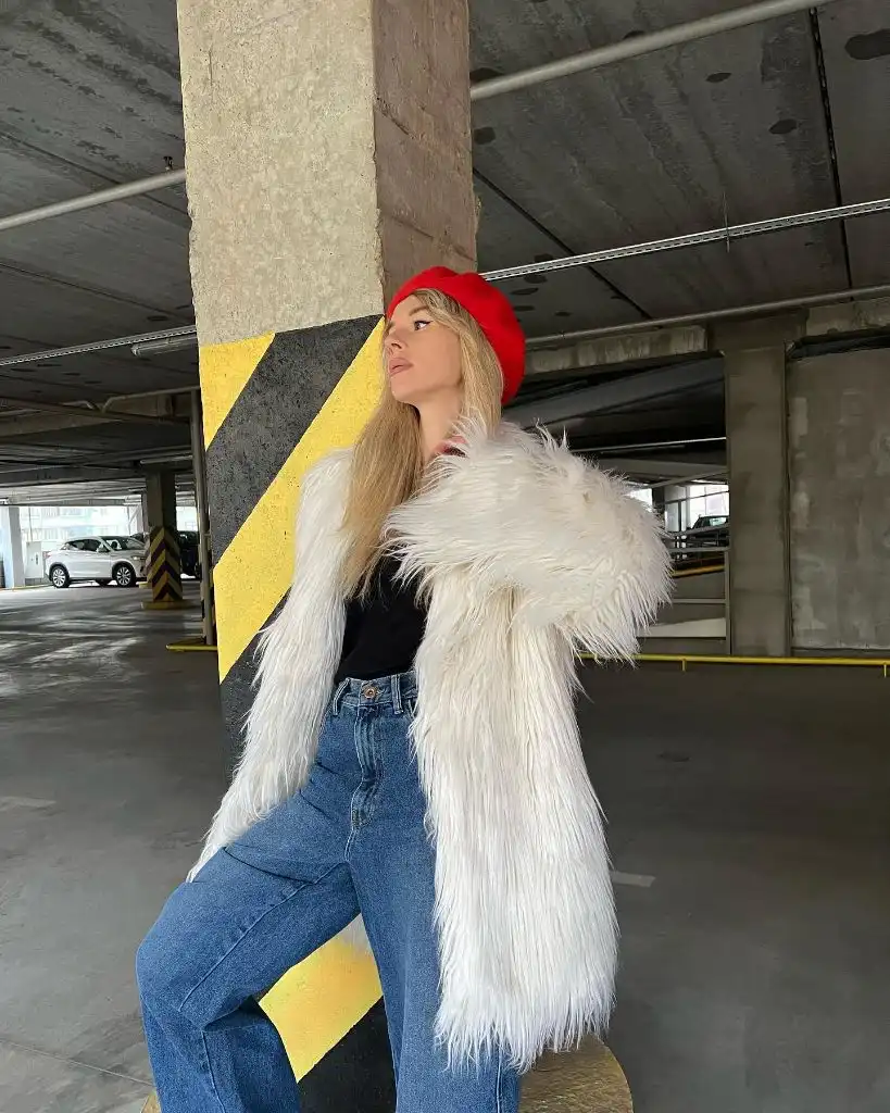
The red beret is the only fully saturated colour in the frame, and it sits at the highest point of the composition — the eye reads it first, then travels down through the white fur, the black top, and into the denim. The yellow-and-black striped column behind provides an accidental graphic frame that echoes the black-white-red logic of the outfit itself. The industrial setting keeps the styling from feeling costumey.
The trade-off with a jacket this textured is that it demands a plain background and a plain base. If the top underneath had any pattern, the fur would fight it. The transferable principle is that a single saturated accessory — the red beret here — can steer a look built entirely from neutrals without needing any other colour support.
15. Green Beanie Ties Coat to Crossbody
A long black coat runs almost to the ankle, worn open over a black top and dark leather-look trousers with heavy lug-sole boots. In a fully black outfit, two green pieces do the entire colour job: a bright green ribbed beanie at the head and a small quilted green crossbody bag at the hip. The two greens are close enough in tone to read as one accent repeated twice.
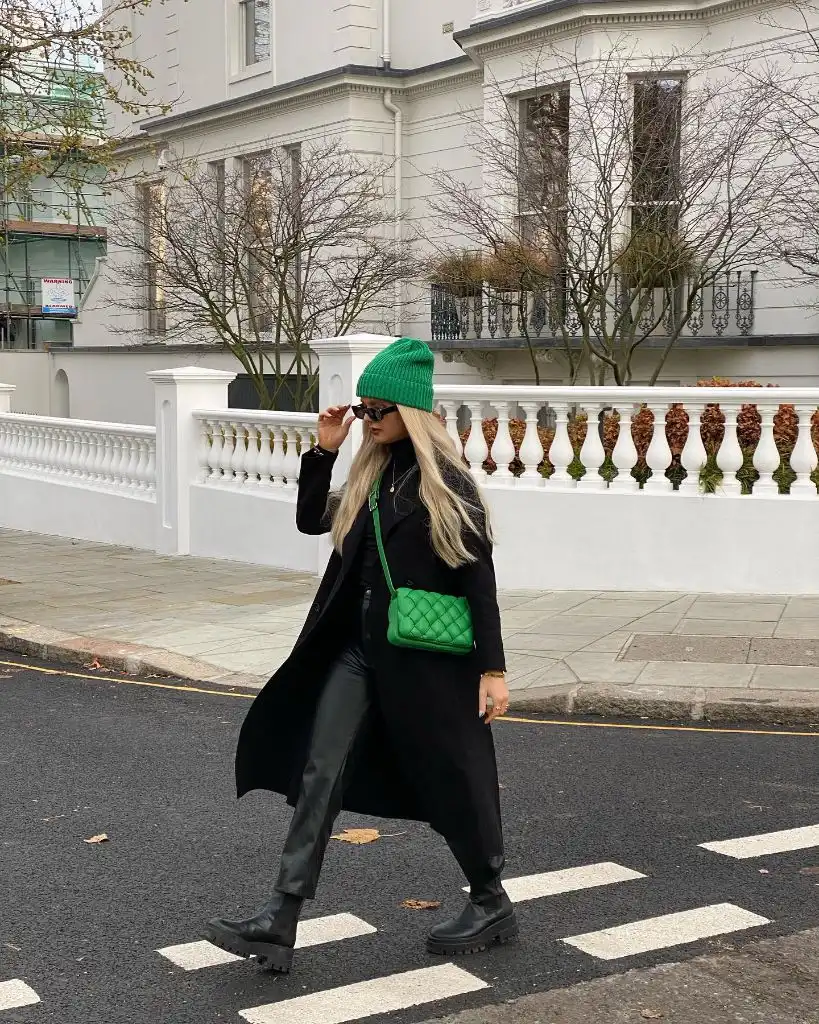
The placement matters. Because the green sits at head height and at waist height, the eye ping-pongs between them and effectively ignores the black in between. The crosswalk stripes below, the white house behind, and the bare winter trees provide a neutral backdrop that lets both green notes read cleanly. Long blonde hair adds a pale vertical line that keeps the coat from swallowing the frame.
Compared with the earlier fully black column with knee-high boots, this version uses colour rather than length to define the outfit. The transferable principle is limiting an accent to exactly two placements — no more — so the accent feels intentional rather than scattered. A third green piece, like a scarf, would tip the balance.
16. Beige Suit Cuts Across a Corner Street
A beige suit — long single-breasted blazer over wide-leg trousers — reads as one continuous column against a brick-and-brownstone corner in New York. The suit’s uniform colour and vertical fall are what make the outfit; there is no waist definition, no belt, no shirt tucked in to break the line. Underneath, a black polo neck rises to the jaw and gives the pale suit a dark anchor at the top.
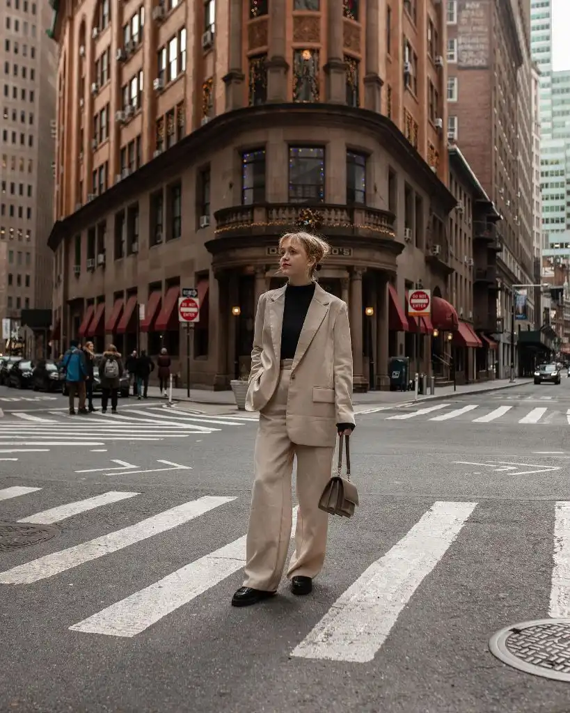
Black loafers at the feet repeat the polo neck’s darkest note and close the outfit at the bottom, creating a top-and-tail bracket in black around a warm neutral middle. The small taupe shoulder bag stays inside the suit’s own colour family, so it doesn’t compete. The red awnings and orange brick behind add warm environmental colour that flatters the beige — the setting is essentially working with the outfit rather than against it.
The lesson here is about scale in tailoring: an oversized suit reads as intentional rather than borrowed when the shoes are formal and the layer underneath is precise. Swap in trainers and the balance would shift toward casual. The current combination keeps the outfit at the exact register where sharp and relaxed intersect.
18. Puffer Sheen Against a Classical Facade
A glossy black puffer with a stand-up collar takes up the middle of the frame, and its shine is the outfit’s most identifiable feature. The material is not identifiable, so the visible sheen is the useful detail rather than any fabric claim. The puffer’s shape is boxy and oversized, cropping at the hip, and the dark trousers below fall in a straight line to keep the silhouette clean.
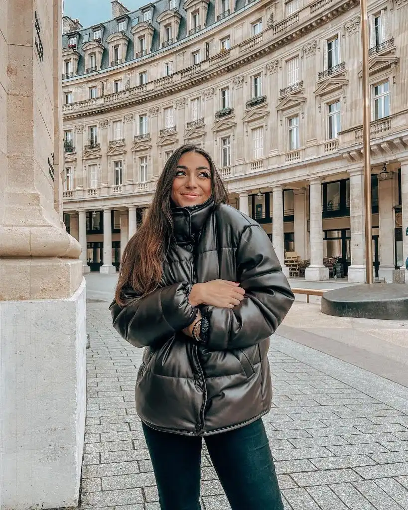
The Haussmannian facade behind, in warm cream stone with dark grey roof detail, provides the outfit’s colour context — the puffer reads even glossier against so much matte stone. Long dark hair falling forward softens the puffer’s boxy line, and a small watch at the wrist is the only visible accessory. The near-empty street contributes negative space, which lets the jacket dominate without competing objects.
Compared with the matte black puffer earlier in this set, this version leans entirely on sheen for its character. The trade-off with a glossy finish is that it magnifies scale — a large glossy jacket reads larger than the same jacket in matte. If you wanted to shrink the visual weight, a matte puffer in the same shape would immediately feel more restrained.
19. Cropped Detail Reveals a Tonal Trio
This is the same grey column outfit from earlier in the set, seen from mid-torso down, and the closer view exposes the exact tonal engineering. The coat, jumper, and knit trousers are three distinct pieces in three subtly different textures — smooth wool-looking coat, ribbed knit jumper, cable-knit trouser — all in the same mid-grey. What looked like one column from a distance is three fabrics doing the differentiation work up close.
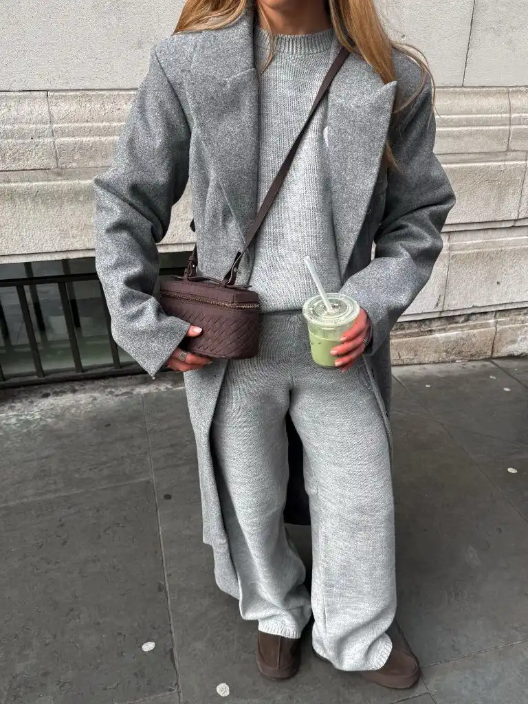
The brown woven mini bag becomes far more prominent at this crop — its texture is visible, and the woven basket-like surface reads as the only real pattern in the frame. The matcha drink in the other hand introduces a green that quietly complements the brown. The brown suede-looking loafers at the bottom repeat the bag’s colour family, so the warm accents bracket the grey field at hand and foot.
Compared with the full-length view of this same outfit, the crop is a useful lesson in how monochrome depends on close-range texture rather than colour. The takeaway for Winter NYC Outfits built on one tone is to check what your fabrics look like from arm’s length, not just from across a room — that is where the outfit either holds or flattens. If you’re building a similar tonal wardrobe, this look at grey coat pairings explores the texture layering in more detail.