November nail trends 2026 become easier to evaluate when you stop isolating a single colour or shape and start reading the full composition of each manicure — the proportion of bare nail to polish, the scale of any pattern, the contrast between matte and gloss, the spacing of accents, and the overall palette temperature. That wider lens turns a scroll through inspiration photos into something closer to visual analysis, which is more useful than simply copying a shade.
Before you move through the set below, decide what you actually want to compare: warmth versus coolness of base tones, how much negative space a design leaves, and whether an accent nail disrupts or supports the dominant colour field. Notice where a design gains its energy — from a single bold hue or from the interplay of several quiet ones. Weigh coverage against restraint, complexity against longevity, and remember that no single formula here functions as a rule for every hand or every occasion.
1. Deep Burgundy Gloss Commands the Entire Nail Field
A single, uninterrupted burgundy covers every nail from cuticle to tip in what reads as one continuous colour field. The shade sits in the darker wine range, closer to oxblood than cherry, and the high-gloss finish amplifies the depth by catching light in clean, narrow reflections along each nail’s centre ridge. The almond shape tapers to a soft point, elongating the fingers and keeping the visual weight distributed evenly rather than pooling at the tips.
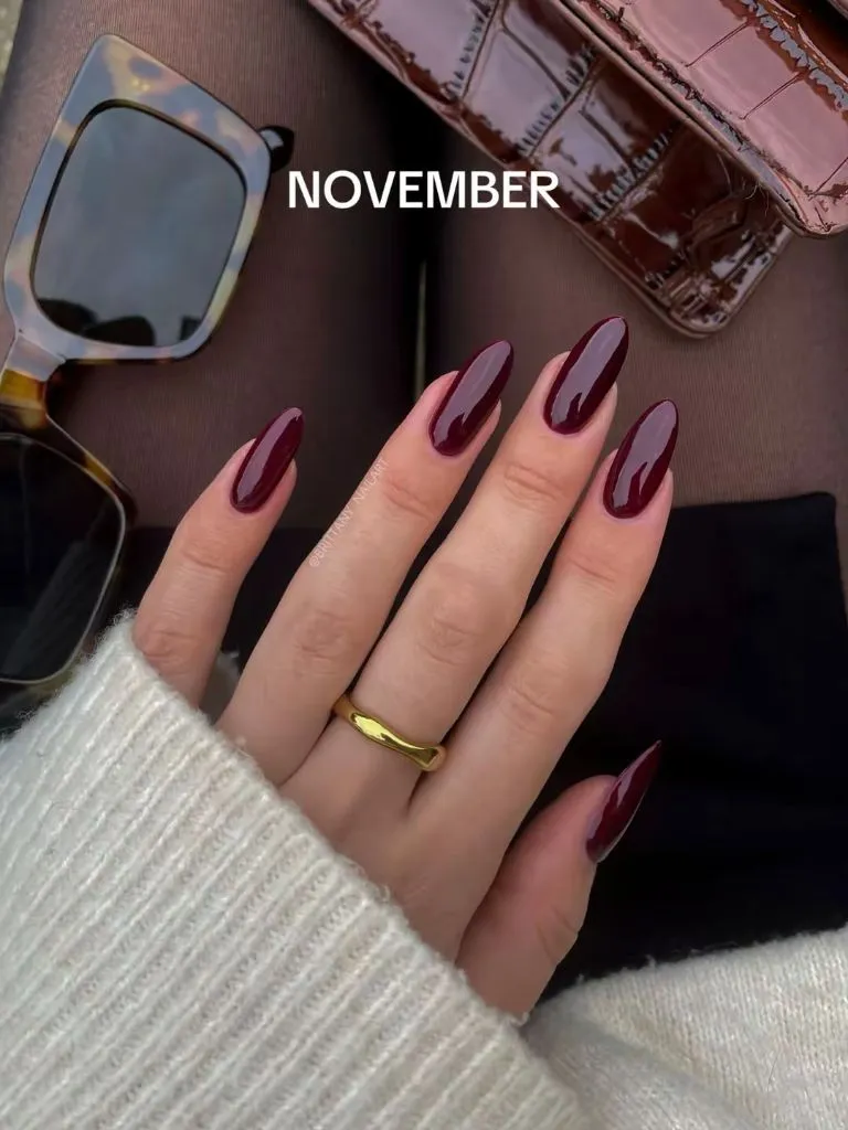
The cream knit sleeve sitting against the hand provides a warm, light backdrop that makes the burgundy read even darker by contrast. A gold band on one finger echoes the warm undertone already present in the polish, while tortoiseshell sunglasses and a glossy brown bag visible above share the same amber-to-brown family without competing. Everything surrounding the nails stays tonally adjacent, so the polish holds its position at the top of the hierarchy without effort.
A manicure this uniform lives or dies on application quality — any streaking, cuticle flooding, or uneven tip shape would be immediately visible with nothing else to distract the eye. That honesty is both its strength and its limitation. If you prefer this level of saturation but want a slightly lower-maintenance version, a single coat of a sheer wine over a nude base would give a similar temperature with more forgiveness at the grow-out line.
2. Brown Zebra Lines Fracture a Metallic Base
Irregular horizontal brown lines break across a warm, metallic-looking bronze base on every nail. The pattern reads as zebra or tiger stripe, hand-painted rather than stamped, with enough variation in line thickness and spacing to avoid mechanical repetition. The almond shape keeps each nail relatively narrow, which compresses the pattern and makes the stripes feel denser than they would on a wider nail bed.
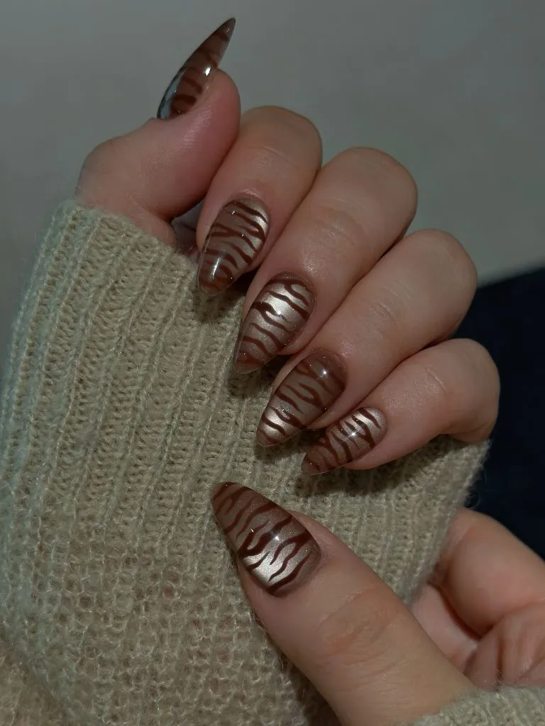
The metallic sheen of the base colour does the heavy lifting here — it separates the design from a flat matte animal print and introduces a reflective quality that shifts as the hand moves. The brown of the stripes matches the darker end of the base tone, so the palette stays within a single colour family rather than introducing a second hue. A cream knit sleeve provides a soft, neutral frame that keeps the visual attention on the nails alone.
Compared with the solid burgundy gloss above, this design trades simplicity for surface interest but stays within a similarly warm, autumnal register. The practical trade-off is longevity: any tip wear will interrupt a stripe line and become noticeable faster than a chip on a solid colour. If the density feels heavy, applying the pattern to only the index and ring fingers while leaving the others in the plain metallic base would preserve the concept with less visual noise.
3. Dark Cherry Ombré Fades From Nude Toward the Tips
A gradient moves from a nearly bare, skin-toned base near the cuticle into a deep cherry-wine at each tip, creating a soft visual fade rather than a hard colour boundary. The transition zone sits roughly at the midpoint of the nail, wide enough to read as intentional blending rather than a smudge. The almond shape supports the ombré by giving it directional flow — the colour intensifies as the nail narrows, so the darkest pigment concentrates at the smallest point.
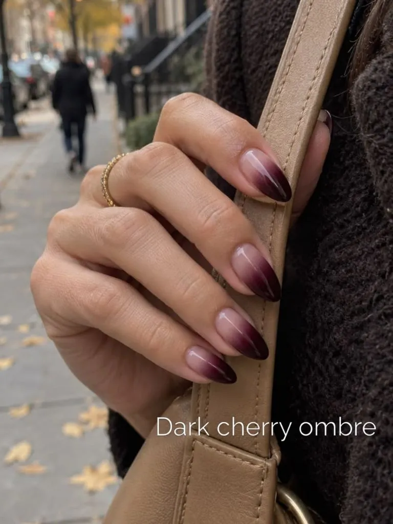
The hand grips a tan leather-looking bag strap, and the warm camel tone sits between the nude base and the dark tips on the colour spectrum, acting as a visual bridge. A dark brown knit garment visible behind the hand deepens the overall warmth of the frame. A fine gold chain ring on one finger catches a sliver of light without pulling focus, staying well below the ombré in the visual hierarchy. Fallen yellow leaves in the background reinforce the autumn context without the nails needing any seasonal motif.
The ombré technique is genuinely forgiving at the grow-out stage because the cuticle area is already close to natural skin tone — new growth blends rather than creating a visible gap. That makes this one of the more practical designs in the set for anyone wanting two or more weeks of wear. The limitation is that the gradient requires a sponging or airbrushing step that adds time and skill to the application process.
4. Chocolate and Pink Alternate With Polka Dot Accents
Two distinct colour fields share the hand: a rich chocolate brown and a soft cool pink, alternating nail by nail rather than blending. The brown nails carry small white polka dots scattered evenly across their surface, while the pink nails remain clean and unadorned. The square nail shape with slightly rounded edges gives each colour block a wider canvas than an almond would, which lets the polka dots breathe and keeps the pink panels looking deliberately minimal.
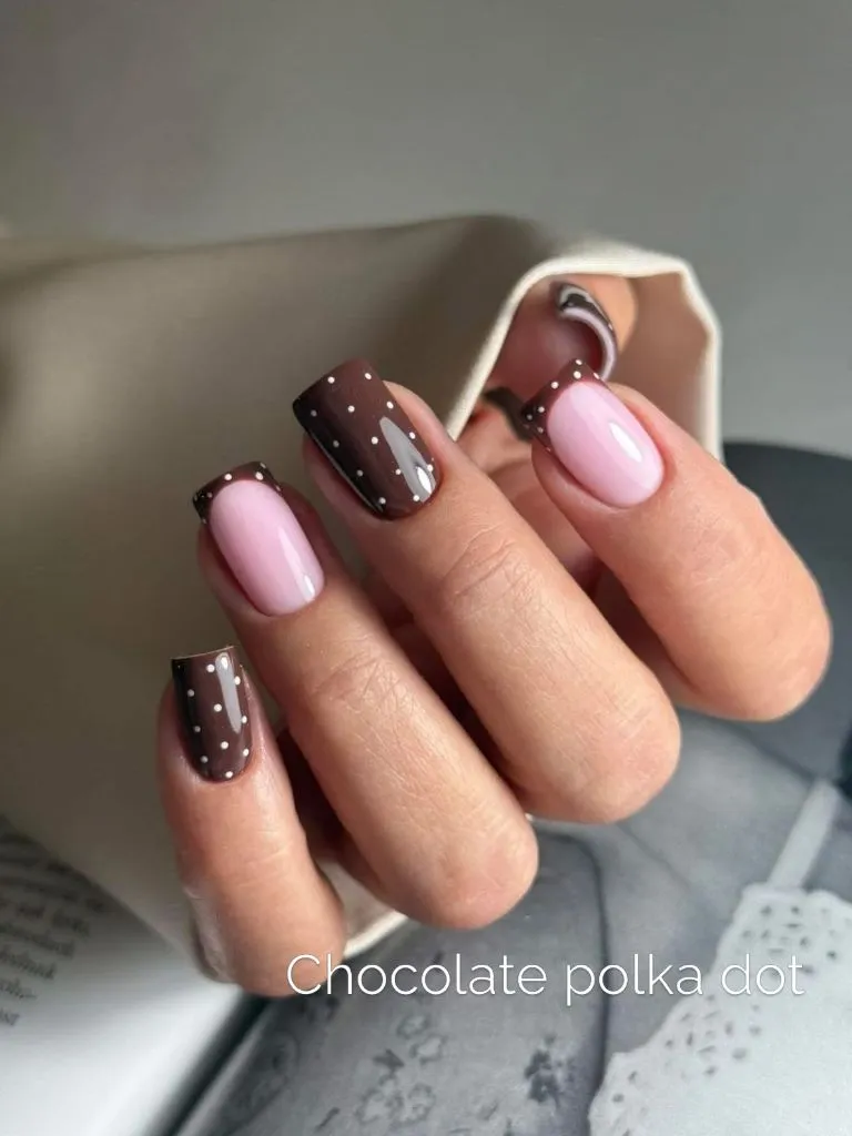
The contrast between the two colours is high — dark warm brown against pale cool pink — yet the alternation creates a rhythm that prevents either from dominating. The white dots on the brown nails introduce a third tone that echoes the lightness of the pink neighbours, tying the two fields together. A cream fabric backdrop keeps the surround neutral, so the brown-pink-white triad stays the only active palette in the frame.
I find the square shape well-chosen here because it gives the polka dots a grid-like regularity that a tapered nail would curve and distort. The honest limitation is that alternating-colour designs draw attention to any inconsistency in nail length — if one nail is shorter or wider than the rest, the pattern’s rhythm breaks. Keeping all ten nails trimmed to the same length matters more in this layout than in a uniform single-colour manicure. For anyone exploring fall nail ideas with a playful element, this balance of pattern and plain is a useful reference point.
5. Burgundy Cat Eye Shimmer Shifts Across Short Nails
A burgundy-to-mauve cat-eye effect creates a soft, moving band of lighter shimmer across each short, rounded nail. The shimmer band is most visible on the nails catching direct light, while the others read as a deeper, more opaque plum. The nails are cut close to the fingertip with a natural rounded edge, making this the shortest shape in the set so far and shifting the visual emphasis from silhouette to surface effect.
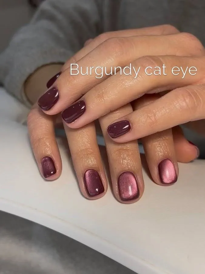
Because the nails are short, the cat-eye shimmer occupies nearly the full visible area rather than sitting as a stripe within a longer canvas. The two hands rest together, and the slight difference in how light hits each nail demonstrates how the magnetic pigment shifts — some nails lean rosier, others darker. A grey fabric sleeve frames the hands without competing, keeping the temperature contrast low and letting the burgundy warmth hold the scene.
After the more elaborate patterns and gradients in the items above, this manicure reads as notably quieter. The cat-eye technique adds dimension without adding a second colour or any drawn detail, which makes it one of the lowest-effort options for achieving visual interest on very short nails. The trade-off is that the shimmer effect is only fully legible in direct or angled light; in flat overhead lighting, these may simply read as a standard dark mauve.
6. Wine French Tips With Glitter Swirl Accents
Deep wine-coloured French tips sit on a nude-looking base across an almond-shaped set, with an additional glitter line curving alongside or through several of the tips. The tips are thicker than a traditional French manicure, covering roughly the upper third of each nail, which gives the wine colour enough area to register as a true colour field rather than a thin edge. One or two nails replace the French tip with a thin swirling line and glitter trail instead, creating accent nails within the set.
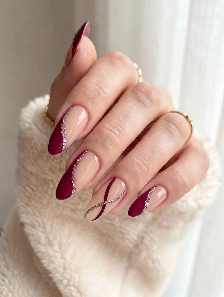
The nude base does the structural work here — it provides the negative space that makes the wine tips readable as a deliberate border rather than a full-coverage polish. The glitter line, which appears silver or champagne-toned, traces the perimeter of the wine colour on the accent nails, adding a metallic edge without filling large areas. Gold rings on the fingers echo the warm metallic note without matching it exactly, keeping the accessory layer one step removed from the nail art. A white textured sleeve anchors the lower frame in lightness.
The principle at work is perimeter emphasis: by concentrating all colour and detail at the nail’s outer edge and leaving the centre bare, the design draws the eye outward and makes the fingers look longer. If you find the glitter line too decorative, removing it and keeping just the oversized wine tips would retain the elongating effect with a cleaner read. The grow-out visibility here is moderate — the nude base near the cuticle is close to natural, but not as seamlessly invisible as the ombré version earlier in this set.
7. Deep Red Bows and Snowflakes Build Holiday Warmth
Alternating nails divide between a full-coverage deep red with a glitter-infused finish and a nude-looking base carrying hand-painted details — small red bows, white snowflake shapes, and tiny gold starburst accents. The almond shape is sharper here, tapering to a more defined point than in most of the set, which gives the stiletto-adjacent silhouette a slightly more dramatic proportion. The red nails appear to have a fine shimmer embedded in the colour, reading as a warm cinnamon-red rather than a cool blue-red.
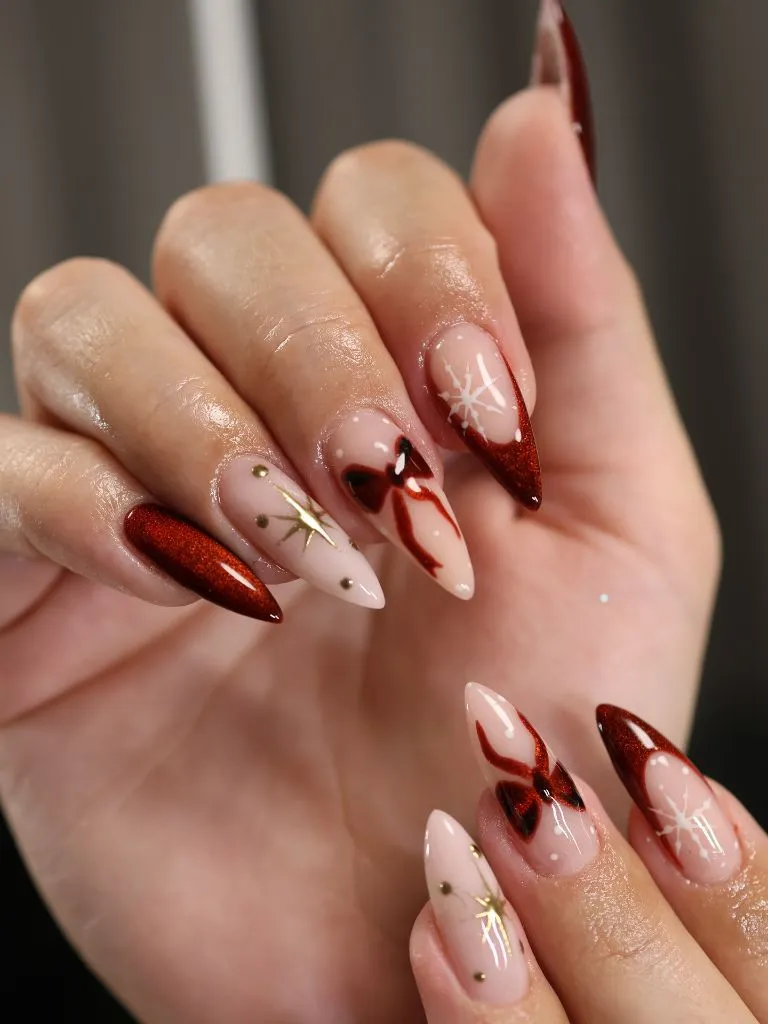
The nude accent nails carry most of the visual complexity: each one features a different motif, so the set reads as curated rather than uniform. The bows are outlined in a darker red with a slightly three-dimensional look, while the snowflakes are rendered in white with simple radiating lines. Small gold dots punctuate the negative space between motifs, acting as connective tissue across the nude nails. The deep red solid nails anchor the set with density, preventing the illustrated nails from feeling scattered.
Among November nail trends 2026, this design sits at the boundary between late autumn and early holiday territory — the bows and snowflakes signal December, but the warm red and gold palette keeps it from reading as overtly Christmas-themed. The practical cost is application time: each illustrated nail requires freehand detail work, making this a salon-dependent design for most people. If you want the same palette with less complexity, keeping only the shimmer red on all ten nails would carry the warmth without the illustrative commitment.
8. Dark Floral Blooms Emerge From a Nude Ground
Delicate flower shapes in dark brown, white, and black emerge from the tips and corners of otherwise nude-looking nails. The blooms are rendered with soft, blurred edges that suggest an airbrushed or watercolour-adjacent technique rather than hard outlines. One nail — the pinky — is fully covered in a dark colour with a textured, shell-like raised pattern, acting as the single fully saturated anchor in the set. The oval shape is moderate in length, keeping proportions understated.
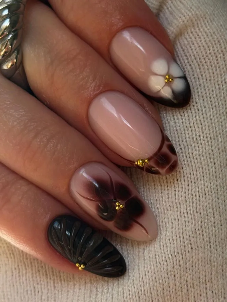
The flowers occupy the nail tips and upper corners, which means the cuticle half of each nail is left almost entirely bare. This placement creates a strong negative-space ratio — roughly half or more of each nail is visible skin tone, with the decorative elements clustered at the endpoints. Small gold bead accents sit at the centre of several blooms, providing a metallic punctuation mark that connects to the warm side of the palette. A cream knit fabric behind the hand maintains a soft, low-contrast backdrop.
The partially covered approach here is the opposite of the full-saturation designs earlier in the set. It relies on the bare nail doing as much visual work as the painted area, which means natural nail condition — smoothness, evenness of tone — becomes part of the design. The textured pinky nail adds a tactile contrast that photographs well but may catch on fine fabrics. If that is a concern, replacing it with another floral nail would keep the set cohesive without the raised surface.
9. Berry Pink Polka Dots Cover Every Nail Uniformly
A warm berry-pink base covers all nails at a medium opacity, and small, evenly spaced dark dots — likely applied with a dotting tool — sit across every surface. The dots are dark enough to read as near-black or deep burgundy against the pink, creating a polka-dot pattern with consistent spacing. The nails are short to medium length with a natural rounded shape, and both hands are visible, confirming the pattern is uniform across all ten fingers.
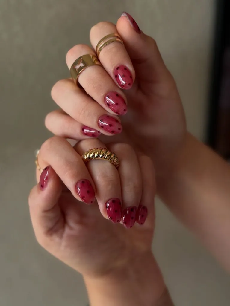
Gold rings on several fingers — including a twisted band and a wider cuff-style ring — add metallic warmth that complements the pink’s warm undertone. The dots are small enough that no single dot dominates, so the pattern reads as a texture from a distance and as individual marks up close. The consistency of dot size and spacing across both hands suggests careful, deliberate application. No accent nail breaks the uniformity, which gives the set a cohesive, almost textile-like quality.
Compared with the chocolate polka dots in item four, this version commits fully to the pattern on every nail rather than alternating with a plain colour. That commitment makes the pattern feel more like a fabric print and less like a feature accent. The limitation is that any missing or misaligned dot will be conspicuous in a field this regular. If perfect dot placement feels daunting, slightly randomising the spacing — making it look intentionally scattered rather than gridded — would be more forgiving.
10. Pale Pink Stilettos Carry Scattered Jewel Tones
Very long, pale milky-pink nails taper to stiletto points, and each nail carries a sparse scattering of tiny coloured gems — green, red, blue, and clear — set into the surface with small gold starburst settings. The length is the most extreme in the set so far, extending well past the fingertip, and the stiletto shape narrows to a genuine point. The base colour is a soft, slightly opaque pink with a creamy finish that sits between nude and blush.
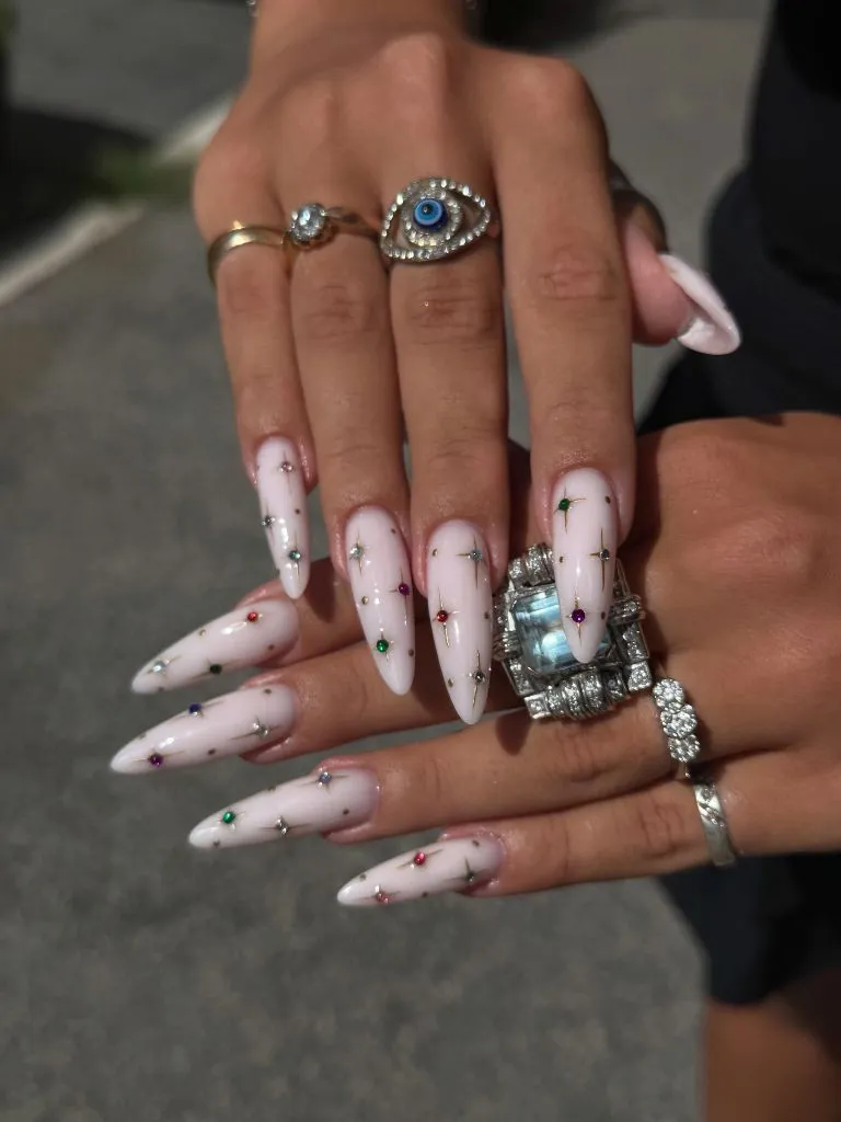
The gem accents are deliberately sparse — most nails carry only two or three stones placed at irregular intervals, which prevents the design from reading as heavily encrusted. The gold starburst settings around each gem do more work than the gems themselves, adding radiating metallic lines that fill space without adding bulk. Multiple silver and crystal rings on the fingers create a jewellery-heavy context that frames the nail gems as an extension of the same accessory language rather than an isolated choice.
The design principle is maximum length with minimal surface density — the nails are long enough to be dramatic, but the sparse gem placement keeps the surface mostly clean and pale. The honest practical limitation is functional: stilettos at this length affect typing, gripping, and daily tasks in ways that shorter shapes do not. For anyone drawn to the scattered-gem concept but needing more functionality, applying the same sparse jewel placement to a medium-length almond would preserve the idea at a more wearable scale.
11. Cranberry and Rose Chrome Nails Trade Finishes
Alternating nails switch between a deep cranberry gloss and a rose-gold chrome finish, with one or two transitional nails carrying small cranberry-coloured dots over the chrome base. The almond shape is consistent across the set, and the length is moderate — long enough to show the full colour but not dramatically extended. The cranberry nails are high-gloss and opaque, while the chrome nails have a reflective, mirror-like surface that shifts between pink and copper depending on the light angle.
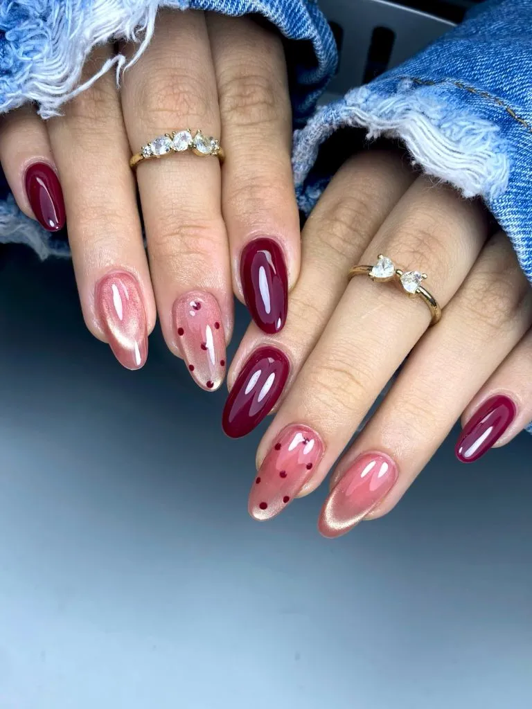
The finish contrast is the main event — gloss versus chrome creates two very different light behaviours on adjacent fingers, which gives the hand a sense of movement even in a still image. The dotted accent nails act as a bridge, placing the cranberry colour onto the chrome surface so the two fields overlap rather than staying completely separated. Denim fabric in the frame adds a cool blue context that pushes both the cranberry and the rose chrome toward their warmer readings. Delicate gold rings maintain the warm metallic thread.
This is one of the more balanced alternating designs in the set because the two finishes share a similar tonal range — both live in the pink-to-red family — and neither is dramatically darker or lighter than the other. That tonal closeness means the alternation reads as a texture shift rather than a colour clash. If you want more contrast, swapping the chrome for a matte nude would push the cranberry into sharper relief, but you would lose the finish dialogue that makes this version distinctive.
12. Jewel-Toned Blobs Sit Inside Chrome Borders
Each nail carries a different arrangement of rounded, jewel-toned colour patches — teal, plum, olive, brown — separated by raised-looking chrome or metallic silver borders. The shapes are organic and irregular, resembling stained-glass segments or cloisonné cells. The almond-shaped nails are medium length, and every nail shows a different colour combination, making the set heterogeneous rather than patterned.
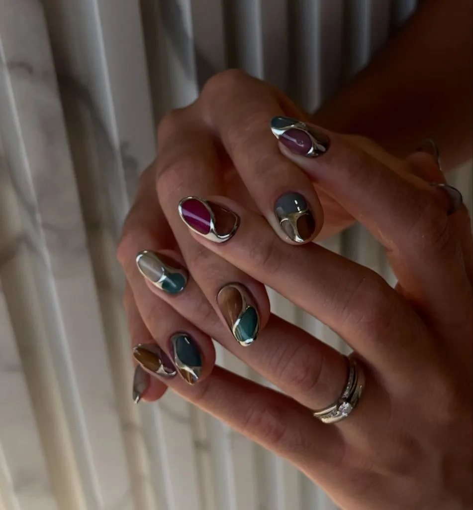
The chrome borders function as the unifying element across the set — while the colours inside the cells vary from nail to nail, the silver outline repeats on every finger and creates a consistent visual language. The teal and plum segments are the most saturated, pulling the eye first, while the olive and brown patches recede slightly. Silver rings on the fingers extend the chrome vocabulary into the accessory layer, reinforcing the metallic framing effect. Warm side lighting emphasises the dimensional quality of the borders.
This is the most colour-diverse design in the entire set, using at least four distinct hues on a single hand. The risk with this approach is visual chaos, and the chrome borders are what prevent it — they impose order the same way leading holds together a stained-glass window. The practical consideration is that any nail requiring repair or replacement needs to match both its specific colour combination and the border placement, making touch-ups more complex than a uniform design would require.
13. Black and Gold Stars Anchor an Edgy Mix
A set that alternates between fully black nails with textured, quilted-looking surfaces and nude-based nails decorated with black stars, gold foil fragments, and fine line work. The almond shape is consistent, and the length is moderate. The black nails carry a matte or satin-adjacent finish with dimensional ridges, while the decorated nails are glossy and smooth, creating a texture contrast between adjacent fingers.
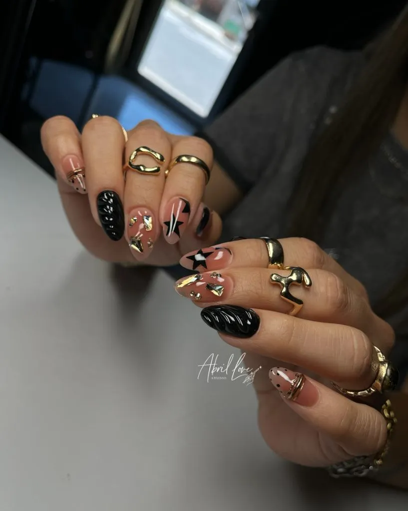
Gold chunky rings and bracelets load the hands heavily, and the gold foil on the nails echoes that hardware directly. The black stars are bold enough in scale to register clearly even at the moderate nail length, occupying a meaningful portion of each nude nail’s surface. The combination of matte black texture and glossy illustrated nails means the set never reads as flat — there is always a surface-level difference between neighbours. The overall palette is restricted to three tones: black, nude, and gold.
The design leans harder into an accessory-driven, maximalist direction than anything else in this set. Where most of the other manicures here create their interest through colour or gradient, this one relies on material contrast and motif variety. The limitation is coherence — with quilted texture, stars, foil, and line art all present, the set risks looking busy unless the black-nude-gold palette stays strictly controlled. Removing one element, such as the foil, would simplify without reducing the overall impact dramatically.
14. Iridescent Opal Surface Holds Gold Wire Overlay
A translucent, iridescent base shifts between pink, lavender, and peach across the nail surface, with raised gold wire-like outlines forming crescent moons, starburst shapes, and organic cell patterns over the top. The nails are almond-shaped and medium-long, and the iridescent base has a pearlescent quality that makes the colour appear to move as the angle changes. Small cabochon-like domes — translucent and opal-looking — sit embedded within some of the gold wire shapes.
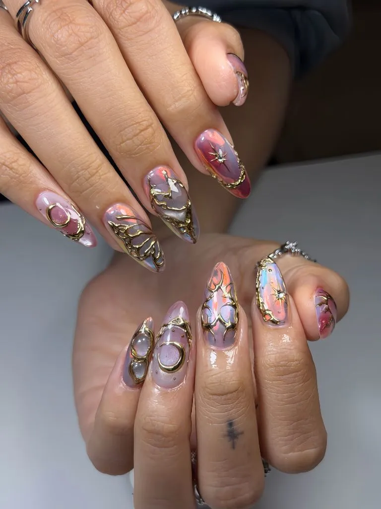
The gold wire overlay is the structural element that organises an otherwise ethereal, shifting surface. Without it, the iridescent base would be beautiful but formless; the wire gives the eye paths to follow and shapes to identify. The cabochon domes add a third layer of depth — base shimmer, then wire, then raised stone — creating a genuinely three-dimensional surface. Silver rings on the fingers sit in a cooler metallic range than the gold on the nails, which introduces a subtle warm-cool tension.
This is arguably the most technically complex design in the set, requiring layered application of colour-shifting base, precise wire placement, and embedded dimensional elements. The result is visually rich in a way that rewards close inspection. The practical trade-off is significant: raised elements catch on hair and fabric, the multi-step process demands skilled application, and any damage to the wire or stones requires full-nail repair rather than a simple touch-up. For anyone drawn to the opal base but wary of the dimension, applying just the iridescent colour without the wire work would capture the shifting-light effect at a fraction of the complexity.
15. Pink Shimmer and Gold Beads Frame Each Nail
A soft pink shimmer base covers most nails, with small gold bead chains arranged in arcs across two nails and scattered gold dots on another. One nail — the thumb — carries a fully gold, shell-textured dimensional design that acts as the set’s most saturated metallic element. The almond shape is medium in length, and the pink shimmer has a fine, sand-like sparkle rather than a chunky glitter.
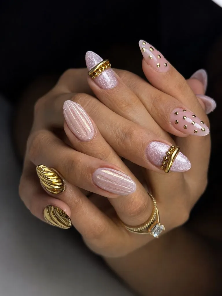
The gold bead chains create semicircular borders near the cuticle or mid-nail on select nails, framing the shimmer surface the way a piece of jewellery frames a stone. The gold dots on the accent nail fill negative space without forming a geometric pattern, reading as decorative scatter rather than a structured grid. The fully gold shell-textured thumb is heavy enough in visual weight to anchor the entire hand, preventing the delicate pink and gold accents from feeling too diffuse. A ring with a clear stone adds one more point of sparkle without introducing a new colour.
The design operates on a light-on-light principle — pink shimmer and gold are both luminous, so the contrast here is about texture and dimension rather than darkness. This works well in warm or golden lighting but may lose its nuance under cool fluorescent conditions, where both the pink and gold could flatten. If you want to increase readability in all lighting, swapping the pink shimmer for a slightly deeper mauve base would give the gold accents more tonal separation while keeping the overall warmth intact.
16. Black Gloss and Rose Gold Glitter Share a Celestial Theme
Alternating nails split between high-gloss black and a dense rose-gold glitter, with two nude-based nails carrying thin black swooping lines and small gold starburst motifs. The almond shape is consistent, and the length is moderate. The black nails are deeply reflective, while the rose-gold glitter nails have a granular, sparkling surface that catches light in tiny scattered points rather than the broad reflections of the black.
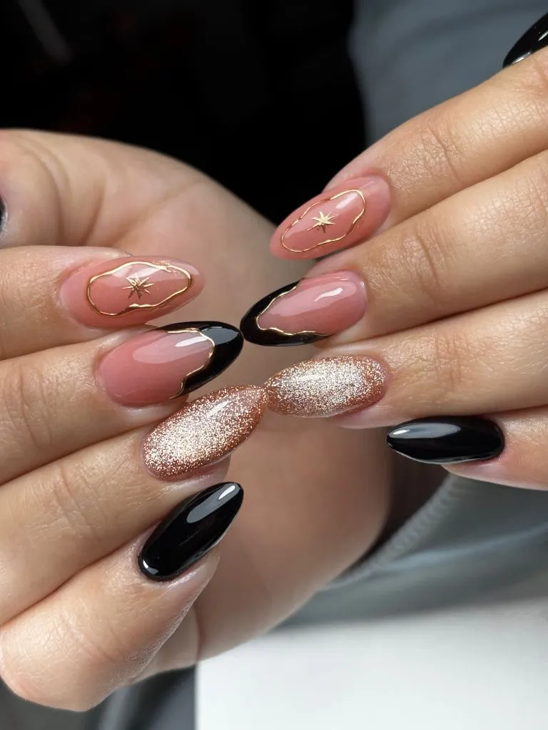
The starburst motifs on the nude accent nails tie the set to a celestial or night-sky theme without being literal about it — they are abstract enough to read as decorative geometry rather than specific imagery. The black and rose-gold nails do the heavy lifting in terms of visual weight, while the nude accent nails provide a breathing space between the two dense finishes. The swooping black line on the nude nails echoes the curvature of the black polish on adjacent fingers, maintaining a sense of formal continuity.
This set manages to include three distinct finishes — gloss, glitter, and illustrated matte-on-nude — without feeling chaotic, largely because the palette is restricted to black, gold, and pink-nude. That discipline is what holds it together. Among various November nail trends 2026 approaches, this type of multi-finish design offers a useful middle ground between single-colour simplicity and the full complexity of the opal-wire set discussed earlier. The glitter nails will outlast the illustrated ones in terms of wear, so expect the starbursts to soften first.
17. Eclectic Mixed-Media Short Nails Refuse a Single Theme
Every nail on this hand is different: one carries polka dots on a pink base, another shows a chrome reflective surface with an embedded eye-like shape, a third has a sheer lavender wash, and others feature abstract marks, metallic patches, or tiny crystal accents. The nails are short with a rounded natural shape, and no two share the same colour, finish, or motif.
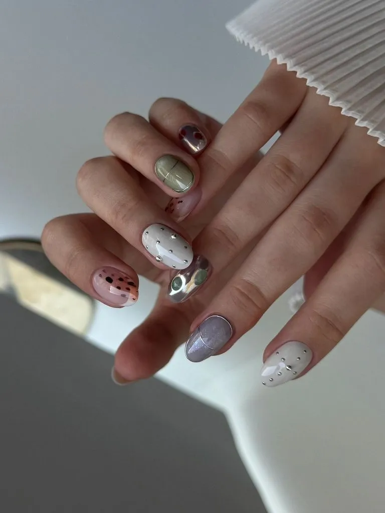
The lack of a single unifying element is itself the design concept — the cohesion comes from the consistent short length and the fact that all the colours stay in a muted, mid-tone range rather than veering into brights or deep darks. Olive, lavender, chrome, warm pink, and soft grey all coexist because none is dramatically more saturated than the others. A pleated white fabric in the background provides a clean, texturally interesting frame that does not compete with the nail variety.
This is the most individualist approach in the set, and it trades legibility for personality. From a distance, the hand reads as colourful but somewhat undefined; the details only resolve up close. That is a meaningful consideration if visibility and a cohesive read from across a room matter to you. I find the restraint in saturation is what saves this from clutter — if any single nail were neon or jet black, it would break the tonal agreement that holds the set in quiet tension.
18. Tortoiseshell, Polka Dot, and Star Motifs Share a Brown-Cream Palette
Four visible nails each carry a different design — one is a ridged metallic bronze, another shows a glossy tortoiseshell-looking pattern, a third is cream with small black polka dots, and the fourth features a metallic brown star shape on a pale base with gold bead accents. The almond shape and consistent medium length unify the set physically, while the brown-cream-gold palette unifies it tonally.
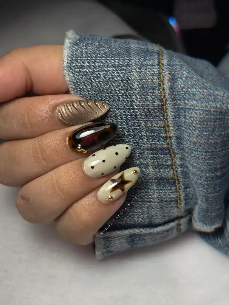
The tortoiseshell nail is the darkest and most visually dense element, anchoring the set the way a dark accent anchors a neutral outfit. The polka dot nail and the star nail both use a lighter cream or off-white base, which gives them more negative space and a lighter visual weight. The ridged bronze nail introduces a tactile, three-dimensional element that contrasts with the flat, glossy surfaces of its neighbours. Denim sleeve fabric in the frame provides a cool counterpoint to the warm brown family.
This set shares the mixed-media philosophy of item seventeen but applies it with more tonal control — everything stays within a brown-cream-gold range, which makes the variety feel curated rather than random. The practical consideration for any mixed-design set is that describing what you want to a nail technician requires reference images for each individual nail, increasing both consultation time and the chance of miscommunication. Having clear photos of each design isolated helps, and this composition itself could serve as a nail art reference for that purpose.
19. Milky White Tips With Black Hearts and Gold Lines
A milky, slightly opaque white base covers the nails, with small black heart shapes placed singly near the centre or upper portion of select nails and thin gold lines running along the lower curvature of others. Two nails feature black tips — a French-tip variation in black rather than white — while the remaining nails keep the base nearly bare with only the heart or gold accent. The almond shape is elongated and elegant, with a smooth taper.
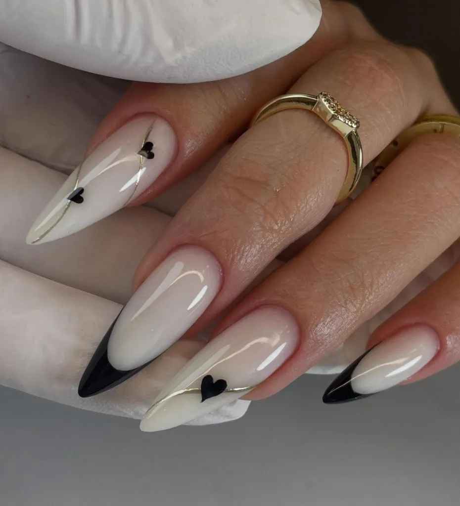
The hierarchy here is controlled by how little is placed on each nail rather than how much. The black hearts are small — perhaps three millimetres — and the gold lines are hair-thin, so the milky white base dominates the visible surface. The black French tips on two nails provide the only areas of full saturation, and because only two nails carry them, they read as punctuation rather than the main statement. A gold ring on one finger aligns with the gold accent lines on the nails, maintaining a warm metallic thread.
After the busier mixed-media sets in items seventeen and eighteen, this design reads as a deliberate return to restraint. The palette is essentially three tones — white, black, and gold — deployed with significant negative space between each element. The transferable principle is that accent details work hardest when the surrounding area is quiet enough to give them room. If the black hearts feel too literal or sweet for your preference, replacing them with a single black dot per nail would preserve the same contrast dynamic at an even more abstract scale.
20. Deep Burgundy Leopard Print With Glitter and Crystals
Long square-shaped nails in a deep burgundy carry two distinct finishes: some nails are solid glossy burgundy, while others feature a leopard-print pattern rendered in glitter against a slightly lighter burgundy base, with the spots themselves in a deeper matte tone. Small crystal clusters sit near the cuticle on one or two nails, adding a dimensional sparkle point. The square shape with sharp corners gives each nail a wider, more graphic silhouette than the almond shapes elsewhere in this set.
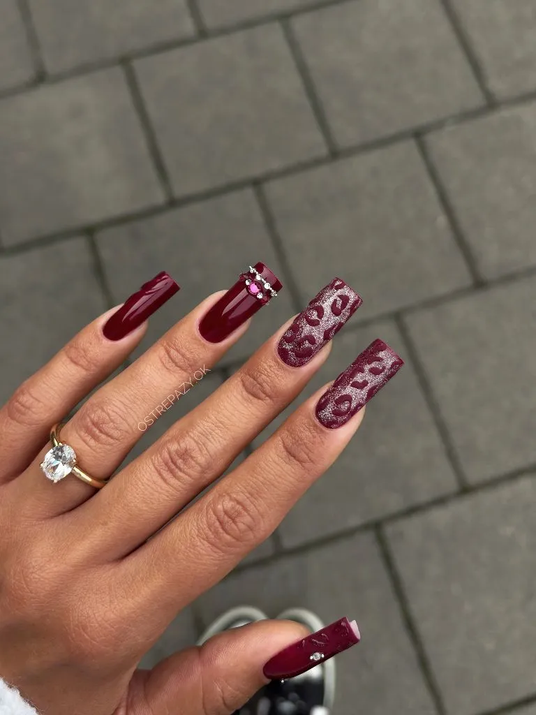
The leopard pattern stays within the burgundy family — both the spots and the base are variations of the same hue, so the print reads as a tonal texture rather than a multi-colour motif. The glitter in the pattern base adds a reflective dimension that the solid nails lack, creating a finish contrast similar to the gloss-versus-chrome dynamic in item eleven but within a single colour family. A large crystal ring on the hand echoes the crystal accents on the nails and establishes a jewelled vocabulary.
The square shape at this length carries substantial visual weight, and combined with the dark colour and pattern density, this is one of the boldest designs in the set. It is not a background manicure — it will be the first thing noticed about the hand in any setting. The honest limitation is maintenance: long square nails are more prone to corner breakage than rounded shapes, and the leopard pattern makes replacing a single nail harder than a solid colour would. For anyone who wants the leopard texture at lower risk, shortening the length by even a few millimetres would reduce leverage stress on the corners meaningfully.
21. Pumpkin Spice Chrome Covers the Full Nail in Warm Copper
A warm copper-orange chrome finish covers every nail from cuticle to free edge, with a metallic reflective quality that shifts between burnt orange and gold depending on the light angle. The almond shape is medium-long with a gentle taper, and the chrome finish is smooth and mirror-like rather than glittery. The colour sits firmly in the warm amber-to-copper range, distinctly orange-leaning compared with the burgundies and browns dominating the rest of this set.
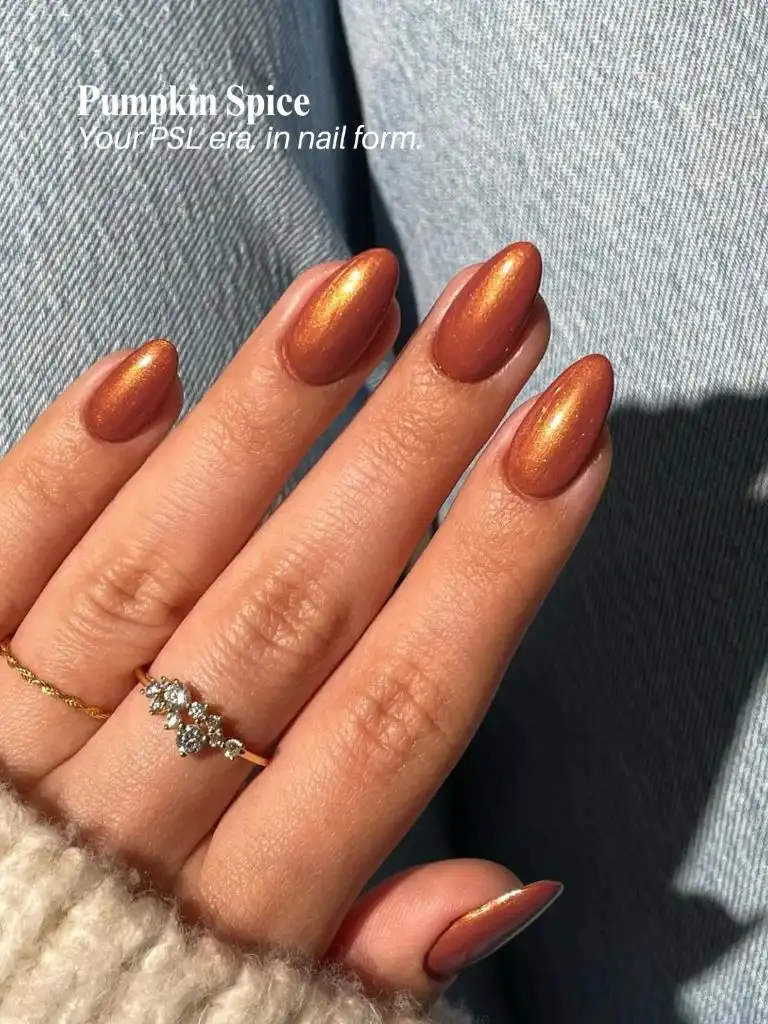
Denim and a cream knit sleeve surround the hand, providing a cool and neutral frame that makes the copper read even warmer by contrast. A delicate gold ring with small clear stones sits on one finger, close enough in metallic tone to the chrome nails that it blends into the same warm field rather than standing apart. The chrome’s reflectivity means the nail colour appears to change significantly between shadowed and lit areas of the same hand, giving a single-colour manicure more visual range than a standard cream or gloss finish would.
This is a single-colour, single-finish design like item one, but the chrome surface adds a dimension that the burgundy gloss did not have — the colour literally shifts as the hand moves. For anyone exploring November nail trends 2026 with a preference for warm seasonal tones, this copper chrome demonstrates how a finish choice can do the work that pattern or accent nails would otherwise need to do. The trade-off is that chrome finishes tend to show wear at the tips more quickly than traditional polish, so a top coat formulated for chrome longevity is worth considering.
22. Mauve Swirls Soften an October-Labelled Palette
A pink-nude base carries fluid, curving lines in mauve and darker brown-mauve, with each nail showing a different swirl configuration. The text overlay reads “October,” contextualising the palette as transitional-season. The almond shape is medium-long, and the swirl lines vary in thickness — some are fine threads, others are broader curves that cover a quarter of the nail surface. The overall palette sits in the cool-pink-to-warm-mauve range, lighter and softer than most of the burgundy-dominant designs earlier.
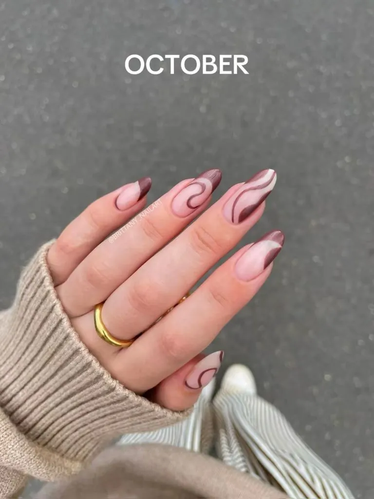
The swirl lines never cross or overlap, which keeps each nail’s design readable even though the configurations differ from finger to finger. The base colour is visible enough to function as active negative space — it is not simply a gap between lines but a deliberate tonal presence. A beige knit sleeve and a gold ring provide a warm, neutral context that supports the soft palette without introducing any competing colour. The background is a flat grey asphalt, cool enough to push the nails’ warmth forward.
Compared with the denser, higher-contrast designs in this set — the leopard print, the jewel-toned cloisonné, the black-and-gold stars — this swirl design operates at a much lower visual volume. It is the kind of manicure that registers as “something interesting” from conversational distance but requires a closer look to appreciate the variation between nails. That subtlety is its appeal and its limitation: in dim lighting or from across a room, the swirls may not read at all, and the nails could appear to be a simple nude-pink.
23. Red French Tips With a Gift-Wrapped Accent Nail
Bright red French tips sit on a sheer pink-white base across most nails, with one accent nail featuring a red line-drawn bow and ribbon design — a wrapped-gift motif. The tips are classic French shape, following the natural smile line, and the red is a true primary red rather than the deeper wines and burgundies seen throughout most of this set. The December label in the image signals a holiday context, and the red reads as distinctly festive.
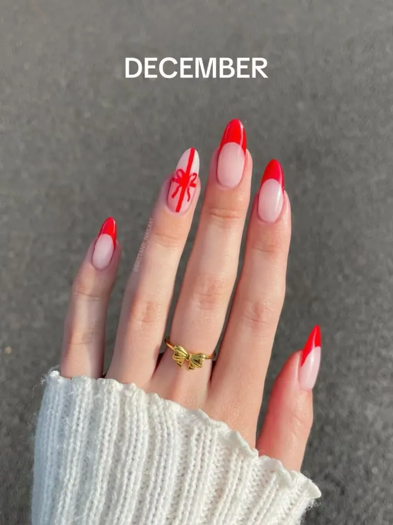
The sheer base is barely tinted, allowing the natural nail to show through, which keeps the design airy and prevents the red tips from feeling heavy. The bow-and-ribbon accent nail uses thin red linework on the same sheer base, making it look as though the nail itself has been wrapped as a present. A small gold bow-shaped ring on one finger adds a three-dimensional echo of the illustrated bow on the nail, a detail that ties the accessory and the nail art into a shared motif language. The grey background keeps the red vivid.
This is the brightest, coolest-toned design in the set — a true red stands apart from the warm burgundies, coppers, and browns that define the November palette around it. It works as a bookend, signalling the seasonal shift from November’s earth tones into December’s clearer, more celebratory colours. The transferable lesson is about accent-nail storytelling: a single illustrated nail can carry an entire theme when the remaining nails are simple enough to support it without competing. The bow motif would lose its charm if repeated on every finger.