November nail colors 2026 become easier to evaluate when you stop isolating individual shades and start studying how each manicure is composed — the ratio of dark to light across the nail bed, the way a finish distributes or concentrates light, the balance between a saturated field and bare skin at the cuticle line. Proportion and surface behavior tell you more about why a color works in moody November light than any shade name ever could. The differences between a burgundy that reads opaque and one that carries an internal shimmer are structural, not decorative.
Before scrolling, notice what each set asks your eye to do first: Does the color sit flat and heavy, or does it pull you into a reflective layer beneath the surface? Compare nail shapes side by side — coffin, almond, stiletto, short square — because the same pigment behaves differently on each silhouette. Weigh the trade-off between a clean single-color field and a mixed design that splits visual attention. Some of these lean on restraint and repetition, others on deliberate interruption, and no single formula here operates as a rule.
1. Magenta Shimmer Anchors a Single Deep Field
A dense, berry-toned magenta with visible micro-shimmer dominates all five nails equally, leaving no accent nail or pattern break. The color sits somewhere between a true burgundy and a warm fuchsia, and the fine sparkle particles catch light across the entire curved surface rather than concentrating at one point. The coffin shape gives each nail a wide midsection that maximizes the color field before tapering to a softly squared tip.
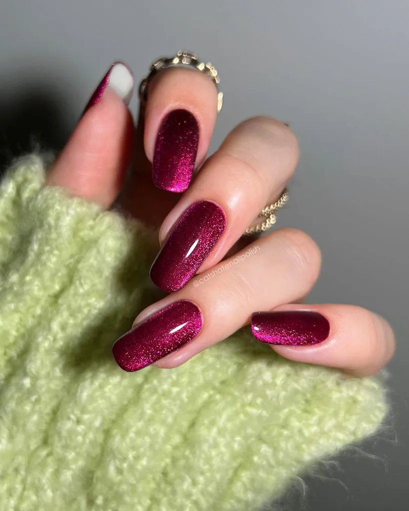
The green textured sleeve visible at the base of the hand creates a complementary backdrop — green sitting opposite red-pink on the color wheel — which intensifies the magenta without any effort from the manicure itself. A thin gold ring on one finger echoes the warm undertone buried in the shimmer, but it stays small enough to avoid competing with the nail color. The glossy topcoat reads as a single unbroken layer, which is the detail that makes the shimmer look embedded rather than applied on top.
The transferable principle here is about uniformity as a deliberate strategy. When every nail carries the same saturated shimmer at the same density, the hand reads as one continuous color block, and the sparkle becomes a texture rather than a feature. If you wanted to push this further, a matte topcoat on one or two nails would interrupt the light pattern enough to create hierarchy without adding a second color.
2. Black Line Art Interrupts a Pale Iridescent Base
Long coffin-shaped nails carry a pale, iridescent base that shifts between white, lavender, and a faint yellow depending on the angle of light. Over this quiet shimmer, bold black line art — sharp four-pointed stars, vertical strokes, and organic flowing shapes — covers most of the visible nail surface. The black sits flat and opaque against the luminous base, creating a strong figure-ground separation that makes the art read as graphic rather than decorative.
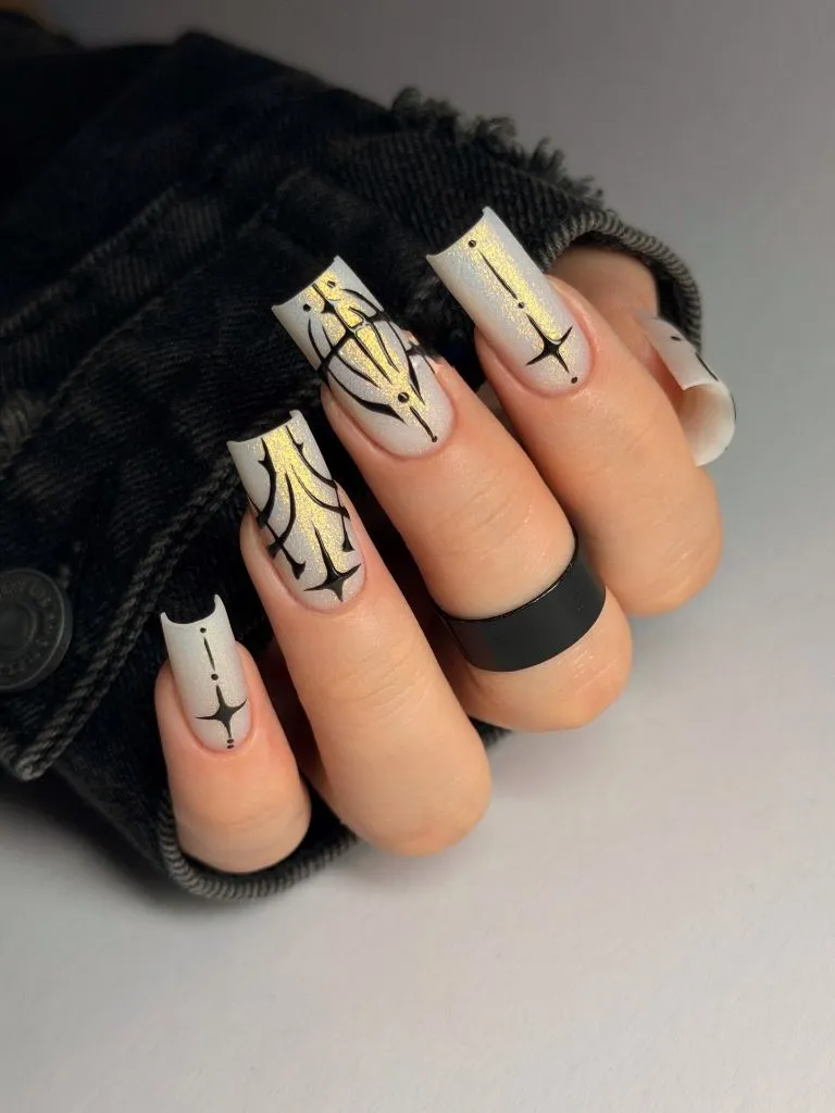
The design varies across nails: some carry dense overlapping linework while others show only a single star or a thin vertical stroke, which creates rhythm across the hand rather than identical repetition. A matte black ring on one finger matches the flat black of the nail art and reinforces the monochrome frame around the iridescence. The base color does the quiet work — its subtle color shift gives the eye something to find between the bold lines, keeping the negative space from reading as simply blank.
Compared with the uniform shimmer field in the previous set, this manicure splits its visual energy between two competing layers. The honest limitation is maintenance: that crisp black linework will show any chip or lift immediately, and the pale base will reveal grow-out at the cuticle faster than a darker color would. This is a design that looks precise at its best and noticeably worn once it starts to age.
3. Cobalt Blue Meets Cow Print at Midhand
Three nails wear a saturated cobalt blue with a high-gloss finish, while the ring and pinky fingers carry a pale pink base overlaid with irregular dark spots in a cow-print pattern. The division happens cleanly at the middle of the hand, creating two distinct zones rather than alternating accent nails. The almond shape is consistent across all five nails, which holds the set together despite the sharp color and pattern difference.
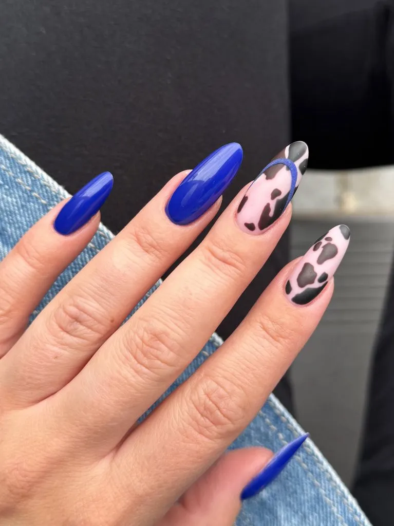
The blue nails dominate by sheer color weight — cobalt is dense and forward-pushing — while the cow-print nails function as a visual release, lighter in value and busier in surface. A thin dark outline along the edge of one cow-print nail echoes the blue, tying the two halves loosely together. The denim fabric visible in the background picks up the blue without matching it exactly, which suggests these were styled with some awareness of how the color would sit against clothing.
The lesson here is about the courage of a hard split rather than a gradual blend. Mixing two unrelated visual ideas — solid jewel tone and animal print — works because neither tries to soften toward the other. If you find the contrast too abrupt, keeping the cow print on a single nail rather than two would still deliver the interruption without splitting the hand into halves.
4. Lavender and White French Tips Frame Gold Accents
A soft lavender occupies the main body of each long coffin nail, with a white swooping French tip that curves asymmetrically rather than following the traditional smile line. Small gold rhinestones cluster near the cuticle area of select nails, and a fine scatter of gold flecks is visible across both the lavender and white zones. The overall palette sits in a narrow range — cool purple, clean white, warm gold — with no dark anchor anywhere.
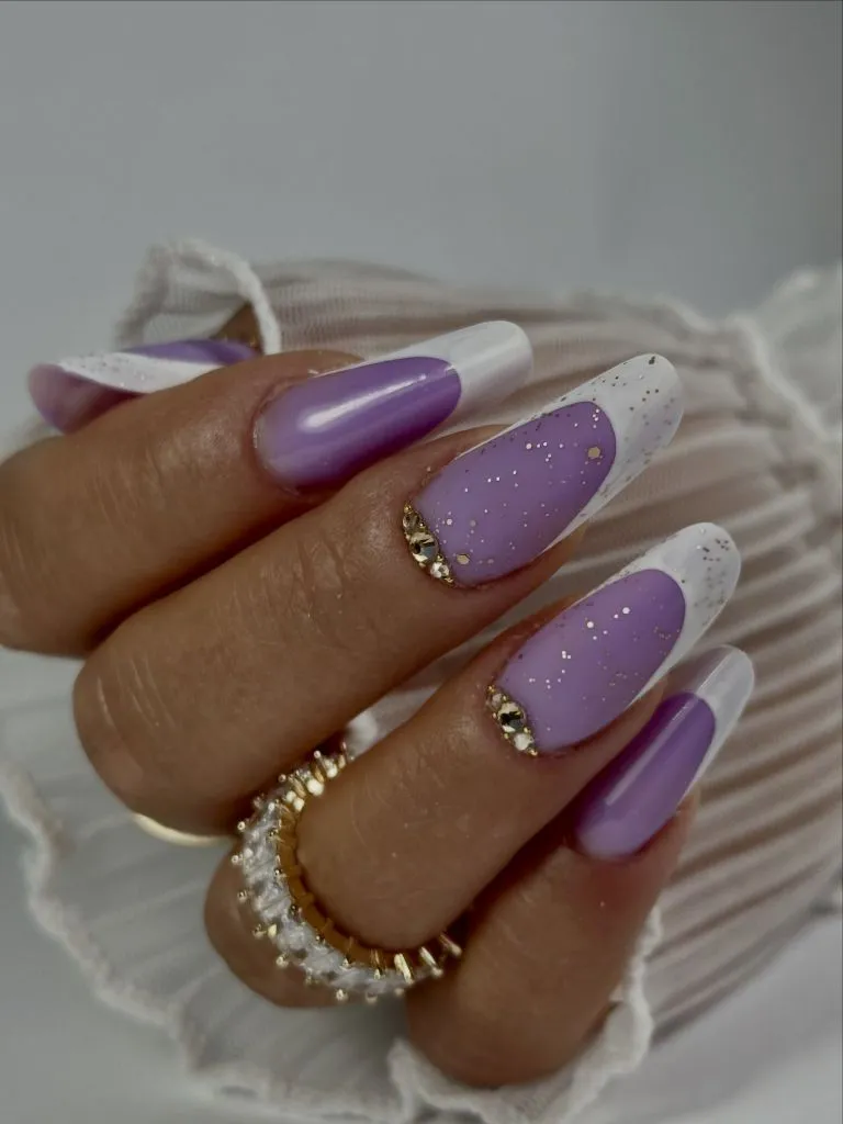
The white tips do not repeat the same curve on each nail, which creates a sense of hand-painted individuality rather than mechanical precision. The lavender base has a slightly milky, semi-sheer quality that allows a hint of the natural nail to show through, keeping the color from reading as fully opaque. Gold accents appear only at the lowest point of the nail near the skin, which grounds the sparkle and prevents it from competing with the white tips at the opposite end.
For anyone drawn to November nail colors 2026 in softer palettes, the practical detail here is that lavender paired with white reads lighter than most autumn choices and may feel seasonally unexpected. That is either its appeal or its limitation, depending on your wardrobe. If you want to pull it toward November more decisively, swapping the lavender for a dusty mauve would keep the same structure but darken the overall tone by one or two steps.
5. Emerald Chrome Sharpens a Stiletto Silhouette
A deep emerald green with a pronounced chrome or metallic finish coats four visible stiletto nails, each tapering to a sharp, narrow point. The color is rich enough to read as dark from a distance but carries an internal glow that shifts between green and a slight gold undertone where the surface curves. The stiletto shape elongates each nail dramatically, and the chrome finish amplifies this by creating a continuous light stripe down the center of every nail.
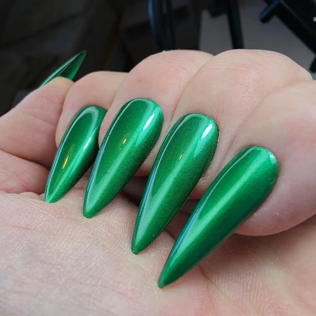
There are no accent nails, no mixed finishes, and no secondary colors — the entire effect depends on the interaction between shape and surface. The chrome catches a bright highlight along each nail’s central ridge and drops to a deeper, shadowed green along the sides, which gives a three-dimensional quality that a cream or matte finish in the same shade would not produce. The surrounding skin and the neutral background let the green occupy all of the visual space.
The honest limitation of this combination is that stiletto nails at this length are functionally restrictive, and the chrome finish will show fingerprints, scratches, or dull spots more readily than a standard gloss. Compared with the flat cobalt blue a few items back, the chrome here does more visual work per nail because it creates its own light and shadow. If you want the emerald but need practicality, an almond shape at half this length would preserve most of the color story while losing the theatrical point.
6. Dark Plum Gloss Carries a Quiet Oval Shape
Short to medium oval nails wear a deep plum that edges close to black in the shadows but reveals its reddish-purple base where the light hits the curved surface. The finish is a high, wet-looking gloss with no shimmer, sparkle, or metallic quality — just pure reflective depth. The nail length is conservative, barely extending past the fingertip, which concentrates all the visual weight into the color and finish rather than the shape.
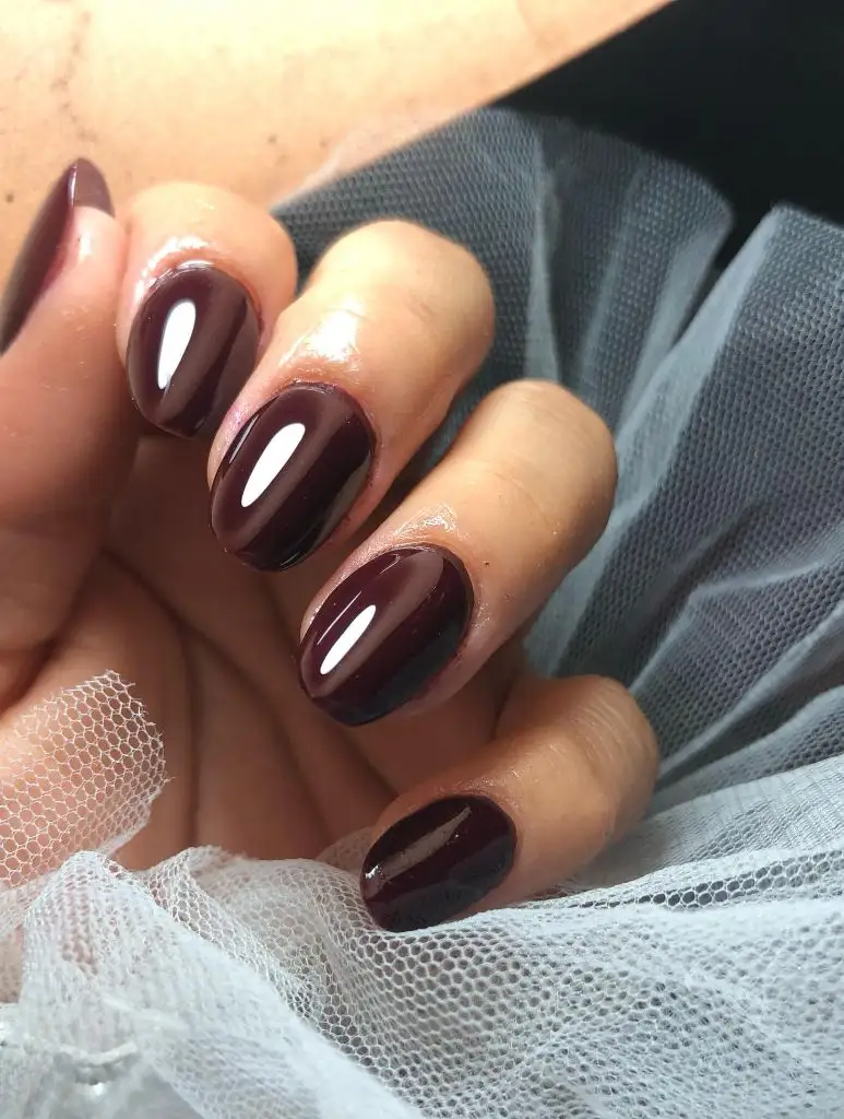
A sheer tulle-like fabric in the background provides a textural contrast — airy and matte against the dense, glassy surface of the nails. The cuticles appear clean and closely maintained, which matters more at this length because there is less nail surface to distract from the nail-skin border. The plum shade is cool-leaning, without the warm brown tones that would push it toward a chocolate territory.
This set demonstrates that a dark, glossy monochrome on short nails can hold just as much visual presence as a longer, more elaborate design. The principle is density: a near-black color on a small surface reads concentrated rather than minimal. For anyone who prefers low-maintenance nails but wants depth for November, this is a strong reference — though the dark shade will make any chip visible against the natural nail underneath, so the upkeep cycle stays short.
7. Dusty Mauve Softens Across a Short Square Set
Both hands display short, squared-off nails in a muted dusty mauve with a gentle warmth — not quite purple, not quite gray, sitting in the middle ground where the two overlap. The finish is glossy but not dramatically reflective, giving the nails a polished, natural appearance. The length is very short, with nails trimmed close to the fingertip, and the square shape is slightly rounded at the corners rather than sharply geometric.
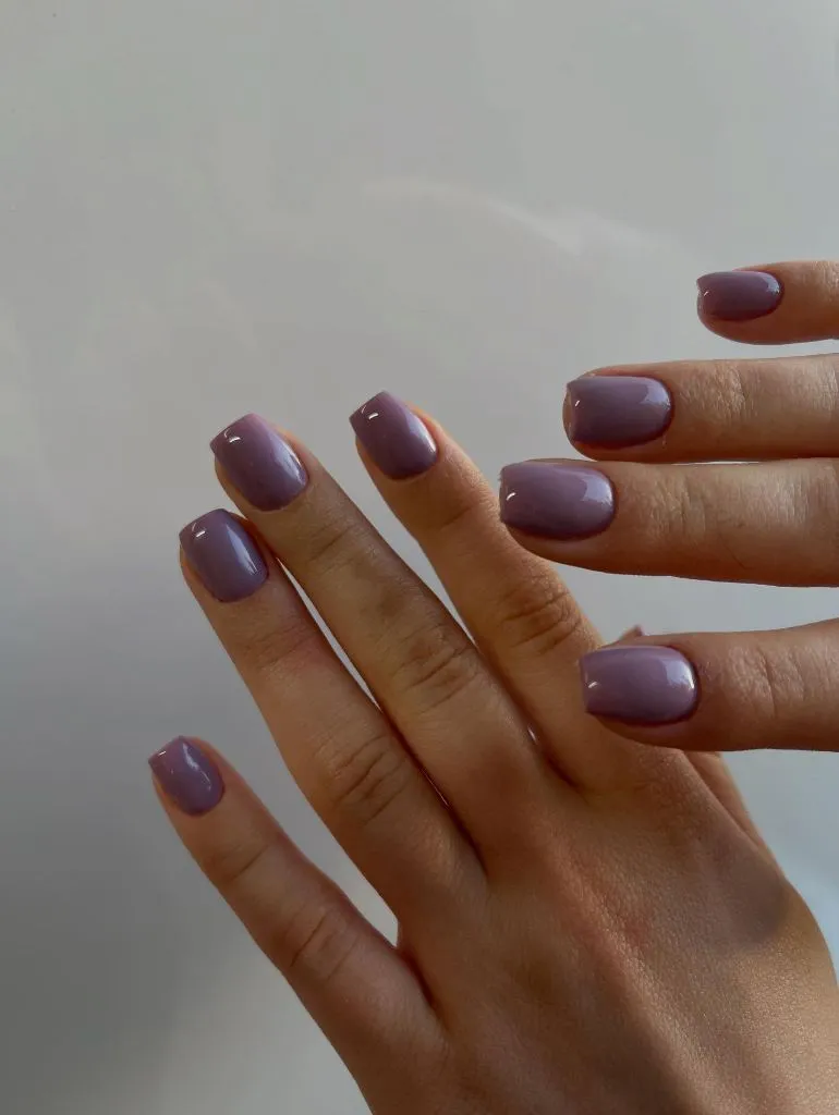
Because both hands are visible in the same frame, the consistency of the color becomes the subject — there is no variation between nails, no accent, no texture shift. The mauve reads neutral enough to function almost like a tinted version of bare nails, which is a fundamentally different approach from the saturated jewel tones earlier in this set. The skin tone and the nail color are close in value, so the border between nail and fingertip is soft rather than sharp.
After the high-contrast chromes and deep plums above, this reads notably quieter, and that is its strength. The transferable idea is about closeness in value: when nail color and skin tone sit near each other on the lightness scale, the hand looks unified and the manicure disappears into the overall appearance rather than announcing itself. If you find this too understated for November, even a single coat of a slightly deeper grape over this base would add enough distinction without abandoning the muted register.
8. Green-to-Blue Gradient Extends the Color Range
Medium-length nails with a softly squared shape carry a gradient that transitions from a bright lime green at the cuticle to a deep blue at the free edge. Fine glitter particles are visible throughout, catching light across the entire transition zone. The gradient is smooth enough that there is no visible hard line between the two colors, but the endpoints are far enough apart on the color wheel that the shift reads as dramatic rather than subtle.
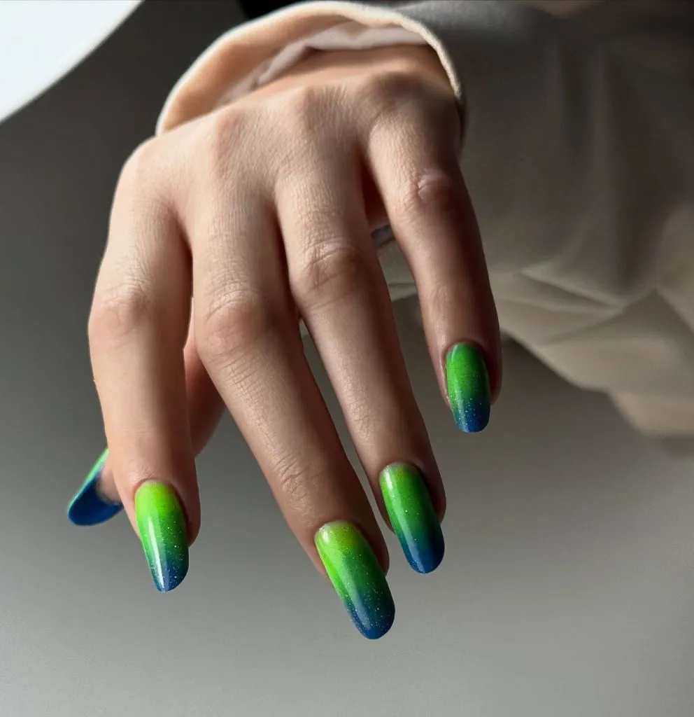
The green zone is the lightest area and naturally draws the eye first, while the blue tips are darker and heavier, creating a sense of weight settling toward the ends of the fingers. The glitter is fine enough to blend into the gradient rather than sitting on top as a separate layer, which keeps the surface looking cohesive. The surrounding skin is visible above the cuticle line, and the green-to-skin transition is relatively abrupt, making the color pop at the base of each nail.
This is one of the more seasonally unconventional choices among November nail colors 2026 — bright green and blue lean more toward spring or summer. The trade-off is distinctiveness versus seasonal harmony: this set will stand out against dark autumn clothing precisely because it refuses to match. If you want to anchor it more firmly in a November palette, shifting the green toward an olive and the blue toward a navy would preserve the gradient structure while cooling the overall temperature.
9. Star Motifs and Water Drops Build a Textured Collage
Short, squarish nails alternate between a muted blue and a dusty rose-beige, each decorated with raised-looking star shapes and three-dimensional water-drop details that catch light independently of the base color. The stars vary in size and placement across nails, and the water drops appear scattered randomly, giving the overall design an organic, handmade quality rather than a symmetrical pattern.
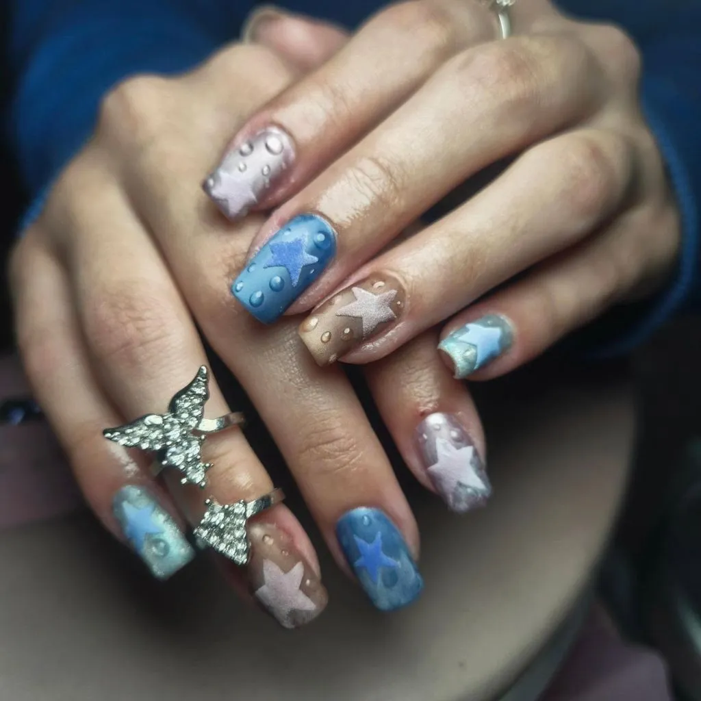
The color palette stays within a narrow range of cool tones — nothing here is warm, saturated, or dark — which allows the textural details to become the dominant feature. The star shapes appear in a slightly lighter or more opaque tone than their background, creating subtle figure-ground contrast rather than bold graphic separation. A rhinestone-studded butterfly ring on one finger introduces an additional decorative element that echoes the ornamental density on the nails without overwhelming the composition.
The limitation of highly textured nail art like this is tactile: raised elements can catch on fabrics and are more prone to lifting or breaking off than flat designs. Compared with the flat chrome and gloss finishes elsewhere in this set, the texture here creates visual interest through dimension rather than reflectivity. If you want the star motif but need durability, flat-stamped or painted stars on a smooth surface would give you the shape vocabulary without the fragility.
10. Warm Burgundy Rounds Into a Classic Almond
A rich, warm-toned burgundy — distinctly redder than the plum shown earlier — covers medium almond-shaped nails on both hands. The finish is a clean, high gloss with strong light reflection visible as a bright white stripe on several nails. The length is moderate, extending maybe a centimeter past the fingertip, and the almond taper is gentle, creating a natural, slightly pointed silhouette.
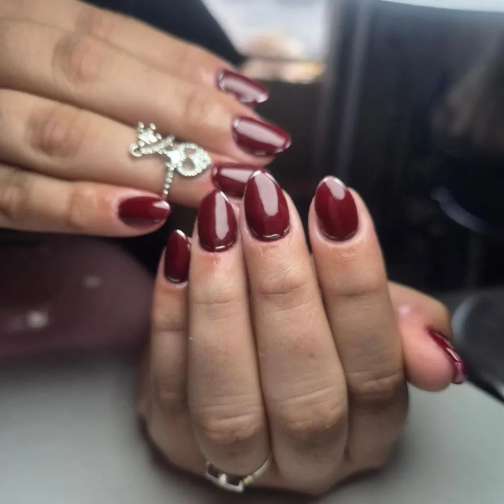
A decorative ring with a bow-like or infinity shape catches light on one hand, adding a small point of interest without competing with the nail color. The burgundy here is warmer and more overtly red than the plum in item six — where that shade edged toward cool purple-black territory, this one sits firmly in the red-wine family with visible brown warmth. The gloss finish is the same high-shine approach, which makes the color comparison between the two even clearer.
I find this particular shade one of the most wearable in the set because it occupies that middle ground between red and brown that tends to complement a wide range of skin tones. The almond shape at this length is practical enough for daily use while still reading as intentionally manicured. If you gravitate toward this color family, you might also explore the deeper tones covered in guides to fall nail trends for additional ways to work burgundy into a seasonal rotation.
11. Near-Black Plum Squares Off With Clean Edges
Both hands show medium-to-long nails in a square or squoval shape, coated in a color so dark it reads as nearly black in lower light but reveals a deep plum-burgundy undertone where the surface catches direct illumination. The finish is glossy and smooth, with strong light reflections emphasizing how flat and even the application is. The square shape gives each nail a wide, rectangular face that maximizes the visible area of dark color.
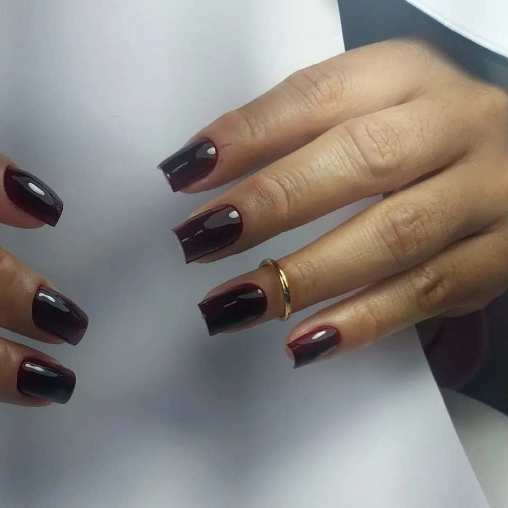
The nails on one hand appear slightly longer than the other, which may be a growth difference or a deliberate asymmetry — either way, the dark color and consistent shape unify the pair. A simple gold band ring is the only accessory, and its warm metal tone creates a minor contrast against the cool-dark nails. The free edges of the square nails are cut cleanly, and the dark color makes each edge line very sharp against the skin.
The visual weight of this set is considerable — near-black nails on a squared shape at this length occupy significant space and command attention in any hand gesture. The trade-off is that this degree of darkness can read as heavy in brightly lit or casual settings. Compared with the warm burgundy almond in the previous item, this is colder, darker, and more architecturally rigid. If you want the depth but less severity, rounding the corners into a softer squoval or shortening by a few millimeters would reduce the visual mass without losing the dark impact.
12. Classic Bordeaux Sits Against Dried Florals
Short-to-medium square nails wear a deep bordeaux — a dark wine red with no shimmer, no sparkle, and no visible texture variation. The finish is a standard gloss, and the color appears completely opaque in a single uniform layer across all five visible nails. Two stacking rings in gold tones, one a twisted rope design and one with small white disc shapes, sit on one finger and provide the only warm metallic contrast.
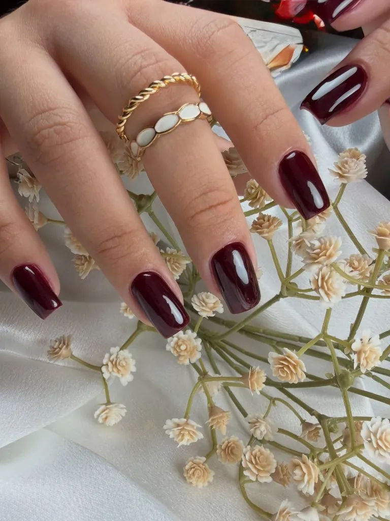
Dried flowers scattered across a white fabric surface in the background introduce a range of cream, tan, and muted green tones that position the bordeaux nails within a distinctly autumnal color story. The styling matters here because it contextualizes the nail color as seasonal — the same shade against a metallic clutch or a bright tablecloth would read completely differently. The nail length is practical, barely past the fingertip, and the square shape is soft enough to avoid looking blunt.
This is the most conventionally November-appropriate set so far — dark wine red, short length, no adornment. Its strength is also its limitation: there is nothing here to surprise the eye, which means it works as a reliable background element in any outfit but will not function as a focal point. If reliability is the goal, this is a useful template; if you want the same color family with more visual interest, the magenta shimmer in item one shows how a finish change alone can transform a similar hue.
13. Brown Cow Print Splits Between Pattern and Bare Skin
Almond-shaped nails alternate between full cow-print coverage and a pink-toned bare or sheer base with minimal markings. The cow-print nails carry irregular dark brown patches on a cream-white ground, while the non-print nails show mostly bare nail with just a small dark brown French tip accent at the very edge. The alternation creates a rhythm of busy-quiet-busy across the hand.
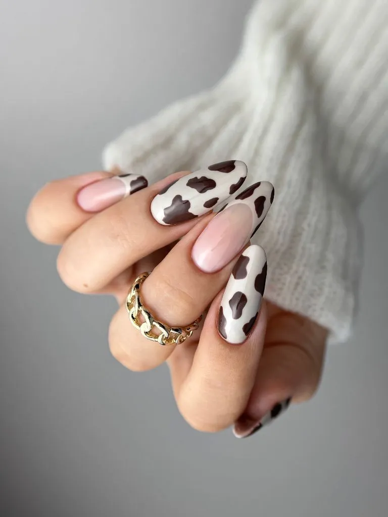
A chunky gold chain ring adds warmth without pulling attention from the pattern, and the white knit sleeve in the background keeps the surrounding palette neutral. The brown tones in the cow print are warm and rich, sitting somewhere between chocolate and espresso, which reads more sophisticated than the black-and-white cow print seen on the cobalt set earlier. The cream ground of the print nails closely matches the natural nail color visible on the alternating fingers, creating a visual continuity.
The comparison with item three is instructive: both use cow print as a secondary motif, but this set integrates it more smoothly by matching the print’s light areas to the bare nail tone. The result feels cohesive rather than deliberately mismatched. If you want to try cow print without committing to a bold partner color, this warm-neutral approach is the more versatile path, and it pairs well with the kind of brown and cream clothing combinations often discussed in seasonal outfit guides for fall.
14. Deep Plum Chrome Absorbs Light on an Oval Shape
Medium oval nails carry a dark plum shade with a chrome or cat-eye finish that creates a concentrated light band running vertically down the center of each nail. The surrounding areas of the nail fall into deep shadow, making the light stripe the only bright element. The color is similar in family to the plum in item six, but the chrome finish completely changes how it behaves — this one pulls light inward rather than reflecting it broadly.
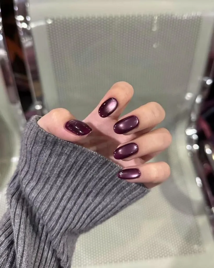
A ribbed gray knit sleeve frames the hand and stays tonally quiet, keeping all visual attention on the nails. The chrome effect is most visible on the nails where the curvature catches the light source directly, while the nails angled away read as almost solid dark plum. This variation across the hand — some nails glowing, others muted — happens naturally with chrome finishes and gives each finger a slightly different character without any intentional design change.
The trade-off with chrome finishes in this dark range is that the magnetic or reflective effect is only visible in certain lighting conditions. In dim or flat light, these will read as simple dark nails; in directional light, the stripe appears and the nails become dramatically more dimensional. I find that ambiguity appealing — it functions as a quiet everyday manicure that occasionally reveals something more. The oval shape at this length keeps everything wearable.
15. Red Underside Frames a Tortoise-Patterned Surface
Long, square-tipped nails show a mottled pattern of amber, brown, and black across the visible top surface, resembling tortoiseshell, while the underside of each nail is painted a bright, opaque red. This dual-surface approach means the nails read as warm-toned and organic from above but flash vivid red when the hand turns or the fingers curl, as captured in this image.
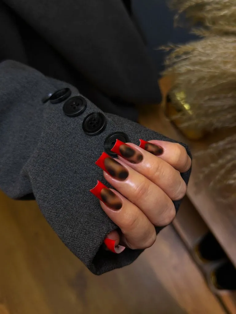
The tortoiseshell pattern is irregular and translucent-looking, with dark patches floating over warmer amber sections, creating an effect that reads as layered rather than printed. The gray suit-jacket fabric and large black buttons in the background suggest a formal or tailored styling context, which positions this manicure as an intentional contrast — organic pattern against structured clothing. The red underside is the sharpest color in the frame and pulls the eye to the tips.
This is the most architecturally complex design in the set because it uses the three-dimensionality of the nail itself to create two different looks depending on viewing angle. The limitation is obvious: the red underside is only visible at certain hand positions, so it functions as a reveal rather than a constant. The length required to make the underside visible also means this is not a low-profile manicure — it occupies space and invites attention by design.
16. Chocolate Brown Meets Leaf Print on Mixed Textures
Almond nails split between a warm chocolate brown and a pale pink-nude base decorated with black leaf and vine motifs. The brown nails themselves show at least two different finishes — one appears to be a textured, sweater-knit-style raised surface, while another is smooth and glossy, creating within-color variation that adds depth. The leaf-print nails are matte or satin-finished, with the black botanical shapes painted cleanly against the light ground.
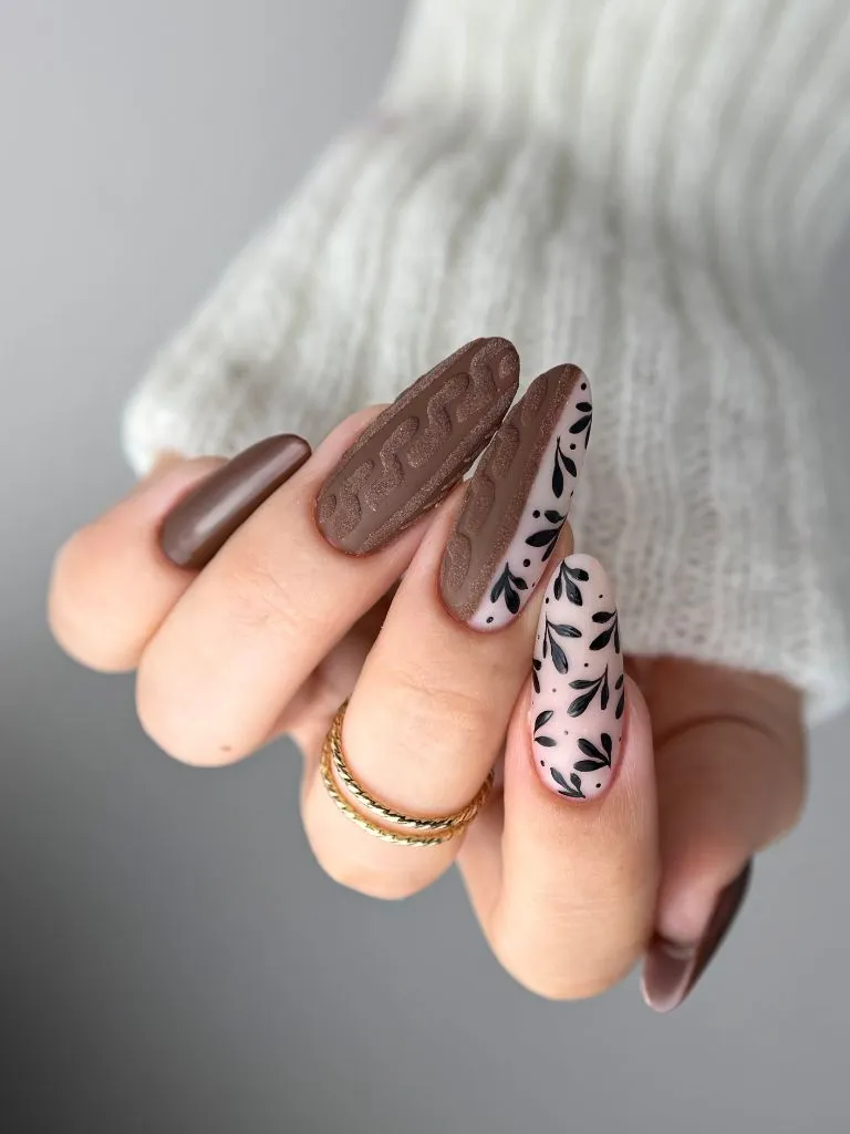
The white knit background echoes the sweater texture on the brown nails, tying the manicure to its seasonal context. Thin gold rings sit below the nails and add a small warm-metal accent that complements the brown tones. The hierarchy works because the chocolate brown carries the visual weight while the leaf-print nails provide surface interest and lighter value contrast — the two types need each other to avoid being either too heavy or too delicate alone.
Among November nail colors 2026, this combination of warm brown with botanical illustration feels particularly rooted in the season without relying on the expected dark reds and plums. The textured brown nail is the most distinctive element — if that raised sweater-knit effect is gel-based, it will have a different wear pattern than the flat nails beside it, so longevity across the set may be uneven. If you want the brown-and-botanical pairing without texture complications, keeping all nails smooth and splitting only by color and pattern would simplify the maintenance.
17. Reddish-Brown and Floral Accents Balance on Short Nails
Short almond nails divide between a deep reddish-brown and a translucent milky base carrying small dried-flower or foil-flower inclusions in dark and gold tones. The reddish-brown nails are fully opaque and glossy, while the floral nails appear to have actual embedded elements — small flower shapes and metallic fragments that sit beneath a clear topcoat, giving them a layered, encapsulated look.
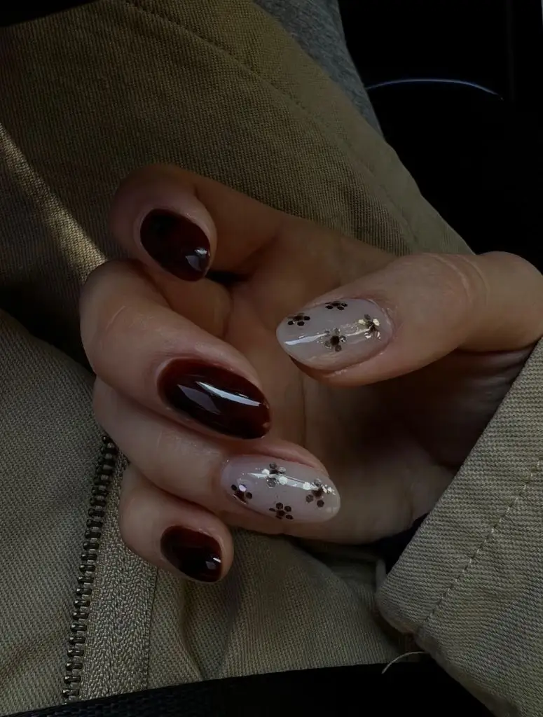
The tan fabric — possibly a jacket or bag — in the background provides a neutral, warm-toned context that supports the brown family without adding visual noise. The flower inclusions are small enough to read as texture rather than distinct images at any distance, which keeps the floral nails from feeling overly literal. The reddish-brown and the floral nails alternate in what appears to be a two-and-two split, maintaining balance across the hand.
The restraint of the length is what makes this set work: embedded flowers on long nails risk looking overly ornamental, but on short nails they read as a subtle textural surprise. The reddish-brown shade is close to the bordeaux in item twelve but pulls warmer and lighter, sitting more clearly in the brown family. If you prefer the encapsulated flower concept but find the color too quiet, pairing the floral nails with a deeper, cooler burgundy would sharpen the contrast between the two nail types.
18. Chocolate and Gold Foil Separate on Square Tips
Medium-length square nails split between a solid chocolate brown and a nude-pink base carrying irregular gold foil fragments and faint marbled brown swirls. The chocolate nails are fully opaque with a glossy finish, while the foil nails are sheer enough to show the natural nail color underneath. The square shape at this length gives each nail a broad, flat canvas that shows off both the solid color and the foil placement clearly.
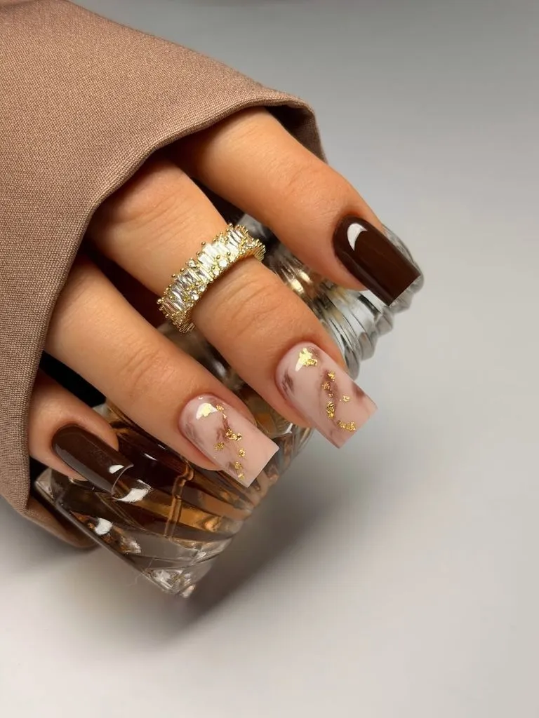
A tan or camel fabric draped around the hand and a crystal-set eternity ring contribute to a warm, styled composition that frames the nails within a cohesive earth-tone palette. The gold foil pieces are placed irregularly — some large, some small — which avoids the mechanical look of evenly distributed glitter. The marbled brown veins on the sheer nails echo the chocolate color on the solid nails, creating a quiet link between the two types.
Compared with the chocolate-and-leaf set in item sixteen, this version is simpler and more refined — it uses metallic accents rather than botanical illustration, and it avoids textured surfaces entirely. The gold foil will catch light in a way that is directionally dependent, meaning these nails will flash and go quiet as the hand moves. If gold foil feels too flashy for your taste, silver or copper foil in the same sparse placement would change the metal temperature while keeping the same compositional logic.
19. Iridescent Base Returns With Varied Star Density
This set repeats the iridescent-base-with-black-line-art concept from item two, confirming it as a deliberate design rather than an unrepeatable one-off. The same pale, color-shifting base supports black star shapes and flowing organic lines, though the exact distribution of linework varies — some nails are densely covered while others carry only a single motif. The coffin shape and length appear identical to the earlier version.
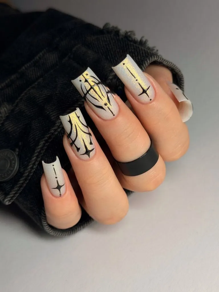
The matte black ring reappears as well, reinforcing the flat-black-against-shimmer contrast that defines the set. Viewing this alongside the first instance allows a closer comparison: the star shapes are consistent in style, and the base color’s iridescence shifts the same way, suggesting this is the same manicure photographed from a different angle or under slightly different lighting rather than a second, separate execution.
Because this is a repeated image from a different context in the set, it functions here as a reminder that angle and lighting change how a manicure reads. The stars that appeared prominent before may look subtler from this vantage, and the iridescence may shift toward different colors. For anyone considering this style, photographing your own nails from multiple angles before committing to a particular design density is a practical step — what looks balanced on one hand position may look sparse or crowded from another.
20. Cobalt and Cow Print Confirm the Split-Hand Logic
This final image revisits the cobalt-blue-and-cow-print combination from item three, showing the same saturated blue on three nails and the same pink-based cow print on two. The almond shape, the gloss finish, and the dark outline along the print nails all appear consistent with the earlier view. The denim background is the same, and the hand position is similar but not identical.
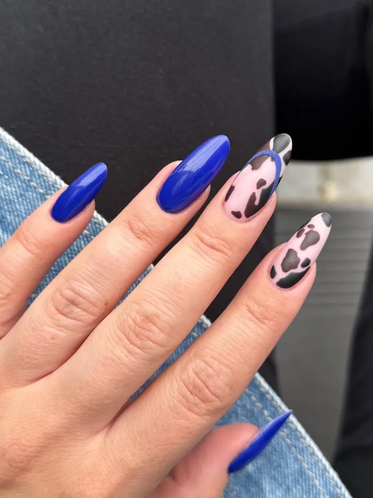
Seeing this set twice in the article offers a chance to study the transition point — the middle finger, where the blue and the cow print meet — more carefully. The border between the two design concepts is clean, with no blending or transitional nail. The cow-print spots are organic and varied, and the blue is uniform and unbroken; the contrast between these two surface types is what gives the set its energy.
Ending on a revisit feels appropriate because it underscores the central idea: the same nail set, seen from a different position or in a different sequence, asks you to notice different things. Among November nail colors 2026, cobalt is an outlier — bold, cool, and far from the expected autumn reds and browns — and pairing it with animal print doubles the departure from convention. Whether that departure appeals to you depends on whether you want your nails to harmonize with the season or deliberately stand apart from it.